It’s tough for small business owners to wade through the sea of conflicting label design information to decide on the best design for their product. A lot of food label design tips are prescriptive — “Add a subtle gradient,” “choose a minimalist color palette,” “use a sans serif font.” And if you ask 10 different designers for their advice, you’ll get 10 completely different responses.
Advice like this is skin-deep and doesn’t address the underlying purpose of food product labels: Creating meaningful connections with your target demographic that drive sales.
That’s why we’re going to go beyond the usual “how-to” design tips. Instead, we’ll walk business owners through the labeling process, arming them with the decision-making framework to use when making design choices that will resonate with their customers. Only then will we offer tactical design resources to reference when opening up Illustrator and creating their label design.
What to do before creating your label design
Label design often gets left to the last minute. The business owner contacts a designer with an “almost-done” design. He expects the designer to take it to the finish line quickly because he needs the labels printed and applied to the product container in two weeks.
This is not how the label design process should work.
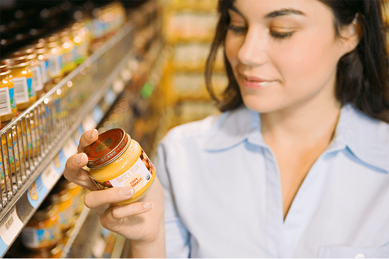
70% of purchase decisions are made in-store. The stakes are simply too high to leave your label design — your only tool to influence these split-second decisions — to chance. To make an impact on the shelf, you need to take a measured, thoughtful approach to creating your label.
Before you even consider the actual design, you’re going to need to understand three things: Your brand, your audience and the competitive landscape of your product category. All tactical design decisions should be made within context of these three elements.
Define your brand and develop your story
In the grocery store, your product will be placed on a shelf next to dozens of products that seem exactly the same to your customer. Depending on your product category, even value-based claims like “organic,” “GMO-free” and “low carb” might just be status quo.
Your brand and its story will be how you create clear distinctions between your product and your competition in the mind of the customer. Award-winning label designer Mario Di Paolo said in M_use that the secret behind good design is to “find a brand’s hidden distinctive features to represent it to the fullest.”
Try and find the one thing about your company no one else can reasonably claim. Perhaps you donate a portion of your profits to charity. Or maybe your company was started in 1921 by your great grandmother, who was passionate about finding the perfect recipe for chocolate chip cookies.
Whatever it is, you need to define it and tell the story prominently on your packaging, using copy and subtle visual cues. If your brand story is about being an authentic, family-owned brand, perhaps a subdued, simple design which prominently displays your founder’s story would make sense. If your brand story is about donating your proceeds to a wildlife charity, then your packaging should probably look natural and eco-friendly.
Check out the competition in your product category
Take a look at the aisle in which your product will live. What do the other labels in your product category look like? What’s the common design language connecting this product category?
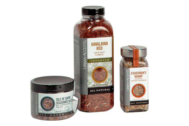
The trick is to make your label similar enough to the competition that customers know what your product is, and different enough that it stands out.
Food packaging designer Clay Towne illustrates this paradox using pasta sauce. Almost all spaghetti sauce labels have a rustic look, relying heavily on yellow and red tones. By making your label almost entirely white, using the red-yellow palette as an accent, your product will be easily recognizable as pasta sauce while still standing out in contrast to other brands.
Understand your audience
If you understand your audience, you’ll be better equipped to tailor your label’s message and design to their needs and preferences. As label designer Hernán Braberman said in an article on M_use, “Labels tell a story. Everyone loves a story. But everyone loves a different kind of story.”
If your product is a snack for children, your label will look vastly different than a snack for high-income women with refined tastes. Or, at least, it should.
There are plenty of resources that break down packaging preferences by age, gender and income. To get started, check out the “What Consumers Want to Buy and Why” report from Mintel. It details how consumers of different demographics react to the packaging of a wide range of food products.
Make every design choice in context
Now that you understand your brand, your competition and your audience, use them as your North Star. Evaluate your label design by asking three questions:
- Does this design align with my brand and its story?
- Will this label be recognizable within its category while still standing out?
- Would it appeal to the person who will be buying my product?
Within the frame of these three questions, there are a million “right” ways to design your label. There are some non-negotiables that you have to include on your label — your product name, FDA-compliant nutrition facts panel, allergy warnings, etc. Almost everything else is a stylistic choice you get to make to better represent your brand, differentiate your product and appeal to your customer.
Tactical resources to look at before designing your label

Novels could be written about design best practices and trends — so we can’t cover them all within the scope of this article. But we can give you a list of valuable resources to check out before designing your label.
- Packaging design resources from industry professional Clay Towne
For a quick-hit list of all the information you need to include on your food label, check out this article. Or for a primer on label design best practices like visual hierarchy and flow, look at his packaging design tutorial. - Data-driven insights about label design
This report from Avery Dennison looks at real consumer reactions to label design choices like font, material and texture. - A shorthand guide to the new FDA labeling rules
Although not technically a “design” resource, this guide to the new FDA labeling rules will aid you as you aim to design a compliant label. The compliance deadline for food producers with less than $10 million is on the horizon — January 1, 2021.- Inspiration and advice from label design professionals
Check out M_use for innovative label designs from the world’s leading professionals, and hear how they approach label design. You can also browse different label material options, and get ideas for your own product label.
- Inspiration and advice from label design professionals
- The product labeling guide for small businesses
SMBs don’t have a packaging design team to take care of labeling for their brand. This guide helps business owners simplify this complex process, offering pre-printing checklists, regulation reference sheets and material selection information. - Check out the top design trends in 2019
As with fashion, design trends go in and out of vogue. Packaging Strategies gathered all of the design styles that are “in” in 2019 in this article.
The bottom line is that there are a million ways to customize your label. The stylistic label design choices you make must serve to authentically communicate your brand and your differentiators, so your packaging stands out on a shelf of similar products.


