There was a time when a company could happily tick the ‘online presence’ box when its website went live. Not so any longer.
The online landscape is changing so fast, constantly iterating, that it’s no longer sufficient to have a ‘website’, you have to have the right website to market yourself effectively. Websites with slow Flash intros for example are out-dated. It’s not just about fashion – it’s about speed and attention span. Google added site speed to search rankings last year in a response to searchers who aren’t prepared to hang about waiting for pages to load.
Iterate or Die
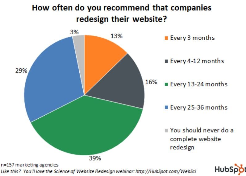
Research from
Giving users what they want and cutting down the number of clicks is driving website change.
Users want to be social and this has been a major factor in the evolution of website design. Sharing functionality is important, as is the integration of social networks. The Facebook Like Box was introduced recently allowing website visitors to ‘Like’ a Facebook Page in a 1-click step, without having to leave the website.
Twitter has recently followed suit with its ‘Follow Me’ button. This allows a website visitor to ‘follow’ the website’s Twitter feed in a 1-click process, without having to leave the website and go to the Twitter platform.
Google has now entered the social space with its +1 button. Working in a similar way to the Facebook Like button, a visitor can +1 the content of a page and this recommendation will influence the search results of people in his network. This may have future implications for social SEO.
The 3-click rule applies: you should never be more than 3 clicks from the home page. The idea is to facilitate visitors and let them do what they want to do as quickly and easily as possible.
Time Travel on the Internet
It’s interesting to take a trip back in time to put some historical context on the online environment. The Guardian is now one of the best sites on the web and has been heavily invested in over the years. But look at it back in 1997:
It seems a little, well, primitive.
Now look at it:
Let’s take a look at the features:
- Navigation: The navigation bar along the top allows visitors find what they want in the quickest way possible. You can see that the tabs on the Amazon site have a similar navigation. And you may be sure that the Amazon site has been user-tested to within an inch of its life!
- And if it’s not clear from that, you can search with the Search Box.
- The site is interactive – you can see the number of comments the news stories have.
- It’s got an RSS feed, which lets people access the content the way they want.
- It’s visual engaging.
- It’s got usability built, in allowing larger text at the click of a button.
- It’s got a mobile site.
- The content is up to date (updated 1 minute ago).
If you’d like to do some Internet time travel of your own check out the Wayback Machine.
Now, what was that DOS command to bookmark something..


