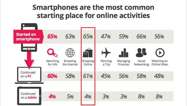
It’s easy to sell your product on a mobile app. Yes. You read it right. It’s easy. In fact, smartphones are the most common starting place for online shopping. Check this image.
Image Credit: ConversionXL
So, can you avoid this problem and improve your product sell? Definitely. You have a big opportunity here. But, how? How can you improve your app design?
Take account of these 5 design factors before developing your eCommerce app. They can dramatically increase your conversion rate. Let’s discuss these factors one by one.
#1. Clear Product Image
Are you likely to buy any product from blurred and vague images? No. Because that’s the first impression. So, make sure to grab the user’s attention with clear product images. Don’t miss your first chance to impress your customer.
Do you know what kind of images attract more users and convince them to buy? Most selling retailers know the importance of images. And use them to leverage more customers.
Here is the list.
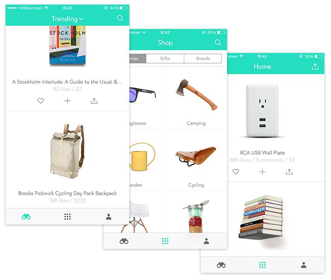
a. White Background
See the below image. Isn’t it beautiful and clutterless? What do you think? Can you represent your product with the same elegance?
Why not? You can. But, make sure it’s responsive and zoomable.

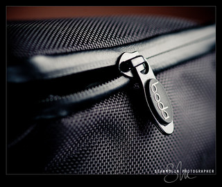
b. Detailed Shot
“God is in the detail”
Sean Molin captured this image for his ‘Boda V3 Lens Bag’. Does your product have images with this delicacy?
Try it.You can observe and feel the detailed features like the material and its quality.
Can you deliver the same feeling to your product?
c. 360° shot
We feel, and sense the product when we are buying it in the real world. But, what about in the virtual world?
Can you deliver the same experience in the virtual world? Yes. You can let your users sense the product with the 360° shot.

d. In-use
Image in-use persuade more users than the product image itself. Show your product in use. This shot can be the motivation to purchase decision.
Now, you have a clear idea of images, images that can entice your audience. Let’s move on to the 2nd point.
#2. Typography
Typography conveys the feelings. It automatically drives users to read your product copy. So, make sure it is clear, simple, and easy to read.
Let’s play a quick game. See the following image and tell me, which copy is easy to read. Left? or Right?
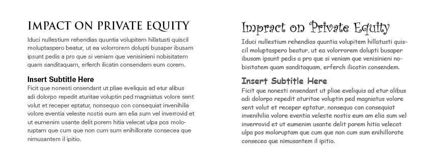
Undoubtedly, the copy on the left side. Right? Yes, because it makes sense, and it’s easier to read than the copy on the right side.
So, what are the elements of good typography? The basic elements of any typography are alignment, responsiveness, and background color.
Let’s go through a brief description of these.
a. Alignment
Alignment makes your product copy unified and focused. Make sure your copy follows the left (in the most cases) or right alignment as it gives an edge for your readers.
b. Responsive
Can you deliver the same typography across all the devices?
Well, it’s hard. But, Sara wrote a profound post on different techniques you can use to make your typography responsive. You can try any of these techniques.

c. Background color
Preferably, use black fonts on a white background. Dr. Lauren F. V. Scharff researched on the website readability with various foreground/background color combinations at Austin State University. She found that black on white has the highest readability.
Before moving ahead to the 3rd factor, let me suggest you write down the previous factors so you can quickly refer to it at any time.
#3. White Space
White space (or negative space) is an essential but most neglected part of the designing process.
It makes your copy:-
- Minimal
- Usable
- Readable
- Sophisticated, and
- Gives your visitors a break
What will you need before using this white space?
First, get a clear objective of your app design.
Second:-
- Guide your visitors through your app
- Help them where to focus, and
- Show them your product clearly
If you are wondering where to use this white space, you can use it:-
- Around your product image
- Margins, paddings, and gutters, and
- Line-spacing and letter-spacing within text content
See this image.
Can you see where they used the white space? They used it smartly. The main benefit of using this white space is soothing the whole buying experience.
#4. Copywriting
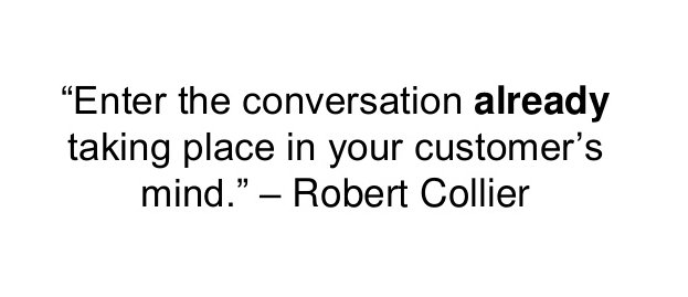
And, your product copy is a medium to enter into the conversation. Make sure the conversation already taking place in your customer’s mind is uninterrupted. Use action-based accurate words. For example, ‘Pay $0.25 Now’ is more precise and meaningful than ‘Pay’. It incentivizes your customer with what exactly would be the next step.
Your product copy must:-
- Aim to the definite audience
- Be benefit or action based
- Appeal to the user’s imagination
- Be scannable and easy to understand
- Seduce with emotional words
Now, imagine you convinced your customer to buy your product. And, they reached the check-out form. But, they don’t buy. Frustrated, you can’t figure out the exact reason behind it. That’s the last and most important factor for any e-Commerce app design. Optimizing a check-out form.
#5. Checkout Forms – Let’s make it simple
The checkout form is the last stage of conversion. Don’t let your customers get stuck. Check these common features of top converting check-out forms.
a. Easy form filling
People hate forms. Make it painless by removing all the unnecessary fields. Don’t ask for information you really don’t need.
b. Don’t force to register
Don’t force your users to register. Allow them to check out as a guest. A company increased their revenue up to $300 million by making the ‘Register’ option non-mandatory.
c. Progress Indicator
Show your customers where they are and what else needs to be done to finish the purchase. This feature soothes a customer’s anxiety.
d. Trust factor (security reassurance)
Provide as many security reassurances as possible. Use SSL certificate or iconology.
e. Use third party applications
Allowing users to pay through trusted third party applications like Google Wallet, PayPal, and Amazon saves customer’s time. This will automatically import the customer’s data and make the whole process simple.
We went through all the design factors that can boost your mobile app conversion.
Let’s summarize this article.
- Use clear product images – White Background, Detailed Shot, 360° shot, In-use
- Typography – Alignment, Responsive, Background color
- White Space
- Copywriting – Use the words people use
- Make your check-out forms simple
Have you tried any of these factors before? How was your experience with it?
Did I miss any important factors? Write it in the comments and let’s discuss.
Images: ” Author’s Own“
____________________________________________________________________________
Tweak Your Biz is a thought leader global publication and online business community. Today, it is part of the Small Biz Trends stable of websites and receives over 300,000 unique views per month. Would you like to write for us?
An outstanding title can increase tweets, Facebook Likes, and visitor traffic by 50% or more. Generate great titles for your articles and blog posts with the Tweak Your Biz Title Generator.
- 5 Ways to Increase Productivity in the Workplace
- How To Boost Your Business’ Customer Service Productivity: Tips and Tools
- Benefits of Artificial Intelligence for Schools
- How to Host a Successful Networking Event
- How We Grew A B2B Blog Into A Business With 100,000+ Unique Visitors Per Month
- Coaching As Part Of The Training Process