If you have decided that you want to start selling online, the first thing you need to do is figure out what you are going to sell, and then choose your platform. Then, you need to choose a design, which can often be a difficult thing to do. This design is going to be what identifies your online store, so you need something that is going to attract people from a wide variety of sources.
It can take a lot of time and effort to come up with just the right design for your online store. You need to figure out what is going to really work for your site, and not just what looks good for online sales.
Compatibility
Your design should be compatible for all types of devices and screen sizes. These days, more and more people are using their mobile devices instead of home computers, so you need to make sure that they can easily see everything on your website no matter what devices they are using. You could be missing out on a lot of sales because your website doesn’t work on certain types of devices. For instance, if your images don’t fit onto smaller screens, no one is going to be able to see what you have to offer.
Review Sites
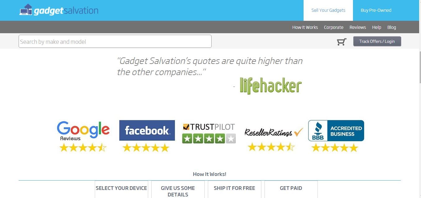
You can do what Gadget Salvation has done, and add links to review sites about your site where your logo can be seen. For example, you can add links to Google Reviews, TrustPilot, Facebook reviews, SiteJabber and ResellerRatings.
The design of your website should be one that is easy for users to navigate. If they can’t navigate quickly and easily, they are simply going to move on to the next online store, and you are going to lose out on sales. Your landing pages should offer an easy way for customers to get to your website, and then they should be able to easily find whatever they are looking for without becoming frustrated and leaving.
Search Features
In addition to easy navigation, your website needs to have great search and navigation features. One of the things that users always look for is a search box. That lets them type in exactly what they are looking for, and they don’t have to navigate through the entire site to find it. You will also need to add certain filters which will also help users narrow down their searches and make searching even faster and easier.
Fast Loading
People are in a hurry, and if it takes more than a couple of seconds for your site to load, they are just going to check out another site. So, even if you have the greatest looking site on the Internet, it won’t matter, because people aren’t going to wait for it to load. Your bounce rate is going to go up (people bouncing away from your site to other sites), and your conversion rate is going to go down.
Great Images
These days, many sites are using images that pretty much fill screens. They are quality images that don’t lose resolution when viewed on larger screens, and they automatically draw attention to a call of action. In addition to a couple of these large images on your website, you also need to have images throughout the site. These images are going to direct people to certain pages, show off what you are selling, etc. Don’t limit yourself to only using images to sell a product on specific pages. Have the images throughout your site to keep reminding people about the products.
Branding Match
Make sure that your website design actually matches your goals for your online business. It should also match the industry and your company branding. If you are not designing the site yourself, take your time in choosing a designer to make sure that you find one who is the absolute best fit for your business. For instance, if you are selling photography equipment, your site should match that industry and be photography related.
Shopping Cart
Your shopping cart should be easy for customers to use. They don’t want to waste their time on a cart that isn’t simple. The shopping cart should be as great as the rest of your website. Indochino has a great example of shopping cart. Think of a real shopping situation. You probably get frustrated when there are problems at the checkout. It is the same when people are shopping online. The easier you make things for users, the more likely they will be to come back.

Secure Sockets Layer (SSL)
With so many people losing money due to identity theft and fraud, it is more important than ever to ensure that customers can safely shop on your website without having to worry about having their information being misused in any way. While they can still have issues with their own computers, you can make sure that you have an SSL Certificate, which will encrypt data from users and make sure that no one else has access to that data. How will users know that your site is secure? If your web address contains “HTTPS” rather than “HTTP”, it means that yours is indeed a secure site.
Ways to Save Money
Everyone wants to get great deals and save money, no matter what they are buying. Whether they are shopping online or at brick and mortar stores, most people are going to shop where they can get the best deals. This means that you have to offer them great savings. You can do this in the way of sales, discounts, offering freebies, etc. The more customers can feel like they are getting a deal, the more sales you are going to get.
Call to Action
You need to have a call to action that is going to prompt users to visit your website and make purchases. The purpose of a call to action is threefold: to make sales; to inform customers about products, deals, etc.; and to gather information about your users so you can make sure that they see the things that they are going to be interested in.
Images “Author’s Own“
________________________________________________________________________________
Tweak Your Biz is a thought leader global publication and online business community. Today, it is part of the Small Biz Trends stable of websites and receives over 300,000 unique views per month. Would you like to write for us?
An outstanding title can increase tweets, Facebook Likes, and visitor traffic by 50% or more. Generate great titles for your articles and blog posts with the Tweak Your Biz Title Generator.


