We’ve all encountered this at work: we have an amazing idea we want to pitch to our bosses, but they only have that one half-hour in their schedule to accommodate us. Perhaps you’re assigned to do a presentation on something about work, and you’re short on time to discuss a ton of the things that were assigned to you. The point remains the same – we really don’t have enough time to do a long presentation, and we want our work to be impressive. Is there a way to make this possible?
Turns out, there is! You can take your otherwise long presentation and tweak it with some of the best hacks other presenters use to make even the most boring presentations something to admire. In this article, we’ll explore some of these quick hacks you can do as soon as you finish reading this piece!
Get Details Straight to the Point
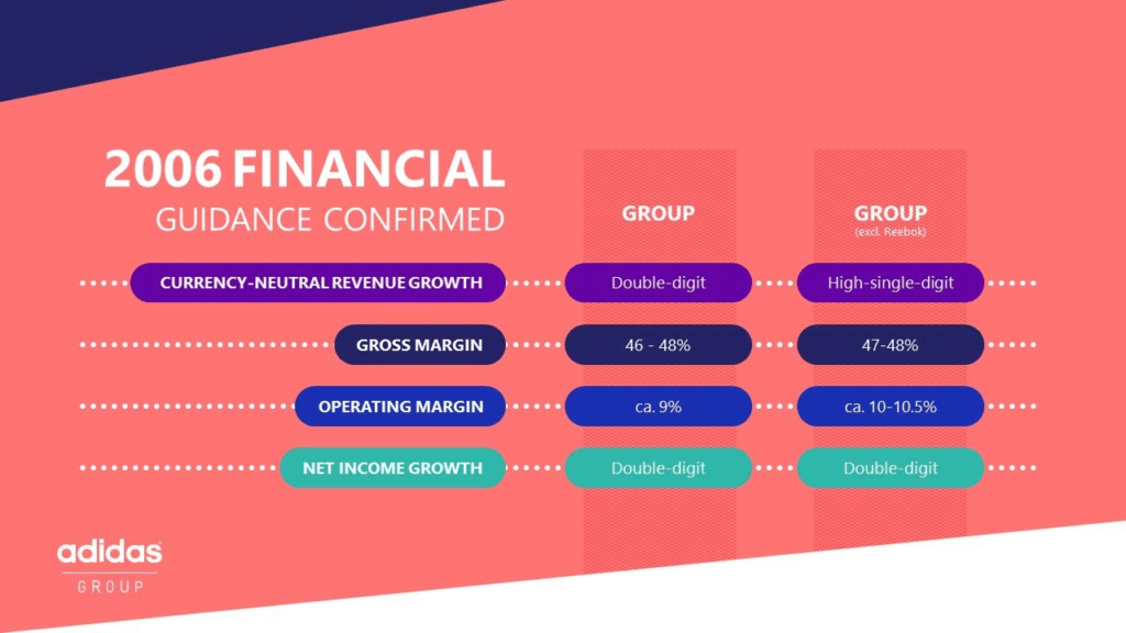
Regardless of your presentation, you’re likely going to present relevant data to your colleagues and bosses. If we want to be “complete,” the tendency here is for you to include everything in your presentation. This shouldn’t be the case – you should only include a one to two-sentence summary of the data you want to present. You then have to expound on everything else that you present after you share them. Designers also follow this principle, as 47-percent of presentation makers prioritize the simplification of difficult concepts for better delivery. Here are some tips, based on the sample Adidas slideshow above:

Choose the Information You Want to Present
As a global sports company, Adidas will most likely want to present the most data to audiences in a single slide. They know this can be overwhelming, so they instead indicated only the most important data across all their slides.
- The goal here is to pick data that will give readers a basic gist of what you’re presenting. Adidas presenters will then explain the idea in detail.
- In the above example, the assumption here is that Adidas presenters should be explaining each point in detail as readers see them.
Elements in Your Slide Should Be Related to Each Other
In order to keep your slides cohesive, all elements you place there should be related to each other and the topic in question.
- In the above example, Adidas showed its three core values and showed how each of its brands relates to these traits.
- The key here is to look at your slides from a readers’ point of view – if you can interpret what the data should generally say, then you’re doing it properly. In our case, the fact that we’re not from Adidas but was able to make the analysis above means Adidas has done the presentation correctly.
Captivating Visuals Can Grab Attention
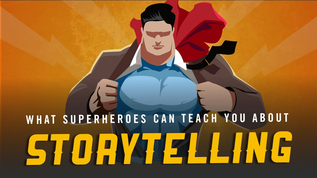
If you want to make presentations that impress, try to present your slides in a way that can entertain and appeal to viewers visually. This not only avoids people sleeping in on your talk, but this can also help “embed” ideas into their memory because of the visuals you presented. In fact, 84.3-percent of presenters are visually-oriented in their slideshows. In the above slideshow, HighSpark shows storytelling lessons from superhero stories. Here’s how they applied visuals into this presentation:
Get Thematic With Your Slides
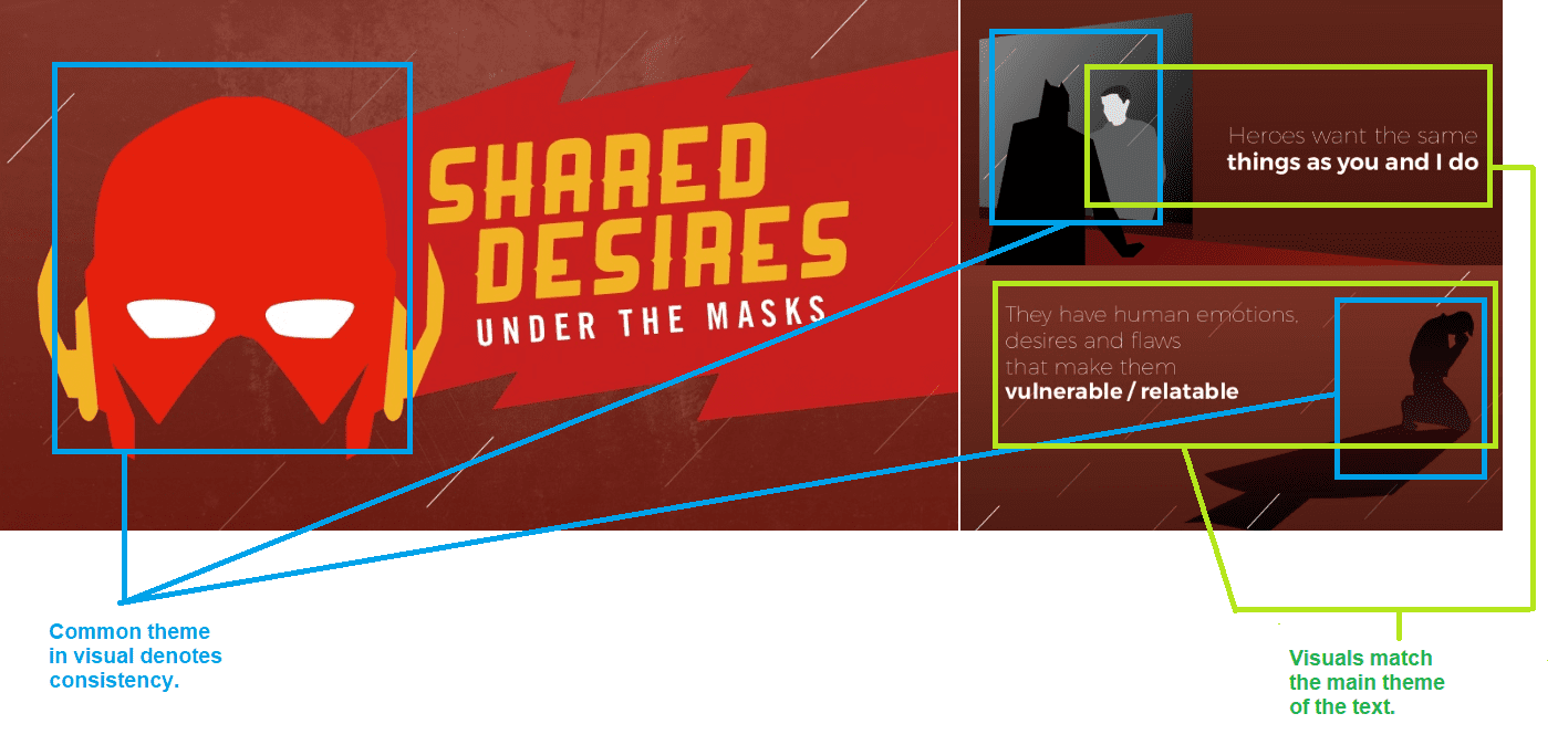
If you want your slides to be captivating to readers, you can share slides with ideas in a visually-appealing manner. In the above example, the presentation takes a superhero-inspired approach to its presentation, and this is something that prevails throughout the presentation.
-
-
- In the above presentation, the theme of superheroes has been made apparent throughout the slideshow. This gives the presentation a sense of cohesion and can keep the reader’s attention to the common theme. If you’re having trouble with what visuals to use for your presentation, consider getting free PowerPoint templates for your slideshow.
- The minimalist approach to visuals in the above presentation can be captivating and visually appealing to users. While the slideshow has some images lifted from films and comic book panels, these are only presented for non-essential information. The usage of minimalist visuals for the most important points of the slideshow helped readers associate essential points to the unique visuals.
-
Make Sure Your Visuals Match the Text You’re Using
It’s not just important to use great visuals for your presentation. You need to make sure your visuals match the text you’re using.
- In the above example, the visuals thematically present the points being shown. Batman facing Bruce Wayne in the mirror visually tells “Heroes want the same things as you and I do,” while Batman’s shadow over a grieving Bruce Wayne also shares, “They have human emotions, desires, and flaws that make them vulnerable/relatable.”
- When you include texts with matching visuals, make sure the text accurately represents the visuals you’re presenting and vice versa. If possible, try to make the visuals “subtly” expand on your points as well. For instance, people familiar with Batman as a superhero can somehow understand that the above points share that Batman is just as human as everyone.

Present to Inform, Entertain: Your Talk is Half the Battle
Just because we’re sharing presentation quick hacks doesn’t mean we should solely focus on what we’re showing to audiences. While it’s true that we should “show, don’t tell,” what we say in line with our presentations also matters for people who are listening. Your amazing visuals and compelling points should be matched with an equally-impressive talk from your end as a speaker. Here are some tips:
Get Yourself Cue Cards That Help Expound on Relevant Information
Another helpful way for you to take note of points in your presentation is to use cue cards.
- These can be in the form of small index cards you can hold during the presentation that can hold relevant information about your current slides.
- These may also have supplementary data you can’t put in the presentation.
Present as Though You’re Talking as an Authority
When you make your presentation, remember that it’s yours. This means you know your presentation best, and it should reflect in the way you’ve organized your slides and your speech.
- When you organize your presentation, do it in a way that you’ll be able to talk about it without even needing cue cards.
- This means thinking about your presentation in the most “logical” progression that makes sense to your preferences, and how you think it can be best presented to viewers.
Practice With Yourself, and With Some Friends
A great way to practice for your upcoming presentation is to do it with yourself in front of the mirror, or even with some friends you trust.
- If your presentation has sensitive information, try to practice with some coworkers that can know the information you’re presenting.
- The target here is for you to identify which parts of the presentation you’re having trouble with in terms of presentation, and which parts your friends may find difficult to understand. This will help you tweak your presentation to best fit your audience.
Presentation Hacks: Impress Your Bosses in No Time!
With our quick hacks above, you should always remember that great presentations show and not tell. The challenge on your end is to apply our quick hacks above to make sure you get to show the best parts of your presentation, with your explanation doing the rest. The best presentations aren’t simply about great graphics and great layouts, but they also have to do with the way you articulate yourself to your bosses.
business presentation -DepositPhotos


