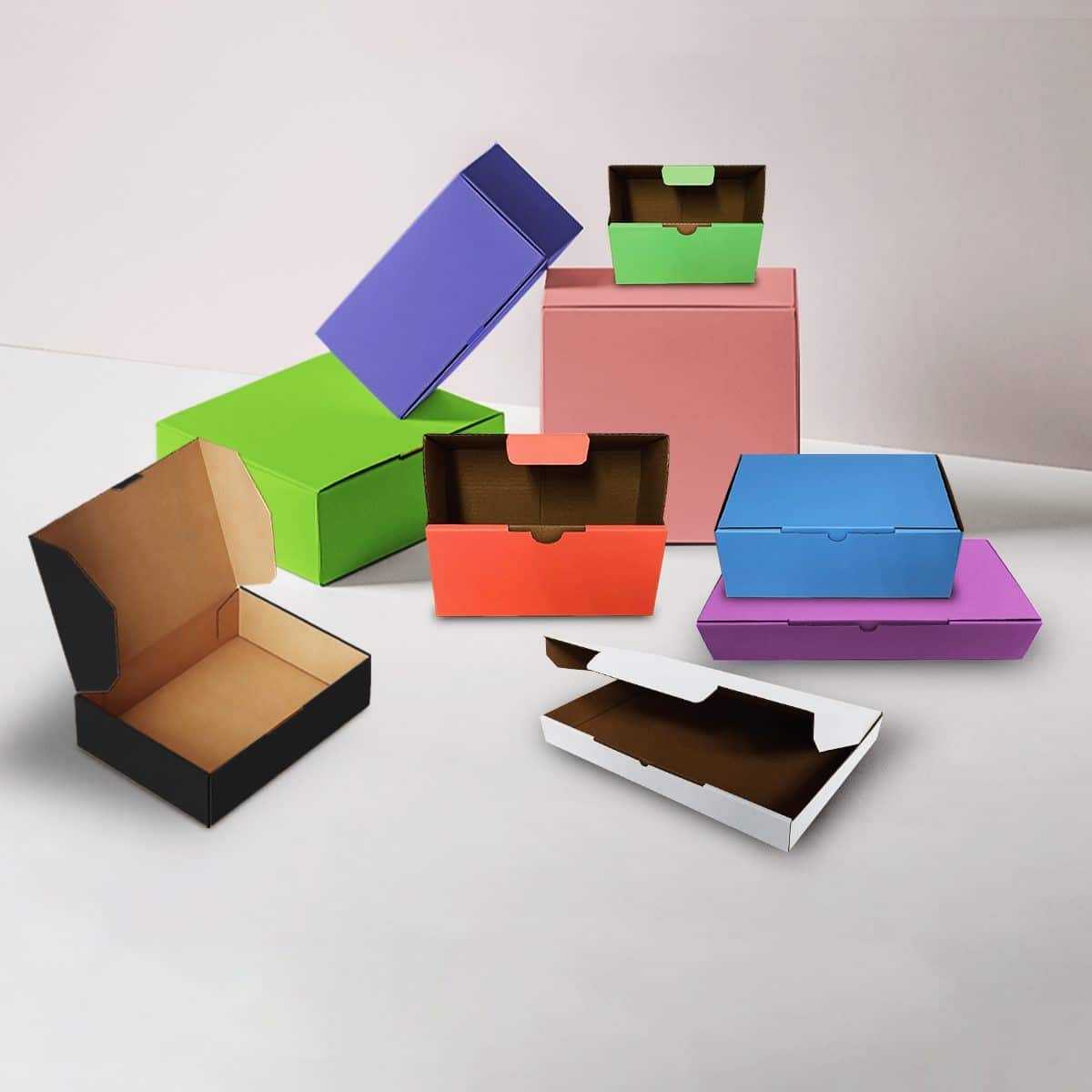
In the dynamic world of marketing, where visual appeal plays a pivotal role, packaging has emerged as a powerful tool to capture consumer attention. Beyond protecting the product, packaging serves as a visual representation of a brand’s identity. One crucial aspect that often gets overlooked is the color palette chosen for packaging. In this article, we delve into the art and science of matching colors to your brand identity, exploring the impact it can have on consumer perception, and how you can leverage it to create a lasting impression.
The Psychology of Colors in Packaging:
Colors evoke emotions and influence perceptions, making them a critical component in packaging design. Understanding the psychology behind colors can help you strategically choose hues that align with your brand identity.
- Red: Often associated with passion, energy, and urgency, red is a bold choice. It can stimulate appetite, making it a popular pick for food packaging. Brands like Coca-Cola and Red Bull leverage the power of red to create a sense of excitement.
- Blue: Trust, dependability, and calmness are emotions linked with blue. Many tech and healthcare brands use blue to convey reliability. Think of IBM and Pfizer – their blue packaging exudes professionalism and trustworthiness.
- Green: Linked to nature and health, green is a go-to for organic and sustainable products. Brands like Whole Foods and Starbucks utilize green to emphasize their commitment to the environment.
- Yellow: Associated with positivity and energy, yellow grabs attention. It’s often used for products targeting a youthful audience. Think of brands like McDonald’s and Best Buy – their yellow packaging exudes vibrancy.
- Black: Elegance, sophistication, and luxury – black is a timeless choice. High-end products, from luxury chocolates to smartphones, often choose black to communicate exclusivity.
- White: Symbolizing purity and simplicity, white packaging conveys cleanliness and modernity. Apple’s iconic white boxes, for example, epitomize a minimalist and premium aesthetic.
Choosing the Right Colors for Your Brand:
Selecting a color palette for your packaging involves more than personal preference. It requires a deep understanding of your target audience, brand values, and the emotions you want to evoke. Here’s a step-by-step guide:
Know Your Audience:
- Identify your target demographic – age, gender, interests.
- Research color preferences within your audience. Conduct surveys or analyze market trends.
Define Your Brand Personality:
- List key attributes that define your brand – is it playful, sophisticated, or eco-friendly?
- Match these attributes with suitable colors. For example, a playful brand might opt for vibrant hues.
Consider Cultural Context:
- Understand the cultural connotations of colors. Red may symbolize luck in one culture but signify danger in another.
Competitor Analysis:
- Analyze the color palettes of your competitors. Stand out by choosing colors that differentiate your brand.
Test and Iterate:
- Create prototypes or mock-ups to visualize how colors interact.
- Gather feedback from focus groups or conduct A/B testing to refine your choices.
Customizing Your Packaging:
Now that you’ve identified the right colors, it’s time to customize your packaging. With a plethora of packaging options available, you can make your brand stand out by choosing the perfect box. Customization options include:
Box Type:
- Choose from various box styles – from standard cardboard boxes to specialty designs.
- Consider the functionality – does your product require a sturdy box for protection, or is a visually appealing design more important?
Size Matters:
- Optimize the size of your packaging to reduce waste and shipping costs.
- Ensure the box accommodates the product securely, preventing damage during transit.
Print and Finish:
- Incorporate your brand colors into the box design.
- Explore finishes like matte or gloss to enhance visual appeal.
Branded Packaging Tape:
- Extend your brand to the tape sealing your packages. Custom printed tape reinforces brand recognition.
The Importance of Consistency:
Consistency across all touchpoints reinforces brand recognition. Ensure your packaging aligns with other branding elements, such as your logo and marketing materials. Consistency builds trust and makes your brand memorable.
Logo Placement:
- Strategically place your logo on the packaging. It should be easily visible and harmonize with the overall design.
Typography:
- Use consistent fonts across all branding materials, including packaging. This ensures a cohesive and professional look.
Imagery:
- If you incorporate images or illustrations, maintain a consistent style that reflects your brand personality.
Conclusion:
Packaging is a visual ambassador for your brand, and the colors you choose play a crucial role in shaping consumer perceptions. By understanding the psychology of colors, considering your audience, and customizing your packaging thoughtfully, you can create a visually striking and cohesive brand identity. Remember, the packaging palette you choose is not just a visual element – it’s a silent communicator that speaks volumes about your brand. With a vast array of packaging options available, the possibilities are endless.


