The ultimate goal of any email is to provoke a response, be it a subscription confirmation or a website visit. All elements – subject line, copy, incentives, custom images – serve this purpose one way or another, but a CTA (call to action) is what gets the job done in the final count.
The concept of email marketing has broadened a lot over the past 10 years, and so did the design of a CTA. You can come across different formats, like symbols, icons, etc. but most businesses stick to the button type, and that’s probably the best option as for today. Customers got used to a particular communication pattern, and expect to see familiar elements. When they see a button, they know how to act, and what would follow.
The similar format, however, doesn’t mean similar functionality. A CTA is a great multitasker than can stimulate different types of conversions.

Purposes of a CTA
Shop Now isn’t the only text to be found on a CTA. Apart from direct encouragement of purchases, a calling button in the email can ask to perform many other actions:
- subscribe or confirm subscription;
- register;
- buy a product or complete any other activity;
- read information (blog, support guidelines, privacy policy updates, etc.);
- forward a friend;
- take a survey;
- share on social media;
- participate in any event or activity (charity, challenge, contest, etc).
Surely, this isn’t a final list. Each business sends emails based on its own goals, and the CTA text must be composed in accordance with them.
Types of CTA
There are volumes of guidelines written on the effective email CTA design, but the main idea still comes down to this: it should encourage people to act. And the color, text, and font that would work for your particular business can be determined during split testing only.
However, in terms of general definition, email CTAs are typically divided into standard and custom.
Standard CTAs contain text than can be applicable to almost any message type and context. For example:
- Sign In;
- Subscribe;
- Register Now;
- Get Started;
- Shop Now;
- Buy Now;
- Learn More.
Custom CTAs are buttons tailored to a particular campaign, that would hardly resonate with any other message.
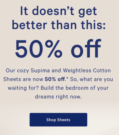
For example, this email by Casper promotes one product only – sheets, and so they’ve created a more targeted CTA. It looks organically in this campaign, but it would look out of place in, let’s say, a towel promo.
Another example is a Christmas campaign by Terrain. Instead of a more standard Buy/Shop Now, they’ve opted for a more specific Shop Cook’s Gifts, indicating the category of the potential gift receivers.

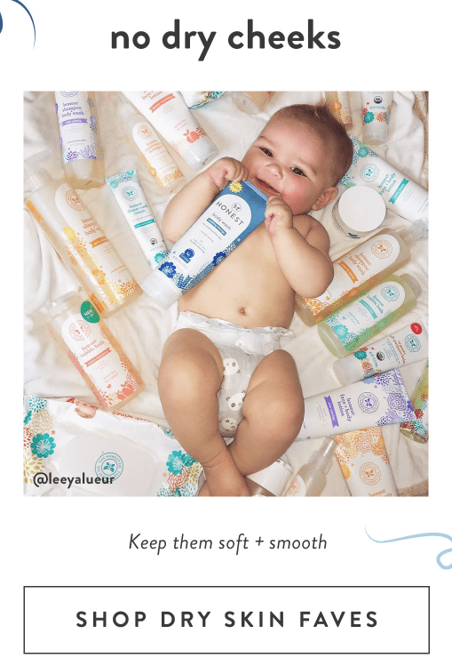
Honest came up with a Shop Dry Skin Faves button to advertise their nourishing skin products, and again it resonates with the message and forwards to a particular product category.
You can combine standard and custom CTAs in one email if you have multiple options or different types of information. You can also test text length, but try to stick to 4, maximum 5 words: they’re more than enough to prompt a click.
Number of CTAs
How many calls to action buttons – one or multiple – there should be per one email is determined by many factors: email type and purpose, copy length, and variety of offers.
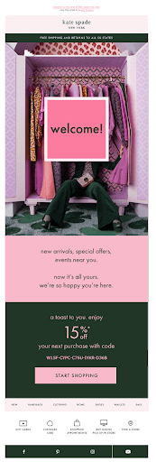
For a welcome email, when you only greet a new member on board, one CTA is more than enough. Yes, people have subscribed to your campaigns, but you yet have to win their trust with quality services and products, so don’t be too pushy. The same applies to thank you emails, requests for feedback or shipment confirmations. Sometimes, the less the better.
When you’re ready to introduce your team members and tell the company’s story, it’s time to include some more buttons to let people explore more.
Holiday gifts guides, new arrivals, recommended picks, and promo emails are the place where you’re welcome to provide 3 and more CTAs. Sales campaigns are often long and information-rich, so the appropriate CTA improves the overall navigation. People can skip the unnecessary info and go straight to the category they are interested in the most.
CTA Placement
Where to put is the question that usually follows How many to put, and the available options are – top, middle, or bottom.
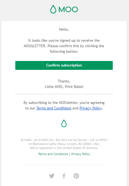
As well as with the number, the CTA location is greatly determined by the email type and purpose. In a single-purpose email, for example, a subscription confirmation, registration, or feedback request, it’s better to put a CTA on top, so that people can easily spot it, and perform the necessary action.
If you introduce new products, services or app updates, you first need to explain why they’re worth buying, so a bit of information or images is required first. before asking people to buy, tell about the materials or new technologies, specify what challenges your solution would help solve, or introduce a new loyalty program that would provide discounts for all new goods.
People are more eager to commit, knowing what they’d get. So, first explain what you sell, enumerate the advantages of the product, whom it may fit and why; next, include a CTA prompting to take advantage of it.
What Makes a Perfect CTA
To come up with a CTA that would generate conversions, first decide what you want to accomplish with your email. A Sign-Up Here button stuck after each paragraph won’t gain you much following. The call should resonate with the overall message and email design. You probably have a communication pattern your subscribers have got used to, so try to follow it. If you use casual and humorous language in the copy, why not apply it to the CTA? If your brand is more about good old classic and traditions, stick to them and don’t chase after the so-called trends.
Be smart with the quantity. For short transactional emails, one CTA, if any, would be enough. Don’t be too intrusive or extra persuasive, putting Shop Now in every message. To each his own. People know you sell things, and they would buy from you, but only if you act smart, and don’t harass their Inboxes with one-type messages.
If you launch regular automated workflows, start running A/B testing to see what text, position, and number work the best for your business. Solutions that help succeed others may fail for you. Don’t look for a single recipe, as there is none.
Well, actually there is one. Each time you compose whatever email, ask yourself not as a marketer but as a customer: Would I personally click this CTA? If the answer is yes, high five – your mission is completed.

