In every industry, customers have expectations for the quality of service, the types of products you should deliver and even how you engage them with your brand. Meeting those high standards isn’t always easy, but doing so creates customer loyalty and helps you retain the clients you already have.
The State of the Connected Customer Report surveyed 6,700 consumers and business buyers to find out what their expectations were for brands. Researchers found 76% of consumers expect businesses to already know and understand their needs.
When it comes to website design and user interface (UI), people have very specific thoughts. Your goal is to match and then exceed what they think might happen. Here are some key factors to look at when determining how well your pages meet your customers’ expectations.
1. Study Your Competition
If you want to meet and then exceed high expectations, you must know what the competition’s website is like. There is a reason all e-commerce stores have similar features. While it’s great to think outside the box, don’t get so far away from the norm that customers aren’t even sure how to navigate your site.
Stay away from trendy design fads no one else uses. They may just confuse your visitors and drive them into the arms of your competitors.

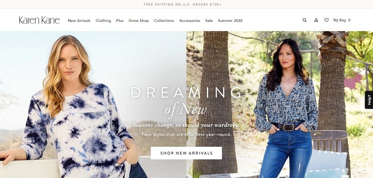
Karen Kane is an American-based clothing company for women. Like many other online clothing stores, the landing page features big, beautiful images of models wearing their clothing. People expect to see examples of how they can pair different outfits, so this works well for the busy woman who doesn’t have time to figure out which pieces go best with one another.
2. Offer Instant Customer Service
In a Microsoft survey, 95% of respondents pointed to customer service as the number one reason for doing business with a company. One way to meet consumer expectations is by offering a live chat on your site. Use artificial intelligence (AI) to collect basic information, but staff your live chat with real people who can answer more intricate questions and solve problems on the spot.
3. Speak Directly to Your Audience
Know who your target audience is and what their pain points are. Once you have an idea of the problems they face, it’s much easier to address them on your landing pages. You can guide each type of buyer to the exact spot they need and the information they most desire, saving them precious time and effort. You also show that you understand what they’re going through and that you’re there to make their lives easier.

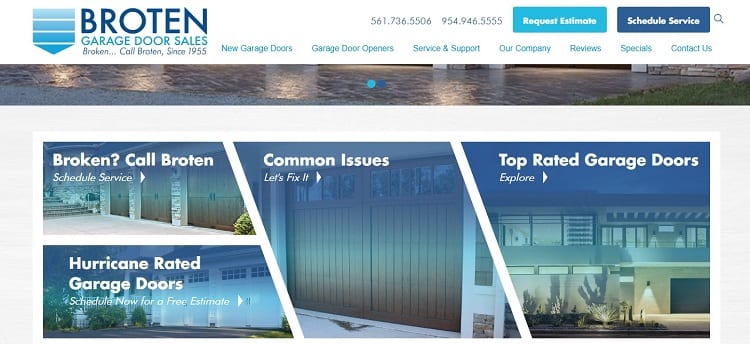
Broten Garage Door Sales breaks their calls to action (CTAs) into several categories to meet their buyers’ diverse list of needs. The client with a broken garage door is looking to schedule service, so the site takes them directly to a related page. Others might be looking for a special type of door or want to see what the best garage doors look like and do some browsing. It’s clear from the design that the company thought through the needs of their personas and presented solutions to match those expectations.
4. Use a Multi-Channel Setup
Today’s buyers expect connected journeys. They might start researching a solution to their problem on their smartphone and chat with a live agent for a few minutes. They then come to your brick-and-mortar store or make a phone call to schedule an appointment or gather additional information. It’s vital that you understand their current position in the buyer’s journey, and that they don’t have to repeat multiple steps over and over again.
Customer relationship management (CRM) software helps you keep notes on individual customers and flag where they are and if you think they’re ready to move to the next phase of the sales funnel. Train your sales representatives to recognize the signs of someone who’s prepared to buy. However, they also shouldn’t push someone into making a purchase if they’re not fully convinced.
5. Create Consistency
Use the same design and navigational hierarchy throughout your site. Once a customer becomes familiar with your layout, don’t confuse the issue. Using a website should be a nearly effortless process. The focus should be on key indicators, such as an image of a new product, descriptions or CTAs. When the user’s attention is only on the design, the site isn’t working for you.

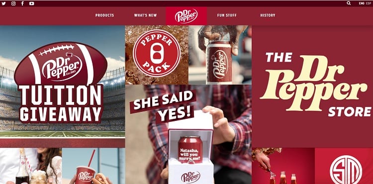
Dr. Pepper uses the same colors and design throughout their pages. If you click on the tab labeled “Fun Stuff,” the only thing that changes is the images on the page. The navigation is sticky and doesn’t blip or move as you go from page to page, creating a sense of stability. The consumer begins to predict how the site behaves and isn’t disappointed as they move through the different sections.
6. Go Mobile-First
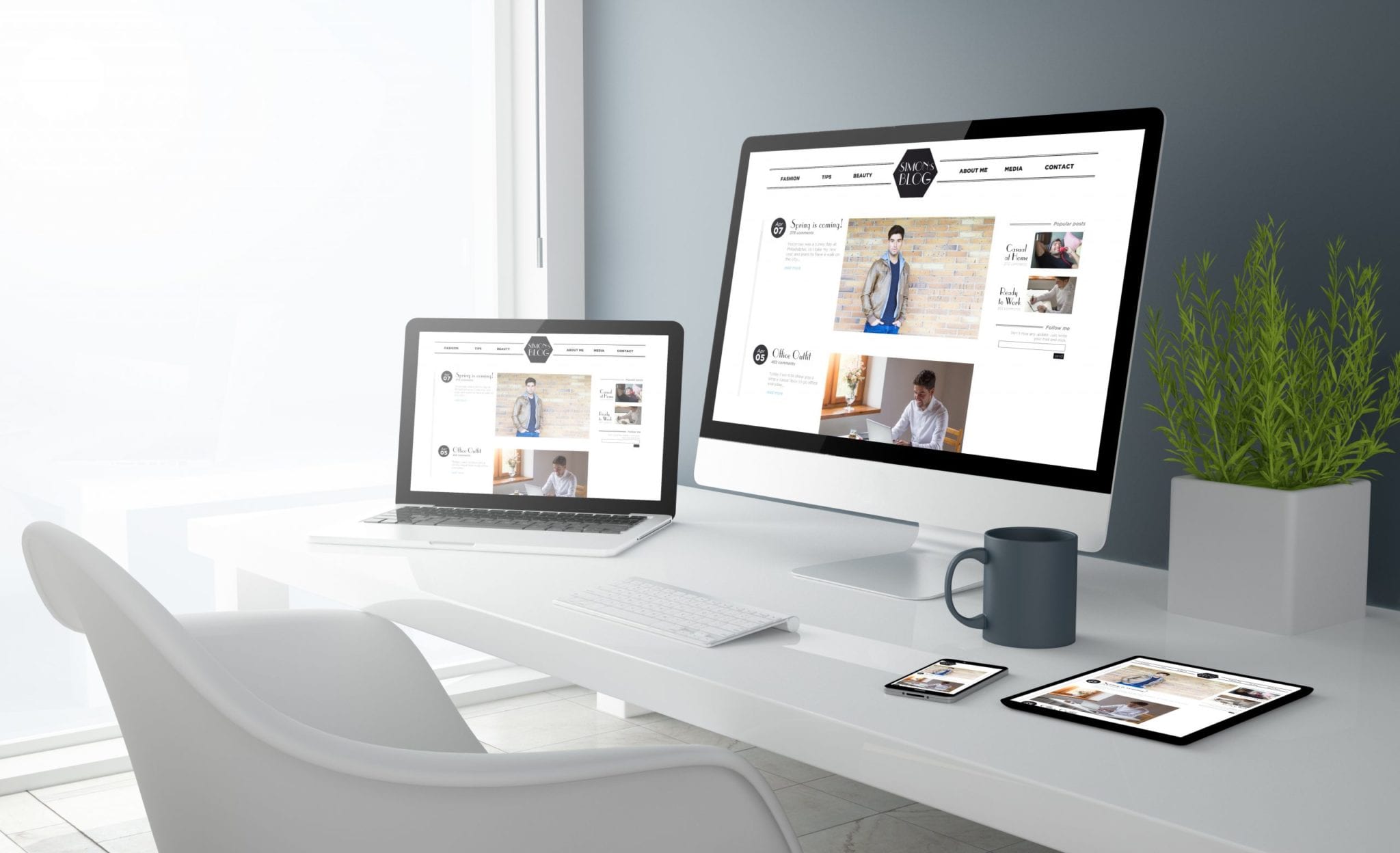
By 2025, 72.6% of people will access the internet via their phones. Consumers expect the experience of your mobile site to be equal to a desktop version. If your site isn’t responsive or is difficult to maneuver with mobile devices, you risk losing visitors. Spend time ensuring images, buttons and text are all responsive. Test everything to make sure it looks the way you expect on smaller screens.
7. Choose a Brand Style
One way to create a consistent image online and offline is by creating a brand style guide. Ensure you stick to the same colors, placement, and mood no matter where a customer encounters your name.
Exceeding the expectations of your customers is an essential piece of a customer-first brand, and now you should be even better equipped to deliver.
web design -DepositPhotos


