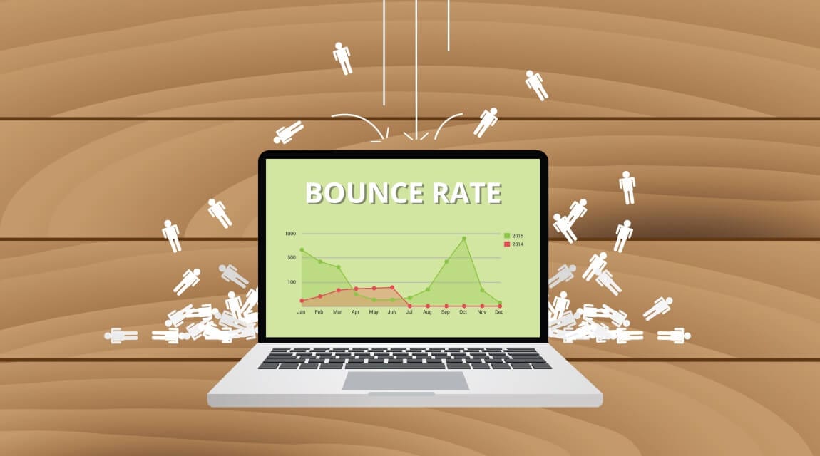
A website is only as good as the number of eyes on the page at a given time. If you’re someone who garners consistent traffic but fails to turn those visitors into customers or long-term readers, then you have an issue with the bounce rate.
What is the bounce rate? Simply put, bounce rate is the rate at which a given visitor will “bounce off” your site before converting. When it comes to building a digital marketing strategy for your brand, the bounce rate should always be considered. After all, a bad bounce rate makes all other marketing efforts totally obsolete.
Luckily, there are a number of key web design issues that tend to lead to higher bounce rates. Confusing layouts, old-school aesthetics, and even slow load times can all force people to “bounce” sooner than they may have intended. Below, we’ll address the 10 web design tips that could improve your bounce rate and lead to conversions!
Keep Your Site Free of Clutter
Cluttered sites are slow-loading sites. If you want to improve your bounce rate, you’re going to need to keep your site clutter-free. After all, we’ve all clicked off a website simply because it didn’t load fast enough. Generally speaking, your site should load within three seconds. Anything more than that will lead to a high bounce rate. How can you go about decluttering your site to increase load times? Start with the following:
- Truncate image files. Images take up lots of bandwidth. Optimize image sizes for faster load times.
- Get rid of any unnecessary plugins. Every time someone visits your website, it will have to load every single plugin. Too many plugins will slow down your load speed.
- Minify your website’s code by removing all unnecessary characters.
- Go with a quality web host, you will get what you pay for.
Use Visual Hierarchy Methods
If you want to improve your website design, you’re going to need to use visual hierarchy methods. This means making sure that the most important features of your website should be the most eye-catching. Use bold fonts, large text sizes, and bright colors to create a visual hierarchy. Utilize clear visual cues to show what is important and what is not on your site.
We live in a social society dead-set on sharing anything and everything. Your website should include social share buttons to the biggest platforms, including Instagram, Facebook, and Twitter. If you have a blog on your website, ensure that there are also social share buttons on every blog post. Allow users to share content, products, or information easily without having to leave your site. This promotes brand loyalty and won’t contribute to your bounce rate. As a bonus, that share button may just attract new users!
Use Effective Colors
Ever been to a website where the text was difficult to read or discern? That’s a site that didn’t use colors effectively. After all, people can’t read or share what they can’t actually see. Always make sure that the text on your website is a color that stands out against the background. There’s a reason black text is used on white paper. You can obviously play around with color, just make sure those colors make sense together. The bright blue font on a bright green background probably isn’t going to be visually appealing to the eye. Stick with complementary colors and envision what you would like to see on a site you visit.
Stick with Serif Fonts
Think fonts don’t matter? Tell that to someone who builds a website around the Papyrus font. They probably have a pretty high bounce rate. When improving your website design, always stick with serif fonts like Times New Roman, Helvetica, and Arial. They are easy-to-read, inoffensive, and aesthetically appealing to the eye. You can choose to use some ornamental fonts, but they should be reserved for headlines or branding. The main text of your site should always be Sans Serif for readability. The easier your content is to read, the higher the likelihood your readers will stick around.
bounce rate illustration -DepositPhotos


