In today’s post, I analyse the impact of heat maps and what they show website and social media page owners. Good times!
Webpage owners (This includes all pages online) will be pleased to hear that heat maps can unravel the mystery of what visitors are looking at on their websites and social media page. Whilst not a recent phenomenon, the knowledge of social media heat maps has brought this topic to the fore once again.
What are heat maps?
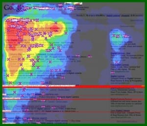
Heat maps are visual imprints of what our eyes look at on a web page. They measure the depth of penetration via a ‘heat’ colour spectrum. In this example – you can see the varient in colour from red to purple. Red represents extensive eye-ball activity and purple extremely low eye-ball activity. The colours inbetween move between these two extremes.
The power of heat map insights
The real power behind heat maps is studying these colour concentrations and looking for trends. Once you have an idea of what your visitors are looking at, you can switch the layout, design and content of your pages to match these patterns.
Now for the ‘juicy’ bit – the heat map insights:
The ‘Magic Triangle’ – Most studies have revealed that the ‘Magic Triangle’ is used by many website users. This means that our eyes first look at the top left-hand corner, move across to the right-hand corner, look down, and then look back at the left-hand corner.
Red hot!
- Images
- Videos
- Text that stands out is looked at – bold, links or underline
- Blog posts (especially homepage feeds with thumbnail images and bold titles)
Red-orange
- Captions
- Icons
Purple
- Blocks of text are scanned (skim-read)
Social Media heat map insights
Red hot!
- Profile pictures – make them snappy and interesting
- Job titles – Really sell your skills here
- Position of content – Important content, move to the top
Red-orange
- Who you are friends with – A well-connected individual is a networker’s dream
Green
- Lower down content
[youtube]http://www.youtube.com/watch?v=abc4RzBfTFA[/youtube]
This ties in with my previous post ‘This Message Will Self-Destruct In 24 hours‘ – As we are inundated with content, we tend to read only fresh content and dismiss the rest. It’s a reason why timing of updates and posts are so important. You need to capture as many of your fans’eyes as you can in a short time-frame.
Next steps
- Take on board all the info you can and list the elements that visitors interact with.
- Work with a consultant, or team members to critically evaluate your own web pages and note areas where changes can be made.
- Draw up a new template/plan which draws on your new-found knowledge. You may need to assess your activity and make room for videos or blog writing to support your new plan/template.
- Work with your consultant and developer to assess how to go about making these changes.
- Find a means of monitoring (a tip is to add an annotation to your analytics graph for the implementation of these changes).
Has the heat map insights caused you to analyse your web pages? What would you change?


