The roll out of Facebook Timeline for pages this week sees the end of the default landing tab. But is having custom Facebook pages worth it? For some time I’d been noticing landing tabs getting more and more elaborate. People were beginning to bring their entire website onto Facebook and although this looks great I often wondered if it was functional. Here’s why;
People only visit your Facebook page once, if at all
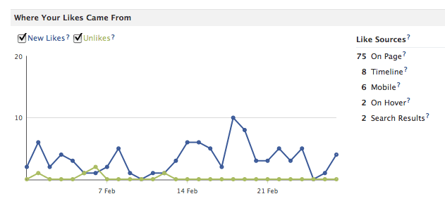
A quick look at my Facebook insights tells me that although most of my most recent Likers clicked the Like button on my page, some clicked ‘Like’ from search results or from a hover (probably over the ticker or a story shared by someone else). So there are some people out there who may never visit my page.
- Once a user has clicked the Like button, wherever it might have been they may never revisit the page, instead they will expect to see your updates in their newsfeeds amongst the updates from their friends.
- So all that work on your amazing customised landing page could be wasted, a portion of your community will have never seen it and others will only see it once.
Mobile users can’t access custom pages
425million monthy active users access Facebook via a mobile app (Facebook IPO statement). As any mobile user knows custom Facebook pages are not accessible via a Facebook app. As mobile internet use grows this is going to represent a larger and larger portion of your audience.
Related: The Strange World of Gathering Facebook Fans: 5 Ways To Make It Right!
It’s hard to get people to revisit your page
In the last few weeks we’ve heard stories of some of the big brands pulling their Facebook shops, in my mind the reason for this is that although the shop was there they were failing at the task of getting people to click through to their shop.
- If you’ve created customised tabs your job is to drag Facebook users back to your page, to do this you will need to engage them on the newsfeed and incentivise their return.
- This requires a lot of work from page admins, you will need to post about your tabs and link to them regularly to encourage the click.
- Once they’ve clicked you better make sure you’ve made it worth their while whether it be an offer, a competition, a shop or some exclusive content.
Little red flags
I’m sure you’ve had one of those Facebook moments, you’ve logged in to do something work related, you get distracted by a little red notification flag and in 10 minutes time you’ve totally forgotten what you went their for in the first place.
As marketers we can keep this in check but most consumers visit Facebook to interact with their friends, we may have been clever enough to provide them with great interactive content and incentivised them to visit our custom page but when they get there a little red flag appears, notifying them that someone is communicating with them elsewhere, and they’re gone. Making your content compelling enough to keep people away from their friends is a tough task.
The more pages you have the more work you have to do
This goes with my first point really. If you build multiple tabs you need to be plugging each one constantly on your newsfeeds. Too much plugging and you’ll scare people off but too little and the investment you’ve made in your pages is wasted. It is hard to balance valuable and engaging content against calls to action and the more pages you have the harder you will have to work. In reality, a single call to action to your website is easier to achieve.
Related: 20 Easy Ways To Grow Your Company Facebook Page And Fans
Facebook changes
Facebook constantly changes and evolves, if you build something now there are no guarantees, you may need to do a complete overhaul in a week, a month or six months. Being new we know Timeline will be around for a while but we can’t be sure if Facebook will tweak it, change tab widths or even change the way we link to pages completely.
It’s not all bad news
The new Timeline gives you a much wider space to work with for your custom tabs, the width has expanded allowing for more website style deigns. In reality it is now a lot easier to design a full website that will sit in a customised tab
You can feature tabs on your Timeline
Timeline features four tabs just underneath your cover image, one of these is photos and cannot be moved, the other three could be links to your customised tabs, you can set images for them and name them as you wish.
This is a far better navigation system than on the previous page design and although it only allows you to feature three tabs you have a chance to make them far more compelling and clickable. This will be a great way to focus on shop, competition or discount tabs.
Related: In-Depth Small Business Facebook Case Study And Strategy: Mykidstime
Do you rely on custom tabs on Facebook, will you miss your welcome page? Or do you think taking the emphasis away from customisation is a good thing? I’d love to hear your thoughts.
Did you like this article? Sign up for our RSS, like us on Facebook or follow us on Twitter


