As 2020 is almost here, it is time for us to analyze the email design tricks that worked in the past year and the trends that we can expect to see in the coming year. To cut through the noise in your subscriber’s inbox, you need to stay in the know with the top email design trends that will make it to 2020.
Here, we have curated a few trends that we believe need to be part of the email you will be sending in the new year for better conversions.
#1 Design for the Dark Mode
The new devices and the operating systems have implemented the dark mode. As the name suggests, it flips the colors to make it more effective for night reading. Those who have a habit of viewing their phones in the dark can spare their eyes with the dark mode.
What happens in here? Simply put, the regular black on white gets transformed into white on black.
If your emails are not designed for this mode, then the subscribers might not be able to enjoy them in the dark mode, which eventually reduces the engagement.
You will need to experiment with the background colors to impart a pleasant experience in the dark mode. You need to activate the accessibility switcher in the emails so that users can switch between the light and dark mode easily.
Apple Mail, Gmail, and Outlook have already adopted dark mode for emails. By 2020, you will see some of the major email clients switching to this mode.
#2 Implement the Minimalist Design
When we say minimalism, it is where the design and copy have minimum elements to communicate a message with greater clarity. This trend, which was quite a thing in 2019, is here to stay in 2020 as well. You will see that the well-organized design and content with plenty of white space will help engage readers and increase your conversions.
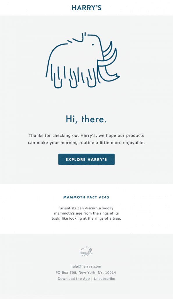
Take a look at the email by Harry’s that demonstrates minimalistic design in the best way. The purpose of the email as well as the CTA clearly stands out and encourages the reader to convert.
#3 Gamification in Email Designs
Gamification in emails works on the principle of incorporating game mechanics into non-gaming realms so that you can encourage the user to take the desired action. It will be a popular trend in 2020 that will establish deeper customer loyalty and satisfaction with playful interaction. It will smarten up the email campaigns, thereby bringing higher subscriber engagement and more visits to your website.
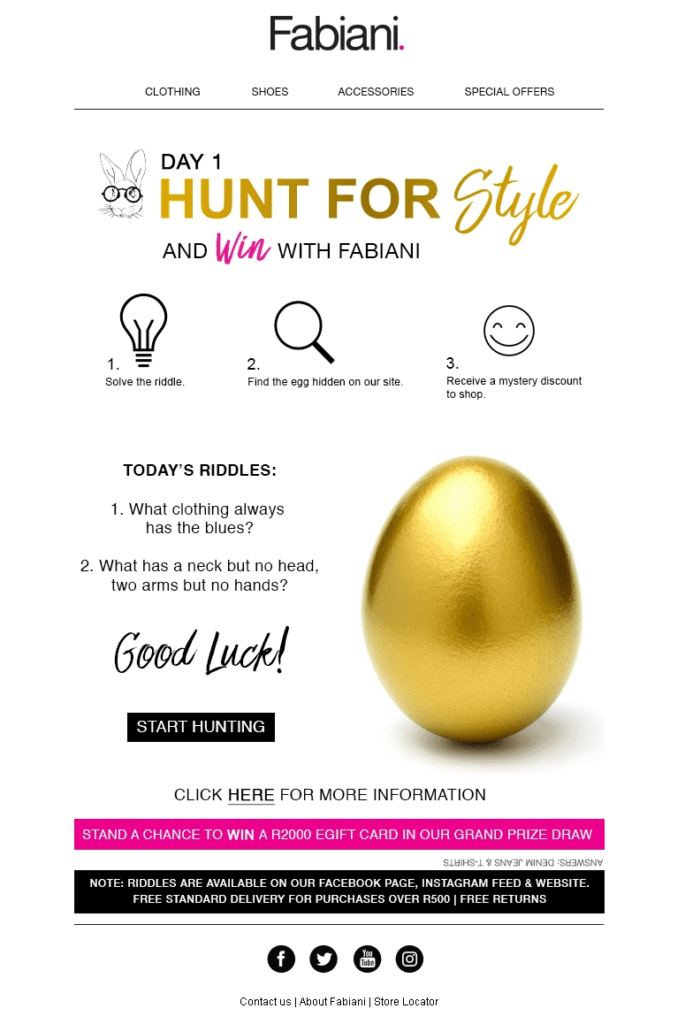
Here’s an example to inspire you. Fabiani has sent some interesting riddles in their email to drive subscriber engagement and make them convert.
#4 Inclusion of APNG Designs
GIFs have been a part of email designs for a while now. They make emails more interactive and interesting for users. They will continue to be a trend in 2020 as well. However, animations will see a new phase in the coming year with APNG images.
From the conventional GIF images, the animations will move towards high – resolution images with this trend.
Generally, GIFs tend to support 8-bit non-transparent images. However, with APNG format, you will get 8-bit alpha transparency and 24-bit colors.
Take a look at the image below to understand the drastic difference between APNG and GIF images.


#5 Dynamic Personalization for Better Engagement
Personalization of emails is a necessity if you want to engage the users and ensure a good open and click-through rate. Dynamic personalization of the content is a step further than remarkably improves the experience of the users.

With this, you can embed live Twitter or any other social media feed, include a timer, and get it updated in real-time. The user’s excitement level and their interest in the email will go up as a result, which will eventually impact the open and click-through rates for your emails.
#7 Add Speed with AMP
It is time to make the users complete the action in the email itself. Not many people have the patience to go to the landing page, complete the process there, and then move ahead.
The process is not only long but also involves a lot of clicks. If you could speed up the process, it will certainly make the experience better.
You can add AMP in an email to make this dream a reality in the year 2020. You can get them to fill out a form, purchase a product or even complete a booking with this technology.
Take a look at the example below in which Booking.com has allowed the user to see the deals and have a look at the hotel rooms from the email itself.
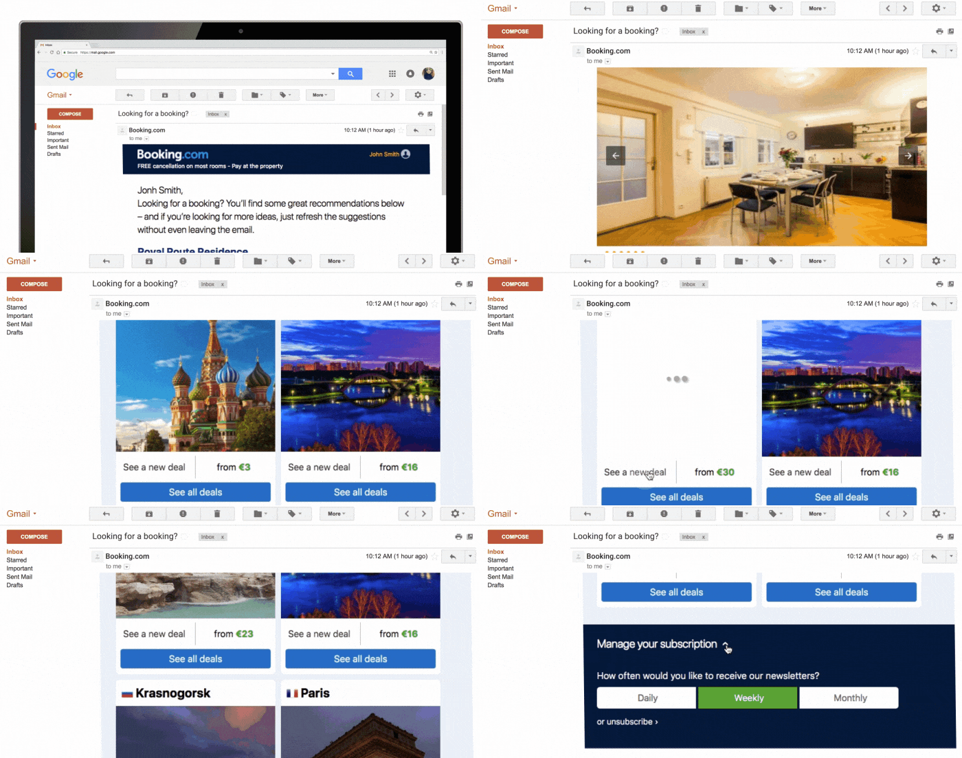
AMP is currently supported by Gmail for Desktop and Gmail App for Android and iOS. Other email clients are likely to extend support for this new interactive technology in the year to come.
#8 Move Beyond Conventional Layout
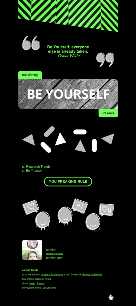
The conventional layout includes the header image, the hero image, product description, and other elements. However, all emails look similar as a result of this practice, and there remains no difference between the emails sent from different brands. This has resulted in a reduced conversion rate for the users.
2020 will see email marketers reducing the usage of column layouts and improving the email design by breaking free from grids. You don’t have to necessarily add all the elements. You can use the necessary elements only and do away with the unnecessary columns in the layout, thus refining the experience.
Here’s an example of broken grids layout by camiah.com.
Wrap Up
Email design keeps evolving to match the new era and needs of the subscriber. If your email is designed keeping the customer in mind, it helps engage better and improves the conversion rate.
Let us know which trend according to you will help you capture maximum attention from the subscribers, and which trend will not work for you? Also, tell us if you have used these elements in the past to attract subscribers and convert them.

