If you own a website that you plan to grow, then your contact form game must be up to speed.
Your website’s forms are a direct way to collect user information, create marketing strategies to cater to those users, and drive conversions. Whether your end goal is to grow your email list or generate sales, your forms are the gateway between your brand and its visitors.
Because 81% of users abandon a form after they start to fill it out, it’s imperative to optimize your contact forms for the best results. If the process is frustrating or complicated, it challenges visitors to complete the form and return to your website. It’s crucial to collect their information the first time around so you can build customer retention and expand your brand.
Let’s look at a few ways you can increase your contact form conversion rate to achieve more conversions.
Minimize Form Fields
It’s frustrating for visitors to see a form that asks for too much information. It’s difficult enough to get them to that point as it is, but when you add extra requirements, it makes it nearly impossible for your audience to follow through. People have little patience for things they don’t want to do, so it’s crucial to simplify the process of handing over their information.
Make sure you get rid of unnecessary fields in your forms that you don’t need. If users are signing up for a lead magnet offer, there’s no reason you need their home address or phone number. They’re at the top of the sales funnel and aren’t ready to make a purchase yet, so requiring extra information does nothing to help your conversion rate.
Eliminating one field can increase form conversions by 50%. Try sticking to no more than three fields for your forms. Decide what fields aren’t necessary that you can get rid of and which fields you need.
Emphasize Security
Have you ever stopped yourself from handing over your information online because you didn’t trust the website? As technology advances, the concerns for user safety increase and impact businesses’ conversion rates across the board.
Around 29% of users neglect to fill out a form due to security concerns. If your website doesn’t take the extra steps to make visitors feel comfortable about the information they share, no one will bother to participate.
Protect your website by switching from HTTP to HTTPS, or Hyper Text Transfer Protocol Secure. HTTPS protects data using encryption, keeping it secure so no user information is at risk of leaking.
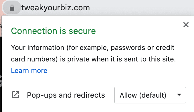
When your website’s data is secure, users can click on the lock next to your URL and see a popup like this:

This eases their discomfort and encourages them to trust your site and give you their information.
Optimize For Mobile
With 49% of all web traffic stemming from mobile devices, it’s crucial to cater to the mobile experience. A good portion of your site’s visitors come from nondesktop devices, so if you fail to optimize your forms for these users, you’re neglecting potential conversions.
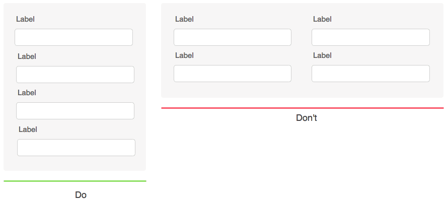
Make sure to use single-column forms and avoid multi-column fields as they appear overwhelming to visitors on mobile. They may also not notice the extra column because it doesn’t fully fit on the page.

Ensure that all text is big, spaced out evenly, and easy to read. Anything that’s difficult for people to consume on mobile shouldn’t be on your website since so many use their smartphones to browse the internet.
Your CTA button should stand out and be clearly visible on the page. Its copy and colors should be easy on the eyes and contrast so it pops even more. It’s easier to fill out and complete a form when the CTA is clear and states exactly what you’re going to do.
Use Proper Placement
Where you place your form on your site matters just as much as every other aspect of it. If users browse your website and find your form placement is inconvenient or difficult to find, it decreases your conversion and engagement rate. The key is to simplify the process as much as possible so users feel comfortable filling out your forms.
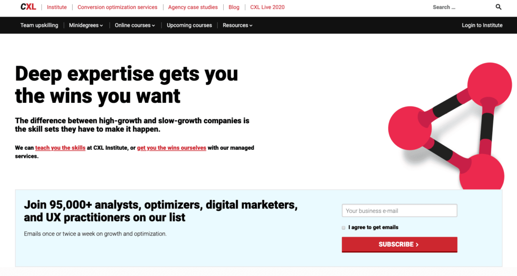
Consider which areas of your site are the best for catching users’ attention and convincing them to convert. Your forms should be above the fold and stand out against other content. If you place it somewhere inconspicuous, such as the bottom of the homepage, it’s easier to ignore or miss completely. Make it easy for users to find the content you want them to see by positioning it in a prominent place.
ConversionXL made sure to place their optin form above the fold on their homepage so anyone who visits their website has a chance to convert.

Build Trust
People don’t want to opt in to your contact form if they don’t trust your brand. Before customers make a purchase or visitors join your email list, they need to know you’re worth the investment. It’s difficult enough to convince people to sign up for your form, so failing to establish trust is essential to boost conversions.
Your website needs social proof to show visitors you’re a business they can trust and do so happily. Social proof is anything that shows prospective customers that your brand is well-liked and supported by others. When we see other customers and brands promoting a product or service, it makes us want to do the same thing to recreate those positive feelings.
There are several examples of social proof you can use:
- Real-time activity
- Customer reviews
- Testimonials
- Brand logos
- Influencer or celebrity endorsements
- User-generated content
Over To You
With these tips, you should be able to see a spike in your website’s form conversions and collect more user information. It’s crucial for your brand’s success to improve your forms and create a smooth UX for your visitors.


