Experience on a mobile phone is way different from that of a desktop or laptop. Designing for both requires a separate mindset, skill set, and a different rule book. Lot of developers simply throw everything they learnt so far on desktop, when it comes to mobile. But, things do not really work that way. UI/UX design principles differ greatly between the two. Let us discuss a few UI/UX principles specifically good for mobile. Although there are many to follow, these principles are a good way to start things of.
#1. Know what goals to cover
Think from a user perspective, and understand what is being expected from your app. Say for example, if your app is about providing city based information, it should have features like featuring weather forecasts, available trains and flights to and from a city, contact details of hotels, and more. Ensure to incorporate more content rather than focusing upon design. People using such an app will be more inclined to see more of text, than jazzy or creative multimedia elements.
#2. Blindly copying the desktop version will simply not work
Most businesses have the tendency to opt for shortcuts due to time constraints. They will simply think, “Why not implement the same desktop version on mobile to make it work as a website or an app?”
This is probably one of the biggest mistakes they make. The reason being there are too many components specifically meant for desktop use, not ideal for a mobile use, and vice versa. Say for example, a hamburger style menu acts great on the desktop website, but it’s of no use in a mobile website or app. Many things differ from each other like input methods, screen sizes, different contextual uses, and so on.
Instead of blindly porting your desktop website, and converting it into a website or an app, it is advisable to go for a mobile redesign.
#3. Cluttering is a big ‘NO’
Who likes cluttering up things? This is even true in case of a mobile UI/UX design. Clutter is bad anyway, whether a desktop website, or an app real estate in terms of a mobile website or a mobile app.
Imagine, you are using an app or a website, and everything seems to be very close to one another. This is even worse in the case of mobile, wherein the screen size is already tiny enough to handle. If things get confusing, users would be pissed off sooner, only allowing them to abandon the website or app.
#4. Divide macro tasks into micro chunks
A major task when divided into chunks of minor tasks, not only enables the task to be simpler and easy to deal with, but also helps users to go through a step by step process, ultimately reducing the possibilities of errors.
When a bigger task appears as it is, it looks complicated to handle, intimidating users. However, when smaller tasks appear in front of users, they feel more relaxed and focused, and complete the task with confidence.
#5. Everything should appear bigger on mobile
The general myth existing among developers is, why not squeeze things on mobile as compared to a desktop. Resist from doing that. No matter how the content looks on desktop, it should appear a lot bigger on mobile. Everything should be big – controls, spacing, buttons, menus, labels, text, multimedia things, etc.
You might ask here, “Why so?” Well, a mobile design is by default meant for poor eyesight, and fat fingers. Majority of users use their Smartphone when outdoors. In a bright sunlight, it is a lot tougher to read things with ease. Additionally, users have the tendency to use their thumbs, poking at buttons. In such cases, if you have everything large in size, users will have an easier time not just viewing content, but even accessing the same.
#6. Minimize typing as much possible
Typing on mobile is always a painfully slow process. It is best allowing users to tap rather than type. Try to have as many short forms as possible. Remove all the unnecessary fields, while keeping only relevant fields intact. Use smart features like postcode lookup, and auto-complete, so that users have to enter the bare minimum information, without going overboard. Also, allow users to save their information, so that it is remembered and retrieved, when users login next time.
#7. Give a thought regarding taps or impressions
Take a mobile in hand, and analyze which areas are more apt for tapping purposes, when users operate an app from a single hand. See where your fingers or thumbs set down. Ask people, where or on which part of the screen they like to tap within the app, the most. Hand grips, or positions, tell a lot about what to place where within your app.
Scrutinize the areas of reach that are easily accessible, and the ones that are far off. Place apt calls to action within the reach, and buttons such as edit or delete out of the reach. You also need to take into account the ergonomics associated with different mobile builds, as well as designs. What also matters here is the behavioral actions of users responding to different kinds of apps.
#8. Leverage mobile capabilities to the fullest
Mobile capabilities are gaining a lot more momentum than you could ever imagine. Today, it does not look surprising seeing capabilities like gyroscope, accelerometer, GPS, orientation and position sensors, or more, embedded within the mobile phones. Adding to that, you have vibration, digital camera, microphone, music player, and lots of other things coming by default.
Have your app take full advantage of these capabilities so that your apps deliver a full-fledged seamless experience. As an example, you can have your app allow users to take snaps of your credit card and upload the same, so that users need not enter details every single time. Another well known use is making use of GPS to detect current location, and estimating details regarding aspiring location. The app can also allow users to make hand movements to make a decision within the app, or probably say yes giving authorization through a specific hand movement. Ensure not to go overboard ruining the entire experience.
What’s your mobile UI/UX like?
You might have a mobile app in place. However, is your mobile app the one sought after by mobile users? As such, there are a number of ways by which you can let your app appeal to a vast majority. But, the principles discussed above have proven to be a surefire way of making your apps appeal to thousands.
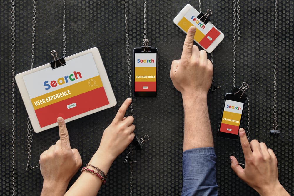
Image: User experience
- The Mobile App Development for Healthcare in 2023: Trends and Challenges
- 9 Suggested Features For An iPad Task Management App
- Why Business Owners Invest in on Demand Mobile Apps
- Why Your Call Center Software Needs Live Chat and Video Calling Feature?
- How Small Businesses Can Leverage AI for Smarter Website Design
- Six Emerging Technologies And How You can Take Advantage of Them