If you have a business, your aim should always be to connect with people. The more you connect with people, the more will be your chances of expanding your business. But to do that, you will need proper marketing. These days, no marketing endeavor is complete if you don’t go online. That’s because, digital marketing is the call of the day. And when you are planning to go for digital marketing, there’s a basic thing that you’re going to require. That’s a website.
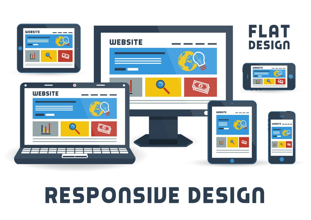
If you are creating a website for your business, it is essential to follow a few steps. In the very beginning, you have to plan to create a responsive website. That’s because, responsive is a must these days. And with lots of internet-friendly devices being introduced with every passing day, responsive web design is gradually becoming almost imperative when you are designing a website.
Responsive web design really helps. It ensures that your website is properly visible to people, no matter from whichever device they are viewing it. But when you are designing a responsive website, you tend to make a few mistakes. The result: the user experience won’t be up to the mark and it will have a
Here’s a quick sneak peek at some of the responsive web design mistakes.
#1. Not Considering the File Sizes
Any website needs a lot of images. That’s because, it’s essential to make it appear attractive. So, you will have to include a large number of images on the website. At times, you can also include a few videos as well.
But this is surely going to have a negative impact. Wondering what?
The page load time of your website is likely to rise significantly, which will increase the bounce rate to a great extent. That’s because the image and video files are usually large in size. So, they make the pages quite heavy.
To solve this issue, you should use images and videos, which are of the smallest sizes. This will keep the web pages light and ensure fast page upload time.
#2. The Amount of Content
When a person is viewing the website on a laptop or a desktop computer, he has quite a large screen size. So, it is possible for them to view a lot of content. So, you can include as much content as you want. All you need to do is arrange it properly.
The moment you plan to make a responsive website, you know that the website is going to be viewed in mobile devices. And all those have smaller screen sizes. So, the first thing that probably comes to your mind is to reduce the amount of content and hiding it. That’s because you want it to fit within the screen size.
But will that be a correct step?
Of course not.
In fact, that’s going to be a major mistake if you do that. Reducing the content means that people who are checking your website on the mobile device will get less information than those viewing it on larger devices.
#3. Putting Links Too Close
Your website must be having quite a few links. When a person views them on a laptop or a desktop computer, he can use the mouse cursor to click on them. But when someone is viewing a responsive design on a mobile devices, he usually uses his thumb for clicking it. So, if the links are too close to one another, he might have some problem clicking them. In fact, he might end up clicking one link while he wants to click another.
So, what’s the best way to solve this issue?
You need to look into it at the very beginning, while the content is being written. Texts too close to one another should not be hyperlinked. Linking the texts separately can help to solve this problem.
#4. Using Incompatible Content
If you are planning to make your website interesting, it needs to have quite a few things. And among them, images and videos are surely among the most important things. But when you are including these media files to the website, you’ll surely need to ensure that your target audience are able to view these properly.
Remember, although most of the video and image files open easily on desktop computers and laptops, there are a few files, which do not open on mobile devices. So, you should focus on ensuring that only compatible devices are used while designing the website.
#5. Focusing Only on the Smaller Devices
Do you think responsive design is only for small devices?
Think again!
The word responsive refers to designs, which are able to take the shape of almost any device. So, no matter what the screen size is, a responsive design is always going to help your website appear perfectly. However, if the focus is too much on the small devices only, you need to create different websites for mobile and desktop versions. Otherwise, you might find that your website is not appearing properly when it is being viewed with the help of an internet-friendly mobile device.
Navigation is important. When you are creating a website for different kinds of devices, you need to think differently for each one of them. And always remember that the navigations for different sizes of devices are going to be different. However, it has been observed that while designing responsive websites, a lot of designers tend to create just a single navigation for large and small devices. The result: the navigation cannot be properly accessed in the smaller version.
So, it is always a good idea to create navigations differently, keeping in mind all sizes of devices, which are going to be used by the visitors to the website.
Conclusion
Responsive design is a must for your website these days. But you need to ensure that while designing the website and making it responsive, you are not committing these mistakes. Because if you can avoid these pitfalls, the website is going to help you reap more benefits.
Images: ”Collection of flat modern devices and responsive design /Shutterstock.com“
______________________________________________________________________________
Tweak Your Biz is a thought leader global publication and online business community. Today, it is part of the Small Biz Trends stable of websites and receives over 300,000 unique views per month. Would you like to write for us?
An outstanding title can increase tweets, Facebook Likes, and visitor traffic by 50% or more. Generate great titles for your articles and blog posts with the Tweak Your Biz Title Generator.
- Flooring Consulting for Designing Safe and Functional Workspaces
- Business Leadership Lessons: Being the Boss You Were Meant to Be
- Top 10 Digital Marketing Learning Guide for Beginners
- Some Insights Into Using Artificial Intelligence to Boost Your SEO
- Are You The Pig Or The Chicken?
- Words Matter: 8 Writing Resources for Anyone Looking to Improve Their Writing