Your business’s website is the face of your brand and the anchor of your digital marketing strategy. Having a solid online presence is just like having a clean storefront, so you need to do everything you can to get it right.
And, with so much competition, your website must be well-designed and provide a great user experience. Not only that, but you also need to make sure every visitor understands how to take the next step with your company. This involves enhancing the experience visitors have when visiting your website to ensure they find value in what you are providing.
Improving your site’s UX will lead to more business leads, increased ROI, and even better search rankings. All it takes is a few simple changes.
Here are five easy ways you can improve the user experience of your business’s website.
1. Make it very easy for customers to take the next step with you
When people land on your website, you want to make it as easy as possible for them to take the next step. A complicated sales process will discourage users from making a purchase, either abandoning their cart or moving on to your competitors.
You need to use smart design to create a more intuitive user experience. Since customers are used to following visual cues, laying out how they can take the next step with your brand will simplify the process and convince them to convert.
You can make it simple for people to find more information or move forward in the buying journey by:
- Giving a clear call to action (CTA)
- Providing a sophisticated search feature
- Designing simple landing pages
- Making it easy for people to get in touch
- Offering multiple ways to pay
These improvements don’t take much effort, but they will pay off as they drive more qualified leads through your checkout process and help make it easier for your customers to close a sale on your site.
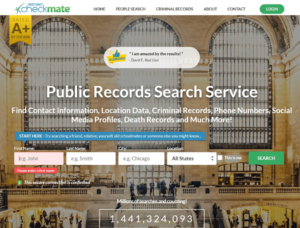
For example, Instant Checkmate, a public records search service, uses a simple design interface that clearly prompts the users to take the next steps. The CTAs stand out and use clear language to guide the user towards the next step with fields right on the homepage that make it easy to choose the right options based on customer needs.

Aura Imaging, a company that specializes in aura photography equipment, simplifies their homepage even further by placing a CTA button right at the top. The placement and strong color choice make the CTA stand out to encourage potential customers to click and continue through the sales funnel.
To improve your site’s UX, put yourself in the place of the customer. Pretend you have no knowledge of your brand and see how easy it is to move through your sales funnel. This is a great way to understand your customer and see exactly where improvements can be made.
2. Publish content to help customers make informed decisions
You want to do everything you can to help your customers make the best shopping decisions based on their needs. This means you need to offer informative content to help them feel more confident about doing business with you.
Publishing content that offers information about your products or services will save your customer service team time, reduce the need for refunds, and generate more positive reviews.
Here are just some of the different types of content that can help your customers make the best possible buying decisions:
- In-depth product guides
- Tools to determine whether your products are for them
- Buying guides
- Demo videos
Generate content that will help customers decide whether or not your products or services are for them. Not only will this build trust, but it will help your users feel more confident about their purchases at each stage of the customer journey.
Word-of-mouth recommendations are incredibly powerful. You can replicate the effects and improve your UX by adding customer reviews and other types of social proof to your site in a prominent place.
Showing that other customers have been satisfied with your products will help new customers feel more confident about buying from you.
This improves the user experience by giving your site credibility and demonstrating your company is the real deal. It also helps prospective customers to set their expectations to ensure they are satisfied with their purchases.
Adding social proof to your site is easy and you can add different types of social proof based on your industry and target audience. Here are some examples of social proof that you can use on your site:
- Customer reviews
- Testimonials
- User-generated images and videos
- Celebrity or influencer endorsements
- Expert stamps of approval
Place your customer reviews and user-generated content in a prominent place to show that your products have helped real people and enhance your UX.
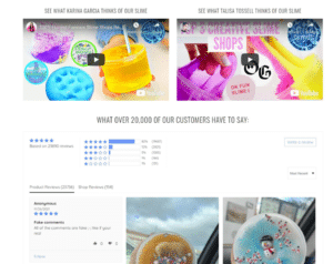
Dope Slimes, an online retailer of slime merchandise, uses customer reviews, videos, and images to show which of their products are most popular. The eCommerce site tags verified reviews and encourages users to review the texture and scent of their products to demonstrate customer satisfaction. You can use the same approach to integrate content and reviews to inform potential customers about your product before they make a purchase.
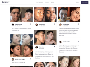
Another business that effectively harnesses the power of social proof is Curology. This skincare company uses real users’ before and after images and highlights customer reviews in their “Real people, real stories” section.
This content is taken from social media posts made by actual customers and offers strong social proof that their products are effective. You can use the same approach to build trust and show that your products/services are the perfect solutions to the needs of your customers.
Generate social proof by offering incentives for leaving reviews or posting with your brand’s hashtag. Existing customers will enjoy seeing their feedback on your website, and potential customers will see that your company offers excellent products.
4. Ensure your contact options are easy to find and access
People will sometimes want to contact you with questions or for clarification before making a purchase. To provide them with the best possible UX, you need to make your contact options easy to find and use. Here are some ways to make reaching out easy for your customers:
- Make it easy to talk to a human
- Place your contact information in a prominent place
- Offer a live chat option
- Employ chatbots
Offering multiple ways to quickly contact you will not only improve the UX but also improve customer loyalty and retention.
If users know they can contact you through their preferred channels, they will be more engaged and likely to trust you. This will generate more leads for your business and make you more sales.
5. Make sure your website is accessible
To offer a top-tier UX, it needs to be accessible to everyone. This means that anyone should easily be able to use your website, even if they have certain impairments that require special accommodations.
So, you must make sure that your website is WCAG 2.0 compliant. This set of internationally honored guidelines ensures that disabled users can access online content in the same ways as their peers.
To ensure a positive, inclusive user experience, you’ll need to make sure your website fits the bill. You can accommodate visual, hearing, and physical impairments with simple accessibility features, such as:
- Adding alt text to your images
- Making sure your website’s text contrasts nicely against the background
- Transcribing videos
- Offering closed captions
- Making your content accessible
Ensuring your content pairs well with browser accessibility features, like screen readers
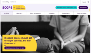
Scope, an online forum and nonprofit for disabled people, offers a “skip to main content” banner on the first tap to allow users to quickly get to where they need to go. This feature helps their audience get to the information they need without having to scroll past updates or other information that does not meet their needs.
It also offers large, high-resolution imagery that is easy on the eye with distinct colors and a nicely spaced out large font.
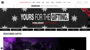
The website accessibility features found on DC Shoes make shopping an inclusive experience, too. Visitors can adjust the spacing and sizing of fonts and letters, which is perfect for those with visual, cognitive, and motor disabilities. It allows the user to customize their own screen view for a more effortless shopping experience.
Whether you choose pre-built or customizable accessibility features, offering an inclusive experience will not only enhance your UX but show that your brand cares about every online users’ needs and enjoyment.
Summary
Improving your website’s UX is a surefire way to drive sales and increase your conversion rate. These small improvements are simple to execute and will have a huge impact on your customers’ experience with your brand.
Do some research to pinpoint any potential problems your users may experience. And, once you see their pain points, take the time to enhance your UX. In no time, your sales will increase, and your customers will turn into repeat purchasers.
Want to find more ways to improve your eCommerce website? Check out Tweak Your Biz’s business section for more great articles.


