I am sure you have read plenty of articles titled “Top CTA Design Tips” on the Internet. Following pro tips is no doubt encouraging. But, not avoiding web design mistakes can throw a wrench into your efforts. And you’ll be left wondering whether the tips were indeed effective.
Call-to-action (CTA) design is the crux of lead capturing. If the design has flaws or is not up to the mark, then prospects will hesitate to click on the CTA. This way, a site may have to wash their hands of qualified leads.
In this article, we’ll discuss the mistakes that one needs to avoid when designing CTA elements.
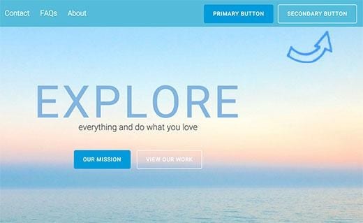
Button blindness occurs either due to incorrect placement of CTA buttons or design mistakes. Here’s an example of button blindness:
The second CTA button has the text “View Our Work” in it. It’s difficult to notice the button. The difficulty is caused due to:
- The use of ghost button.
- The background color doesn’t create any contrast with the text color, making it difficult for one to see the texts.
- No other button on this page is transparent.
Button blindness doesn’t have any definitive cause. If the button is placed in any of the extreme corners, if it’s transparent (like in the example above) or if the texts are not catchy enough, button blindness may be the result.
Limit the number
Too many cooks spoil the broth. Similarly, too many CTA elements on a page can do more harm than good. The page looks crowded. On top of that, visitors cannot put their attention on a single button. They find many buttons around them and couldn’t decide which one to click.
Do all buttons lead to the same page? If no, then keep the ones that take visitors to the most important pages. And if yes, then you don’t need that many buttons, right?
If different buttons take visitors to different landing pages, then there’s a justification for having them on the page. Such as the one below:

While the button in blue gives immediate access to a free 4-step tutorial, the red button is to download the free insider’s guide. The two buttons are for two different reasons, and hence, they don’t make the site look cluttered.
So don’t add too many CTA buttons if you don’t need them. You are allowed to add two CTAs. The secondary CTA is for anyone who might have missed the first one.
Balance copywriting and technicalities
When creating CTA button copy, brands need to balance copywriting and technicalities. This is one of the many copywriting challenges. Giving one of them more importance than the other causes the following problems:
- If copywriting gets all the attention, then CTA elements may lack some key technical details.
- If technicalities are prioritized, then the copy may not be catchy enough to appeal to visitors.
The secret behind balancing the two is fixating on a technical theme and writing the copy only around that theme. If you run an automobile business, you may want to highlight the fact you sell cars with hybrid environment-friendly engines. Draft the CTA copy describing (with brevity of course) why your hybrid engines are best. The texts on the button must be persuasive. This way, you can take care of both copywriting, as well as technical needs.
Careful with visual elements
Visual branding is proving to be way more effective than non-visual branding. When you add cool images to accompany CTA elements, the visual branding quotient of your campaign gets stronger.
But that doesn’t mean you keep putting images on the site without discriminating. Because that would result in visual clutter and your website will look kinda like this:

The page looks like a children’s book cover from the 80s. The last thing you want is your landing page to look like this.
The rules of thumb when adding CTA images are:
- The image should be relevant so that conversion improves
- The image should be high-quality
- The image should be original (no stock photographs please)
Images aside, fonts, typeface characters and colors are visual elements too. Make sure the typography is not too sparkling if the site is about engineering, machinery or software service. The spacing and margin should be appropriate. There should be a tiny gap between the viewport width and each end of the screen.
No emotional appeal
This is a grave mistake. If the CTA copy fails to produce an emotional appeal, then pushing visitors into the lead funnel would be difficult.
That being said, be very careful with the amount of emotion you put into the content. Overdoing it could invite problems. Experts say a CTA copy with excess emotional appeal is like a play overshadowed by melodrama.
To add the right amount of emotion, you need to follow the six principles of influence. If correctly followed, your authority will be established your acceptability among the visitors will increase.
What’s interesting to observe is adding emotion doesn’t need too much effort. All you need to do is make clever changes in the CTA copy. Instead of “We don’t share privacy information”, make the CTA text “Trust us, we keep privacy information safe.” Throwing the word “trust” into the equation makes the connotation more empathetic.
Even marketing automation prioritizes emotion. Email automation platforms like Getresponse let customers personalize the messages to email list subscribers and tailor them to their emotional needs.
Conclusion
Avoiding the mistakes increases your odds of turning visitors into customers and grow your sales. The five tips shared here can come handy in it. But do bear in mind that avoiding the mistakes is not enough. You need to positively enhance the CTA elements so that visitors feel taken with them.
Images: Author’s Own


