CTA buttons or call to action buttons play a very vital role in conversion as far as optimization is concerned. If you want a call to action button that features a high rate of conversion you need to plan accordingly. It matters very much to ecommerce companies and digital marketing companies when visitors to the website hit the CTA button or a link that prompts them to take further action.
This action of theirs will end up benefitting the marketing company in a big way. It may be a service they are being prompted to sign up to, or a button that urges them to purchase something online. Usually the CTA button leads the visitor through to the last stage when he or she is prompted to pay for the service or product.
Here is a list of examples of CTA buttons that help drive conversions at far better rates.
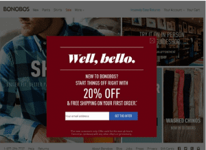
We normally dismiss pop-ups as harmless interruptions when we are busy browsing through a site with intense interest and devotion. However, CTA buttons that feature pop-ups have a very important role to play. They help draw the attention of the visitor to the site, and lead him or her on to a specific task.
A pop-up may be in the form of a small window, or the ubiquitous box that you normally find on top of the page you are browsing. A particular pop-up may be enticing someone to sign up for a free membership and gain benefits. The pop-up is set very cleverly and does not appear annoyingly as soon as anyone reaches a page. It is set to appear only when the visitor shows keen interest in a product by clicking on it.
Yet some other CTA buttons are created in such a way that they pop up only works whenever a visitor clicks on the review tab provided. It then prompts the visitor to write a review, and it often asks for the visitor to leave behind contact details that go into the data base of the company.
A good example is the Bonobos website which tries to woo customers using an attractive CTA button.
Every company worth its salt realizes the tremendous clout social media has today. Most people who are on some networking site go the way most of the others go. This is known as social trust, or in other words crowd psychology. Whenever a majority of the people visiting the site ‘like’ a particular company everyone thinks and believes that it is a trustworthy company. Hence this leads to mass ‘following’ or ‘liking’. Companies cash in on this and convert more visitors by using their existing lot of customers as bait.
This particular CTA has a counter that keeps ticking, and keeps count of the number of people who have already become part of a particular group. This then becomes the proverbial snowball that keeps growing.
Any online store ensures that it has a home page that has a lot of visuals. This is because they want to hold the attention of the visitor and kindle their curiosity to learn more about the product or service.
 The emphasis here is more on attractive images rather than the text, which is kept at the minimal level. Most stores show the products in use, for instance it could be a home utility product that is shown actually being used right in a home. The cleverly created visuals create curiosity that can ultimately end up as good conversions that help businesses grow.
A great example is the Top Dog Dumpster Rental service provider where it displays phone number as a CTA button. People can directly click and call the service.
Making the CTA button stand out prominently in the page catches the attention of the visitor instantly. Some clever designers realize that size matters a lot; hence they make the CTA buttons rather large in order to grab attention. A large CTA button stands out prominently amongst the other buttons and links on the landing page of a site.
 The color of the button too matters when it comes to good conversion rates. Colors have a psychological effect on shoppers, with particular colors being favored more than others. Using contrasting colors makes the CTA buttons stand out and be noticed at first glance.
Have a look at this excellent CTA button from CTA button from Wordstream where color combination influences the decision of the visitor.
#5. Positioning and Whitespace
While positioning the CTA button on the landing page is a very important strategic move, ensuring that the CTA button is framed with whitespace is equally important. The CTA button needs to be placed at a point where the visitor does not need to scroll to view it. The button has to be visible at all times, irrespective of which direction the visitor is scrolling the page. Most visitors are hard-pressed for time and spend just a few minutes at any site. Grabbing their attention in those few crucial minutes makes all the difference.
While most online stores know the importance of CTA buttons per se, most do not realize the exact strategy that needs to be adopted. Making best use of the CTA button goes a long way in increasing conversions.
______________________________________________________________________________
Tweak Your Biz is a thought leader global publication and online business community. Today, it is part of the Small Biz Trends stable of websites and receives over 300,000 unique views per month. Would you like to write for us?
An outstanding title can increase tweets, Facebook Likes, and visitor traffic by 50% or more. Generate great titles for your articles and blog posts with the Tweak Your Biz Title Generator.


