With so many apps out there, users are becoming selective. You always have a bunch of apps competing, for every app download. Hence, it does not come as a surprise, if apps find it difficult to have their own share of space.
Every single mobile app has a hard time grabbing user eyeballs. Studies reveal an average app losing 80% users, within 3 days of installation. Most people install an app, but never use it again due to one or other reasons. The first impression of your app is critical, and this is where user onboarding comes into play.
If your mobile app seems confusing on the first glance or if users find it complex to use during the onboarding stage, they are bound to abandon the app and spread a bad word about it among users. So, what are the steps leading to an ideal app onboarding? We have boiled down our discussion to four points playing a decisive role in defining the fate of your app.
#1. Users should find it easy to understand things
Introduce a video, or presentation slides, talking about how to use the app. If you successfully convey the purpose and the way it works, then users will have no issues in checking out the app content. By the time they are inside, they know why they are inside, and how to go about dealing with the app features.
Remember, you have a broad segment of audience to serve, especially when designing the onboarding process. Treat all users equally, whether having a basic knowledge, or sound tech savvy users.
#2. Get hold of your users on a personal level
You have finally grabbed visitors, now official users. It is time now for establishing relationships with your newly signed up users. Start collecting their personal data and send them personalized emails, letting them feel connected with the app.
Ideally, it is wise to have a social account login like Facebook or Twitter, fetching the personalized social data of users, without actually asking them directly. You have the opportunity to know a lot, such as likes, age, gender, birth date, etc. and accordingly this lets you customize emails, to send individually.
In many cases, you have to ask for details not available on social media. However, ensure asking for relevant details, approaching them at the right time. Imagine asking details from users when they are in the midst of something, in a hurry to go somewhere, or traveling around. You cannot expect users to respond positively in such situations.
#3. Ask for permission before taking actions
Future interactions play a vital role in staying connected with the users. Breaching user privacy without permission is something that is not acceptable. Whether it be iOS, Android, or any other mobile app, it is about seeking for approval, when it comes to alerts and notifications. Think about those notifications or messages popping up without any prior explanation or notice.
It is not difficult to convince users for allowing the app to send notification messages and use personal details for providing advanced functionalities. You just need to explain why you seek permissions. If you deliver a valid explanation why it is needed, it allows your app to retrieve the personal preferences of users.
#4. Focus on bits and pieces of in-app interactions
So you have users registered, allowing you in-app permissions. However, is it enough for getting users glued to your app? Users have many expectations and it is hard to fulfill them all. They want to have entertainment and fun browsing around the app, scrolling the content, interacting with the app elements and components, while receiving surprises constantly.
After all, people use apps to escape from their daily routine. It is ideal if you can have small animations embedded in the slightest interactions. This enables things to be a lot more communicative, and easier to convey. Let users enjoy the app, especially when opening it for the first time.
Do not be overbearing or pushy when delivering interactions in parts. A simple short message, tool tip, or brief tutorial, should work. In addition, keep loading bar animation, hamburger menu opening up when the cursor scrolls over, color of the button changing when mouse cursor goes over it, and more, are examples of micro in-app interactions playing a major role.
Gear yourselves for the next app onboarding!
App users are human beings. It is quite natural for them failing to understand how to go about exploring the app. A social interaction, through a friendly, personal, polite approach, leaves a long lasting first impression, which users easily comprehend and remember, whenever they open the app. Onboarding is a gateway to an app success, not an afterthought.
A systematic onboarding process with landing, login or sign-in, and a homepage, allow users to have a smooth walkthrough with the app introduction, telling them everything regarding the app they need to know about. It is just like getting introduced to a travel destination before actually visiting it, knowing exactly what places to check out.
There are many other ways by which you can have a memorable onboarding process for your app. However, we have specifically listed the above, because they have proved to be ideal. Let us just briefly go through twelve mistakes to avoid while implementing the above strategies:
• Do not have false promises, telling things which your app cannot do.
• A delayed response in the beginning itself can ruin things greatly.
• Set benchmarks and objectives right at the start to ensure success.
• Analytics should never be ignored, even if relates to ‘onboarding’.
• Customers are everything. Do not treat them like numbers.
• Simplify the app pricing as much as possible.
• Keep the onboarding process short, for reaching the core quickly.
• Do not assume things, as it can prove to be a fatal mistake.
• Do not place random conventional messages. Instead, try to interact with them using common lingo.
• The experience should be eye pleasing rather than not good to look at.
• Use proper colors, font, branding, etc. letting users know where they have arrived.
• Avoid any bugs, errors, broken pages, links, etc. during this whole transition.
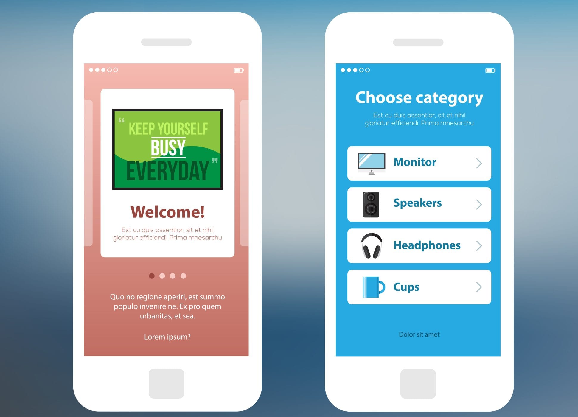
Image: Mobile wireframe app ui kit. Information slide screen and choose category screen.


