If you are constantly looking for ways to boost your conversions and new marketing trends that will improve your sales, you are in the right place.
One of the most effective methods for business advancement is creating pop-ups.
This may sound surprising given that many people assume that these windows annoy your visitors. However, conversion rates depend on what your pop-up looks like and what you offer through it.
But how do you achieve such highly-converting pop-ups?
In this article, we will show you what are the best practices for creating amazing pop-up windows that will grab people’s attention and bring you more customers.
Let’s start right away!
What Are the Pop-Ups and Why Are They Important?
Pop-ups are actually windows that can be easily implemented on your website or online store.
Their goal is to offer visitors some compelling offer that will make them want to take a certain action.
Some of the most important benefits that your leads will find interesting are:
- Newsletter with important or interesting news and updates
- Free online courses or webinars
- Free demos or guides
- Discounts or coupon codes
Of course, your offer should be in line with your business and the interests of your target group.
Pop-ups are actually the best way to present these offers and, at the same time, they help you persuade people to leave you their email contacts so you can continue your email campaign successfully.
High-converting pop-ups will increase your sales and expand your online community.
4 Essential Elements of Every Successful Pop-Up
If you pay special attention to creating pop-ups, they can do wonders for your business.
However, there are some rules that must be followed, and in this section, we will list what are the 4 most important elements of any successful pop-up.
These are:
- Context – in order for a pop-up to make sense and encourage people to take action, it must be placed in a specific context.
- Copy – catchy copies will intrigue people and explain to them what the offer is all about.
- Design – visually appealing design will grab the attention of your visitors.
- Offer – the offer should be conceptualized so that your target group finds it irresistible.
When these elements are consistent, your pop-up can leave a great impact on your visitors.
To make it clearer, we will illustrate these 4 essential elements with an example from the Contently website.
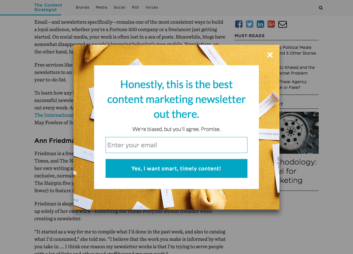
This pop-up has the ability to collect a huge number of email addresses. And why is that?
Let’s break up the pop-up by the aforementioned elements.
Context
This pop-up appears as a continuation of the content on the website. The website itself deals with content intended for marketers as a target group. Anyone who is already interested in this type of content will certainly want more free and valuable information that can help him or her with the business.
Copy
Copy is intriguing and catchy. The choice of words is quite simple, and words like “Honestly” and “Best” aim to gain the trust of the target group.
Design
Although pop-up will appear and surely grab their visitors’ attention, the point is to maintain it. You certainly don’t want your pop-up to look like a virus threat, but professional and alluring. The ocher coloured frame and fortune cookies separate pop-up from the rest of the website. We also have to mention the CTA button in bright colour with the simple inscription “Yes, I want smart, timely content!”
Offer
this offer is really interesting for their target group because all you need to do to get valuable information is type the email address and click on the CTA button. Piece of cake!
We can conclude the following:
Context, design, and copy together make this offer very interesting for the target audience. Marketers are usually very creative people, and creativity is visible here in both copy and the pop-up design itself.
That is why it is important that, before deciding to create a pop-up, you do research in detail on what is most interesting to the people that your business is intended for. In that way, you will give them what they need and encourage them more easily to take action.
Using Exit-Intent Pop-Ups
One of the particularly effective pop-ups for lead generation is exit-intent pop-up.
Smart exit-intent technology keeps track of mouse movements and recognizes the visitor’s intention to leave the website.
Before he fulfils his intention to do so, a pop-up appears with a specific offer that aims to prevent the visitor from leaving the website and making a terrible mistake.
And why are these pop-ups actually one of the best practices?
Precisely because by using them, you get the opportunity to show the visitor the best possible offer that will make him or her want to accept it and stay on your website or online store.
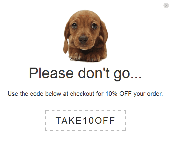
With this tactic, you are offering a potential buyer a benefit through which he or she will buy your product and manage to save a certain amount of money, too.
Use Psychology
In a certain sense, you control what a visitor to your website will do.
When you create a pop-up that makes the offer extremely attractive, you influence people to accept it.
That is why it is important that you know your target group. It is not enough just to know what they need, you also need to know how to offer them.
And pop-ups are a great opportunity to do that.
In the following examples, we will show what kind of psychological impact pop-ups can have.
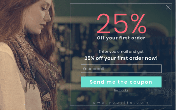
What’s the first thing you noticed on this pop-up window?
Let us guess!
Discount, right?
This is because it is logical that bright red colour and a significantly larger font will first attract attention. This actually reflects the benefit that visitors will get if they leave an email address.
Red actually sparks urgency, and we all know that a percentage sign actually indicates a discount and a reduced price.
Another thing that we will easily notice is the CTA button in a completely different colour than the rest of the pop-up, and this button exactly is the one thing that separates the visitor from a great discount.
Just one click and the coupon is his.
With this kind of pop-up, you have actually encouraged the visitor to become your customer thanks to a smart selection of elements and a design that will realize its psychological impact on the target group.
Let’s analyze one more example.
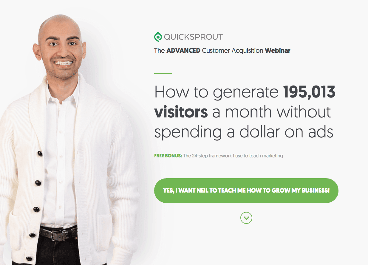
In this example, we see well-known marketing expert Neil Patel offering website visitors the ability to generate a large number of leads without spending money on ads.
This copy already seems very interesting to the target group, wouldn’t you agree?
And why will this example have a major positive impact on visitors to Neil’s website?
First, the human element is very cleverly used.
Looking at the pop-up, we literally see a man who’s the one who will provide us with an answer to what interests us.
By using the human element, people actually associate with the brand and unknowingly develop a certain dose of confidence.
Second, the figure used in the copy seems very realistic. The reason is that the figure is not rounded, but it looks like a sample obtained from certain studies.
Consequently, Neil builds some credibility.
Lastly, of course, we have an extremely striking CTA button, again, in a vibrant colour that literally invites us to click on it and find out all about tips that will make our business grow!
As you can see, psychology is at the root of these pop-ups.
Based on what is on the pop-ups, we cannot force people to do something, nor we should, but we can create such an “atmosphere” that they wish to take some action.
How to Write Compelling Copy
Compelling copy is an essential part of every pop-up.
Regardless of whether it consists of a few words or a couple of sentences, its purpose is to present the offer in a catchy and “hard to refuse” kind of way.
How can we make such a copy?
Follow these steps.
Understand the Target Audience
Identify who you address. What’s your target audience’s age range, gender, what kind of business are they into, what interests them, what they need, and similar. These are important questions that need to be answered, and the more you can find out about your target group, the easier it will be to know what kind of communication is needed.
Be Precise
A copy is not an article in your blog section. It is a key sentence whose job is to make an impression. So do not explain in the copy what the visitor will receive in an email, for example. Select one or two most important items. Present the highest value.
Make Copy Readable
If you are addressing a narrow audience that belongs to a certain niche, it is understandable that you may use some words that are familiar to them only, and that is perfectly fine. But don’t use complicated expressions just to try to blow your audience away, because you will actually get the exact opposite effect.
Break the Text of the Copy
If it is necessary to list multiple important items in the copy, do so with bullet points or simply separate each segment. This will add readability, and after only catching a glimpse of it people will know what it is about.
Use Power-Words
Power words are words that carry a certain effect with them, and they actually carry all the weight of your copy.
For the sake of clarity, take a look at these 20 examples of these words that you can use for your pop-ups.
Exclusivity: Only, Elite, First, Luxury, Trend, Secret…
Completeness: Detailed, All-in-one, Ultimate, Complete…
Simplicity: Simple, Basic, Step-by-step…
Excitement: Intriguing, Trilling, Fascinating…
Greed: Affordable, Free, Immediately, Instantly…
See how power-words are used in the following Livechat example.
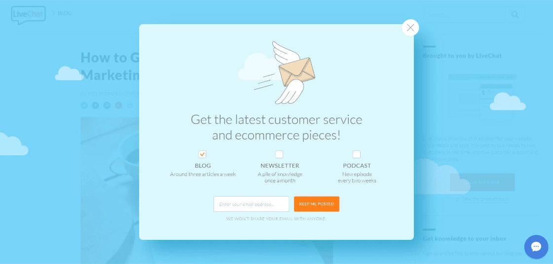
Words such as “get” and “latest” create this effect of the need for anyone interested in a topic to want to find out as soon as possible what information is hiding.
Words like this definitely deserve their epithet!
How to Find Perfect Context
We have already mentioned that successful and highly-converting pop-ups need to be put in the right context.
We certainly do not want our offer to confuse visitors.
In what sense is a pop-up just a continuation of content?
Let’s say you do dropshipping. You have several different products in your store.
Imagine that a potential buyer is currently in the kitchen goods category and begins to explore what you have to offer. You know he’s interested as he has spent some time on the page, and the time has come to show him a pop-up.
Of course, your goal is to sell as many products as you can, but if you show him a pop-up with a gardening-related offer at that moment, you will just turn his attention in the wrong direction and create an annoying effect.
Instead, you can show him a pop-up informing him that if he buys three products in the same category, the fourth will come for free, or offer free shipping, and similar.
This will encourage him to make a purchase.
That’s why it is important to find the perfect context.
The easiest way to do this is to look closely at your website and see where the ideal pop-up opportunity lies, which will surprise the visitor in a positive way and offer him something of value.
The Bottom Line
This may seem like a lot of work, but in fact, all these best practices are very easy to implement.
Remember that whatever you do, you need to have your ideal customer in mind. This will make it much easier for you to make the right decisions.
Creating pop-ups themselves will also not take you much time, because today there are tools like Privy alternatives that allow you to have a window ready to be placed on your website in minutes.
Poptin also gives you the option to test different pop-ups and find out which perform the best.
After that, your highly-converting pop-ups are ready to bring you more sales in less time than you ever expected!
Doesn’t it sound like a fantastic idea to start right away?
computer user -DepositPhotos


