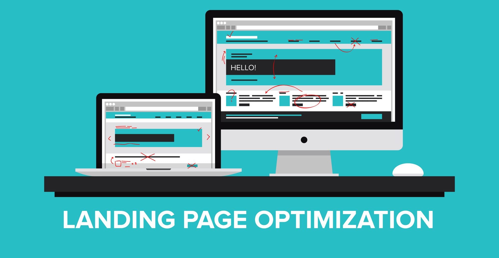
A landing page is a page that your visitor lands on after clicking your promotional ad or mail. It can be a page on your website or a separate page created for a specific campaign. Landing pages play a crucial role in customer acquisition. For most businesses, it’s where conversions take place. It is considered the make or breakpoint in the sales funnel. A good landing page brings good ROI.
What Defines a Highly Converting Landing Page and Why You Need It?
Your website can contain too many menus, links, posts, and more that could distract the attention of the visitors. Whereas, the landing page focuses on one single action – conversion. A landing page helps in increasing the response rate of your visitors and letting them perform the desired action. You can achieve better marketing results by redirecting them to a highly effective landing page.
So, what’s the secret to a highly converting landing page? Is there any golden formula that the digital marketing consultant follows?
Creating a powerful landing page is not rocket science. With the right digital marketing tips and techniques, you too can create one.
What Is a High-Converting Landing Page?
A high converting landing page should highlight your product’s key features and its benefits. The page should concisely deliver the message and use language that require no further explanation. Over the years, it’s become clear that there are a few key elements in common that make a landing page highly converting.
6 Key Landing Page Elements
1. Killer Headline
A headline is the first thing that the visitor notices when they arrive at your landing page. Make it interesting, informative, concise, and crystal clear. A prominent and benefit-driven headline that conveys a specific fact can lure visitors than a vague one. Headlines that are straight to the point, and solve particular problems get the maximum number of social shares.
Expert Tips
- Limit the headline to 10 words
- The headline should be more creative
- Capitalize the beginning of each word in the headline
Also, know the formula for writing the Headlines that really create a good idea for you
2. Enticing Subheadline
The subheadline is as important as the headline. Subheadline assures the visitors that they are on the right page and makes them stay. An enticing subheadline will make the people read all of your copy instead of just scanning it. A subheadline with two or three lines of copy can help maintain the natural flow of the page.
Expert Tips
- Position it directly underneath your main headline
- Give more information, but keep it brief
- Add some element of persuasiveness
3. Convincing Body Copy
Your body copy is where the trick lies that drives the visitors to perform the desired action. The copy helps in attaining your landing page goal – conversion. Your copy should outline the benefits more persuasively and compellingly. You can make your copy compelling with the help of good content. The content is what speaks to the visitors. So, make it more interesting and unique.
Expert Tips
- Add bullet points to the copy
- Highlight important points
- Use an attractive or memorable phrase
4. Use Visuals Effectively
Human brains respond quickly to visual information than to text. Thus, adding images and videos to your landing page can create a good first impression and present your copy more engagingly. This can also provide an extra push to your landing page. Ensure that the visuals are relevant and consistent with your content and offers, and are of high-quality.
Expert Tips
- Use actual photos of your product or service
- Use images of large size and high-quality
- Use videos to describe an offer
5. Make a Clear Offer
If a prospect lands on your page and has no clue about what you’re offering, it’s a waste of time. Your landing page should be super clear about your offer. Ensure that your headline and subheadline explains it clearly. In some cases, you can also add a separate section to explain your offer.
Expert Tips
- Use bullet points
- Focus on succinctness and clarity in your copy
- Use simple language and words
6. Powerful CTA Button
Your CTA is your primary conversion metric and the important thing that you want your visitors to do. Ensure that your CTA button is obvious, simple, and clear. It should be compelling to get a quick reaction from the visitor. Remove any secondary links that might create confusion and make the visitors leave your page without clicking the CTA button.
Expert Tips
- Use contrasting colors to make the CTA button more visible and attractive
- Use action-oriented words
- Restate your offer in the CTA button
The Bottom Line
You need to get your landing page right, to get more conversions. You can use the above digital marketing tips to create an effective landing page. There is no one right or wrong approach. You need to keep testing as you go along.
landing page optimization concept -DepositPhotos


