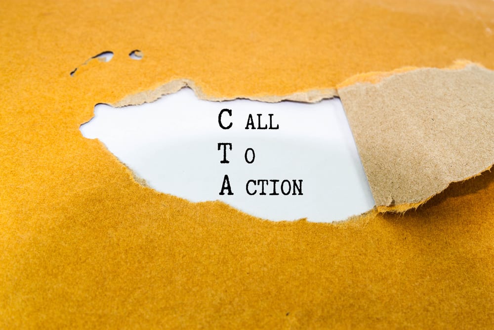
Is your CTA button being ignored? Are you not converting traffic into customers?
In the world of
So it’s absolutely imperative that your CTA is actionable and actually one that inspires people to do something. But unfortunately, it is something that is so often overlooked and ignored.
There are quite a few reasons prospects might not be nudged in the right direction. Maybe your CTA isn’t visually appealing, or perhaps the copy just doesn’t have the strength needed to push them toward a click.
So how do you go from having a call to action that’s largely overlooked, to one that’s enticing and actionable?
#1. Minimize Confusion
One of the primary reasons prospects aren’t responding to your CTA? They don’t even know where it is or where it will take them. It is either too vague and criptic or it just doesn’t stand out and is unnoticeable. You have an extremely narrow window of time in which to capture the attention of a prospect and drive that person to take action. People have very short attention spans so don’t make them guess or wonder what it is you’re asking them to do, or what will happen once they take that action. Be transparent and clear and make it as easy to find as possible.
#2. Maintain Trust
Yes, you want your CTA to stand out and inspire your prospect to do something, but at the same time, if you create a claim that’s bogus or over-the-top, they’re going to lose trust in you. Once that trust is lost you’ll likely never regain it. You want people to become customers, not just click on your CTA because you used misleading wording or images to bait them. Make sure you can always deliver on what it is that you are offering.
#3. Choose Action-Based Wording
The goal is to get someone to take action so use text that reflects this. Browse through positive action verbs and try to select a few options that reflect your product or your brand. Look for action verbs that also have a precise, non-ambiguous meaning. Pair action verbs with personal pronouns to make your prospect feel as if you’re speaking directly to them. For example, using words like “I” and “me” will make your CTA more appealing on a personal level.
#4. Show Value
Many digital marketing industry experts advise that you rethink your strategy of trying to convince prospects to buy or order anything. Words like those and other similar terms are simply going to convince would-be customers that you want them to spend money. Instead, emphasize not the idea that you want prospects to make a purchase or submit their personal information, but that you want to offer them something that will bring value to their lives. Use positive wording that highlights benefits, not costs, to your potential customer. For example, rather than saying “Order Now,” consider saying “I Want To…”
#5. Remove the Work
This tip is a bit similar to showing value. You don’t want your prospects to feel as if taking action on your site will be laborious or time intensive for them. You want to make it seem not only like something they absolutely should do, but also something that’s effortless. Take out work-laden words such as download, register or sign up. All of these words and phrases indicate it’s going to take time and require work for the prospect once they click your CTA. Instead, use words that your users will associate with a sense of ease and pain-free, such as instant, free, or now.
#6. Add Urgency
As humans, we’re hardwired to respond more actively to things where there’s a time constraint or something that feels limited in its availability. Take advantage of this component of psychology by adding a sense of urgency to your CTA. For example, use wording that indicates an offer will be available only for a particular window of time or for a few people or that there are ‘limited slots available’ can increase the sense of urgency and spur people into action.
#7. Make It Visually Appealing
Digital marketers can often get so lost in finding the perfect words that they forget one of the most essential components of any CTA—it needs to be visually appealing. Prospects’ eyes will be drawn to a call to action button that looks not only attractive but also streamlined and modern. It should be easy to spot but not overwhelming. It’s also a good idea to include a frame, such as a box, which will define the CTA in comparison to the rest of the objects around it.
#8. Choose One CTA
Perhaps you would think that if one CTA is good than using two or three CTA’s would be great. In reality, though, more multiple CTA’s can be confusing and overwhelm your users. So, if you are not sure which CTA will work best, instead of splattering your site with CTA’s in every corner, consider A/B testing them each separately to see which one performs the best and gets the most conversions.
Getting Your CTA Right
Once you’ve taken account of the above tips for creating a powerful and impactful call to action you can begin testing the results. Your CTA isn’t an afterthought, but rather should be a central focus of your marketing and advertising strategy, and it’s the primary way you’re driving the behavior of prospects and creating conversions.
Images “ Call to action text on brown envelope / Shutterstock.com“
________________________________________________________________________________
Tweak Your Biz is a thought leader global publication and online business community. Today, it is part of the Small Biz Trends stable of websites and receives over 300,000 unique views per month. Would you like to write for us?
An outstanding title can increase tweets, Facebook Likes, and visitor traffic by 50% or more. Generate great titles for your articles and blog posts with the Tweak Your Biz Title Generator.


