With every blog setting a new bar to raise to for lead generation every day, it is impossible not to be using the power of a blog to increase conversions. Blogging is considered to be the best of the marketing strategies and blogging the right way through will make you see a positive outcome in your ROI like 82% of the inbound marketers who frequently blog.
Before we get to that, you must know that
“Companies that published 16+ blog posts per month got almost 3.5X more traffic than those blogging 0-4 times a month.”
What other than Content affects Lead Generation through Blogging?
Contrary to popular beliefs, blogging doesn’t mean staying within the boundaries of content. Other than letting your content stand out through exclusivity, there are various other elements that must be considered so that your blog does get read amongst the 6.7M people who publish blogs on blogging websites.
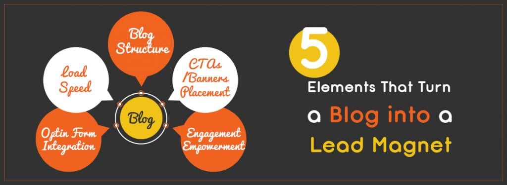
Lead generation from your blog heavily depends on the following five factors after you are done with writing an amazing and engaging piece of content.
- Blog Structure
- CTAs/Banners Placement
- Engagement Empowerment
- Optin Form Integration
- Load Speed
Various famous brands and influencers have used the above mentioned points in various surefire ways to convert their blog into a lead magnet.
Blog Structure
What according to you would make a blog structure a good one? Or better yet – when you land upon a blog, what are the initial few things that you would consider before reading the blog?
Would you bother reading a blog if the blog page doesn’t provide you with a good user experience? And what makes up a good user experience?
User experience is judged by various factors like easy navigation, search functionality, visibility of the list of blog categories on the blog page because more than 83% of internet users are likely to leave a webpage if they feel they have to make too many clicks to find what they were looking for.
Expert Tip:
Don’t mess up with the familiarity of the menu, navigation functionality and search functionality, in short the blog structure, for the sake of creativity.
CTAs/Banners Placement
You must know that there is nothing worse than a CTA shoved right into your face when you’ve just stepped into a blog page. What a waste of a well-designed CTA!
Now there are various ways in which you can save the efforts you spent in designing the CTA by coding it in ways that the CTA brings in conversions, the way it was meant to.
You should be aware of the fact that more than 90% of visitors who read your headline copy also read your CTA copy.
If a CTA pops up after a certain amount of time or after a certain deal of scrolling, then those CTAs have more chances of being a gateway for conversions rather than the CTAs that are thrown into the face of the users even before they have had a chance to go through the blog for a couple of seconds.
Users prefer learning about the CTA before clicking open a CTA. Neil Patel found a 17% reduction in conversion by placing his CTA above the fold.
Expert Tip:
The placement of a CTA must be decided on the basis of user behavior analytics because Personalized CTAs convert 42% more visitors into leads than untargeted CTAs.
Engagement Empowerment
Post engagement rate on Facebook is 75% in the first 5 hours. Now think about all the engagement you would be risking by not providing the social sharing counter on the right place.
Given below are the places where you most commonly find the social sharing buttons to be.
- Above the fold
- Below the fold
- Right side of the post
- Left side of the post
- Within the post
You even get the option to opt for a sticky social sharing counter. Even though it is tempting to put up social sharing buttons just about everywhere, you must know that it will affect the load speed, making the blog page load slow. The more the social sharing buttons, the slower the load speed of your page.
But then, social sharing buttons are the surefire ways of showing social proof. So how to add Social Sharing buttons and make sure your blog page doesn’t load super slowly?

Expert Tip:
You can opt for sticky sidebar social sharing buttons since that would help the users find it easily instead of having to scroll around a lot to find the social sharing buttons to share your post. Adding a social share button above the fold will save your users from having to scroll all the way down to share your content.
Optin Form Integration
Optin forms bring in conversions if used and placed right. There are many ways to integrate an optin form within your blog. The fewer the required form fields, the easier and the more trustworthy it is to the users. That increases conversions, without being said.
The three most conversions attracting optin forms are those that are placed on the sidebar and at the bottom. You can also place it somewhere in between the post after the information related to the offer in the optin form has been disclosed in the content placed above the optin form.

Load Speed
Now this is something on which lies the dependence of right about everything from the name of the brand to the services it provides. Even if your blog page is extraordinarily beautiful, is inclusive of exclusive content with an engaging style, it is not going to be read if the page loads slow.
A 1 second delay in site load speed led to an abrupt increase of 8.30% in bounce rate, decrease of 3.5% in conversion rate, decrease of 2.1% in cart size and a terrible 9.4% decrease in page views.
And if an eCommerce site is making $100,000 per day, a 1 second page delay could potentially cost you $2.5 million in lost sales every year.
There various ways to increase the speed of your blog page.

Expert Tip:
You could enable Google AMP for your website. It will not only push your page up the SERP, but will also make it appear under the header of Recent Stories, a place reserved for AMPed pages.
Key – Takeaways
To wrap it all up, here’s what you can do: –
- Strategize your blog structure in accordance to your target audience.
- Place CTAs in a way that they are in context to the information given in the blog.
- Include social sharing buttons in various places so that users can share your content whenever they want to.
- Integrate optin forms in ways that they only pop up after sufficient information regarding the offer in the form has been given.
- Integrate Google AMP so that the page loads fast and decreases bounce rate.
Happy Blogging!


