The choice of color can make or break your website and branding.
Humans are very quick to form a perception of products using a variety of factors.
One of the main cues we use to form our perceptions is color. When seeing a product for the first time, the brain will make a quick assessment of the product based on its color(s) as well as other visual factors.
The same thing happens every time you visit a new website, see an online ad or look at a product in the grocery store. Color is always shaping our perceptions.
This is why it’s so important to consider your choice of colors carefully. A poor choice will result in negative perceptions.
In this article, I will be exploring the use of color in websites and the influence it has on branding.
I’ll explain the subconscious influence of color. And you will see both good and bad examples of how color is used in websites to shape perceptions.
The Psychology of Color Choice
Every color is associated with certain characteristics, both positive and negative.
For example, the color green is associated with freshness and the environment.
Many of these associations are subconscious in most people. We don’t consciously think ‘this company uses green on their website so they must have a fresh and environmentally friendly product.”
Instead, our subconscious mind forms these perceptions based on pre-existing associations.
Colors will influence our impressions of both brands and people. We naturally form impressions of other people based on the color of their clothing, among other factors. In fact, it’s said that 62% – 90% of first impressions are based on color.
When selecting colors for your website or landing page, it’s important to understand your target audience. The age, gender, location and culture of your audience should be taken into consideration.
Colors can be perceived differently depending on a person’s age, gender and cultural background. It’s also important to understand what colors appeal to your audience.
Gender-Based Color Preferences
Men and women have different color preferences. Generally, women report that blue, purple, and green are their favorite colors. Pink is further down on the list.
Men prefer blue, green, and black — colors that are seen as manly.
Overall, men prefer earthy colors. Using darker shades of earth colors is recommended if you’re targeting a male audience.
Colors can be used to signal to your audience who your ideal customer is quick. If your brand is specifically targetted towards one gender, you can broadcast this through your use of colors.
Colors And Their Associations
Colors trigger associations at a subconscious level.
Red is associated with passion and is known to increase appetite. That’s why the color red is often used in the food and beverage industry.
Blue is the color of calm, integrity, and trust. Many banks and investment firms use blue to convey a sense of trustworthiness to customers. Unlike red, the color blue is less likely to be used with food products, as it’s known to suppress appetite.
Black and dark purple are associated with high-end items, such as luxury cars and jewelry.
Yellow is the color of sunshine. It’s associated with happiness and positivity.
It’s important to consider color associations can vary between cultures. For example, white calls purity and virtue in the Western world, which is why brides wear white. In parts of Southeast Asia and India, white is worn to funerals and is the color of death and mourning.
As Jessica Class highlights in her article on color psychology, our interpretation of certain colors is also influenced by past experiences.
Understanding these color associations gives you the power to shape people’s perception of your brand. You should think about the message you want to send to your prospects and select colors that are consistent with this message.
To make this clearer, I’m going to use examples of real websites to demonstrate exactly how colors shape perception.
Example 1: Sobek Fitness
This first example is from Sobek Fitness gym in Indiana, Pennsylvania.
Their color scheme instantly signals to the viewer what type of gym they are and who it’s for.

The black and dark grey creates a perception of power and strength. This is likely to appeal to potential customers seeking bodybuilding and strength training.
The green provides a nice contrast to the black. It makes the gym appear more welcoming than if they were only to use black and dark grey.
Green is an appropriate choice for any fitness brand, given that green is commonly associated with health and wellness. But the shade of green is important here.
A lighter green would create a perception of natural health and wellness. Lighter shades of green are likely to be used in branding for yoga studios or naturopaths.
By using a darker shade of green, Sobek Fitness can maintain their perception of strength and power, while also making their gym appear more inviting.
Example 2: Prestige Agents
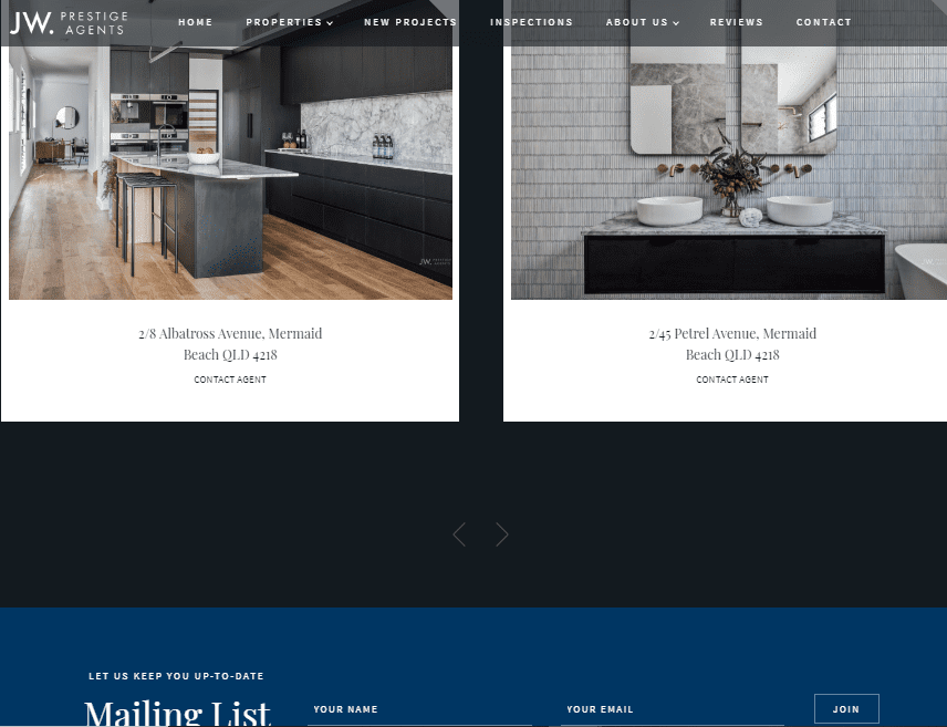
In this second example, luxury real estate agency Prestige Agents provide a great demonstration of how color choice can create a sense of prestige.

The dark grey and black used on this website create a perception of exclusivity and luxury. High-end brands like Chanel, commonly use black to convey exclusivity.
You can see they have also used a dark shade of blue, which helps to create a perception of trust.
This shade of blue is similar to that used by other brands who need to create a sense of trust. This includes brands like Merrill Lynch, PayPal and Visa. For each of these businesses, being able to develop a sense of trust is essential to their business.
Example 3: Oesterlein Coaching
This example demonstrates how just a slight change in the shade of a color can make a big difference in perception.
In the previous example, we saw how the right shade of blue is used to create a sense of trust for brands like PayPal, Visa and Prestige Agents.
But a slightly different shade of blue can actually reduce trust and credibility.

The website above from business coach Ron Oesterlein uses a similar but brighter shade of blue compared to Prestige Agents. This subtle difference leads to a major difference in perception.
As a coach, it’s particularly important for Oesterlein to convey a sense of authority and trustworthiness. But his choice of colors and overall website design fails to do this. In another post, I show how life coach Lisa Jeffs is able to create a perception of authority using strong colors and an effective design on her website.
Unlike the previous examples, it’s unclear who Oesterlein’s target audience is based on this color scheme. In the previous two examples, it was almost instantly apparent who the ideal customer was based on their colors and designs.
Overall, the website design and color scheme are likely to send an unfavorable message to website users. This reinforces the importance of understanding your target audience and choosing appropriate colors to appeal to them.
Example 4: Dentists
Dentists understand that there is a lot of stress and anxiety associated with a visit to the dentist. For this reason, most dentists choose to avoid colors that could perpetuate those feelings.
Research from Minnesota State University found that red environments tend to create a stress response, while green, white and blue environments have a more calming effect. For this reason, nearly all dental practices like Coomera Smile Dental tend to use light shades of green and blue in their branding.

These light colors have a positive, calming effect on the viewer. This helps their clients to feel more comfortable in visiting them and reduce the stress response.
But in the example below, we see that Aider Dental has chosen to primarily use the color red on their website.
This color choice is likely to create a stress response in the viewer and resistance to visiting this dentist.

This highlights how important it is to consider the nature of your product when deciding on color selection. While the color red can create a positive perception when used by a restaurant, it can also create a negative response when used in other industries.
Summary
Color is one of the very first things a prospective customer notices when they visit your website.
Users will subconsciously form a perception of your brand based on the pre-existing associations they have with the colors used on your website.
This can work in your favor by creating a positive impression. But the wrong choice of colors will create negative associations and a bad impression.
When designing your website, consider your target market, and select colors that appeal to that demographic and convey the values you want to be associated with your brand.
There truly is only one chance to make a good first impression. Always consider the underlying message that you’re sending to your audience through the colors you use in your branding.
color wheel -DepositPhotos


