In this article, we will provide you with some general information on the psychology of colors. You will also learn how to employ the latest color psychology trends in your website design and convey the right positive customer perception for your business/product.
Colors are powerful ingredients of a website. They provoke a strong psychological impact on people’s behavior and consumer decisions. In today’s marketing landscape, they are used as strong catalyst to affect human behavior and purchase state of mind.
Knowing how to effectively use colors in branding, helps you send a positive message on the market, boost sales, improves your advertising and encourages customers to purchase. Colors are the first eye-catcher and leave a lasting impression. They can even be the sole reason that someone purchases a product. This makes colors a strong player when it comes to web design.
Prior to aligning your color scheme with the message you want your website to deliver, it is essential that you learn more about the emotional power of colors. The single best thing to do is dive into the psychology of colors so you can best decide on the best color scheme for your webpages.
Blue – used for all types of businesses, especially for those stressing on loyalty, stability, reliability. It is also a good move for tourist agencies, yacht companies, leisure and cruising business.
Red – frequently used by fast-food chains, businesses producing energy drinks, food. Provoking a feeling of speed, energy, and desire; they are appropriate to spot clearance and sales.
Yellow – related to happiness, warmth and sunshine, yellow is most commonly chosen by businesses operating in the field of social events and activities, fun clubs and disco bars.
Orange – evoking the feeling of friendliness, trust, energy, confidence, ambition and optimism, orange is a great pick for companies involved in the e-business, technology and social communication. Orange is also the brand color of Puzl.
Pink – mainly considered to be a gender defining color, pink is generally used for girls’ and women fashion industry.
Green – identified with health, tranquility, ecology and nature, money and wealth, it is used in the green industries, relaxation centers and environmental organizations, organic and eco friendly products. In relation to money and wealth, green is also a good decision for businesses specialized in accounting, financial securities, investments funds, etc.
Purple – symbolizing royalty, dignity, wisdom, purple is appropriate for businesses dealing with finance, higher education, relaxation.
White – embodying purity and tenderness, white is preferable for charity associations, relaxation and spa saloons, wedding houses and technology items. It is also the main component of most other colors.
Grey – associated with business wisdom and seriousness, it is most commonly used in fields such as Manufacturing, Information Technology, and Consulting Industries. Grey is also preferred by lawyers, and medical professionals.
Black – expressing authority, elegance , sophistication , black is used as a symbol of intelligence, aristocratism, prestigious lifestyle. It is a good matching color for automobile industry and jewelries. Black is often preferred by web designers as it symbols luxury and proficiency.
Here are few examples of websites to help you understand the color choices according to the psychology of colors:
John’s Yachts
In the yacht site the blue color scheme has been applied to naturally relate the yacht vessels business with the aquamarine landscape. Being a symbol or reliability and prosperity, blue is a good option for showing trust. Some fading blue effects were used to make refined ocean feeling. In terms of text, the Highlight option of the text editor has been chosen to put an accent on content. Predefined to be in blue again, it greatly conforms to the color scheme of the entire design. Titles were also chosen to be blue-colored.
This wedding site is designed in a white-grey scheme. The choice of white symbolizes purity and finesse. It is a typical color for weddings celebrations and evokes feeling for happiness, beauty, luxury. Grey keeps the overall light appearance of the site and finishes the final look with style and elegance. Using dark red for the titles is associated with emotions, love, and royalty.
Having a better idea of the colors psychology, you will now be able to fully benefit from the colors of your site and let it effectively work for your business. Don’t hesitate to leave your insights on the marketing power of colors and share your helpful opinion on how they help you influence your customers and reach business goals.
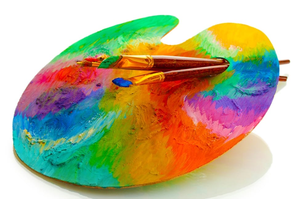
Images: ”wooden art palette with paint and brushes isolated on white / Shutterstock.com“
__________________________________________________________________________________
 Connect with Tweak Your Biz:
Would you like to write for Tweak Your Biz?
Tweak Your Biz is an international, business advice community and online publication. Today it is read by over 140,000 business people each month (unique visitors, Google Analytics, December, 2013). See our review of 2013 for more information.
An outstanding title can increase tweets, Facebook Likes, and visitor traffic by 50% or more. Generate great titles for your articles and blog posts with the Tweak Your Biz Title Generator.
Want to get your business featured on Tweak Your Biz? Check out #TYBspotlight


 Connect with Tweak Your Biz:


