Let’s assume a time when smart phones were new to the world. Developing websites were becoming increasingly popular and developers were gaining knowledge while working on a website. At such a time, developers used to create different website for the different devices. For example the website for a PC did not match in size to the website for a mobile which made it difficult for consumers to view the same website on mobile. So, there was a separate mobile website in which companies invested money while developers invested their time and energy.
But, at that time websites and mobiles were gaining popularity. Today it is slightly different. Mobiles and websites are a given and hence developers can’t really keep developing separate websites for both devices every time. This is where responsive website design grid came into being. Responsive web design allows you to design the website once and resizes itself as per the device. So, you won’t see any issue when you view a particular website on a PC, tablet or smart phone. The website automatically resizes itself as per the device size and shape.
When you are talking of responsive web designs, you also need specific tools to help you build on their responsiveness. Firstly, you need responsive grids and wire-frames which will help the responsive designs. Secondly, you need responsive images and typography that will match the design while the third major tool would be testing tools to check the responsiveness.
Here you will find an exhaustive list of responsive tools necessary for grid designs to make viewing and navigation of responsive designs absolutely comfortable.
#1. Bootstrap Framework
It is one of the free responsive web design frameworks which works using CSS and Javascript to design the site. You can always customize the code bloat or remove it in order to increase the loading speed. It speaks volumes of documentation and representation. It is compatible with both HTML5 and CSS3 which is pretty useful to all the web designers and developers.
#2. Skeleton Framework
Another interesting and popular grid tool that is used by most designers indulging in responsive web design! It is a purely CSS based framework. It is a 960 grid system but developers can resize and accommodate it as per their device size and development purposes. It’s lightweight, loads fast, responses well and is pretty neat to use.
#3. Semantic Grid Framework
This grid tool and design is pretty popular because of the pre proceeded CSS extensions that come along with it. You can modify the number of columns, the width of the columns and the width of the gutter at any point using this framework.
#4. Less Framework CSS Framework
It is basically a four set web layout which has predefined layouts for PC, laptops, tablets and mobiles. It is based on the simple grid layout that has been quite popular with developers. It uses the adaptive CSS grid module that resizes and adapts as per the screen size and the device type.
#5. Golden Grid Framework
In case you are looking to begin structuring your grid framework, you could begin with the Golden grid framework. It could be the starting point for your responsive website design grid. It comes with proportion gutters so that you can arrange your content to a resizeable format that can be used on any device. The baseline grid can be zoomed and viewed using this framework.
#6. Gridless Framework
With gridless, you can use HTML5 and CSS3 boilerplate to design and develop interesting and responsive websites. It is an open source tool for grid frameworks. You get interesting typography with this framework and it also comes with the internet explorer bug fixes which are helpful to you for sure. It works with feature phones too for a great many reasons so you don’t need smart phones to actually make these websites work responsively.
#7. Gumby 2 Framework
It comes with the Sass CSS preprocessor that is pretty popular. It is one of the major tools used for responsive web designs. You can customize this framework to suit your design and development needs. It has responsive images, intrinsic ratios, video embed, buttons, toggles etc. that is needed to build an amazing website. Typography that is important to a website can also be taken care of using this framework.
#8. Columnal Framework
It’s a mashup framework. All the best possible tools of the other framework come along with this one making it an interesting framework. Debugging and building a responsive website design grid is pretty easy with this framework. It uses the popular CSS tool, so it is relatively simpler to use and build on.
If you have any suggestions please let us know in the comments below.
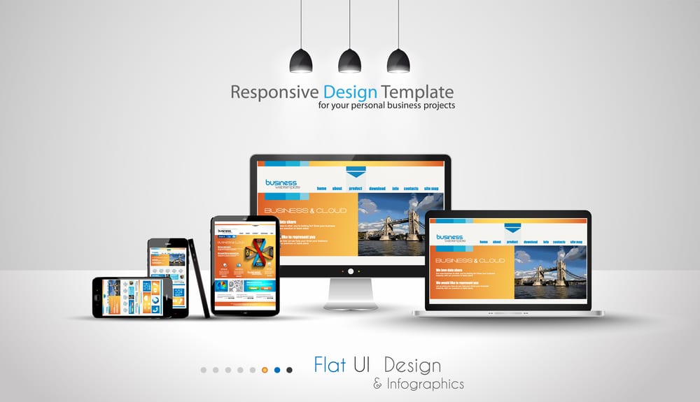
Images: ”Modern devices mockups fpr your business projects. webtemplates included. / Shutterstock.com“
__________________________________________________________________________________
 Connect with Tweak Your Biz:
 Connect with Tweak Your Biz:


Would you like to write for Tweak Your Biz?
Tweak Your Biz is an international, business advice community and online publication. Today it is read by over 140,000 business people each month (unique visitors, Google Analytics, December, 2013). See our review of 2013 for more information.
An outstanding title can increase tweets, Facebook Likes, and visitor traffic by 50% or more. Generate great titles for your articles and blog posts with the Tweak Your Biz Title Generator.
Want to get your business featured on Tweak Your Biz? Check out #TYBspotlight.