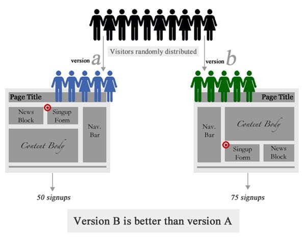
List all the buzz words in the online community, and few will get a bigger response than A/B testing. Countless articles, books and lengthy discussions are all dedicated to designing the tests, selecting the test subjects or carrying out the tests, but often no one bothers to explain why every site owner should be interested in it. This article will explain what A/B testing is, why it is important to you and how to do it properly.
What is A/B testing?
A/B testing is a form of randomised testing that companies in the advertising, marketing and web development industries use to improve their ads, marketing materials and websites, respectively. The process is fairly simple: they create two versions of an ad or website, and they provide half of their audience with one version and half with the other. The versions are monitored for their impact, and the one that performs best is the version they use from that point on.
A/B testing is used to test the efficacy of everything from the wording of sales offers on Google AdWords to the colour of the ‘Contact Us’ button.
Why is it important for you?
The short answer is: A/B testing is important to every site owner because it shows you what works and what doesn’t. It is no secret that the online marketplace is a jungle. Almost every company has to compete with international giants, local superstars and charmingly homespun enterprises. Every advantage that can be gained, must be gained, and A/B testing helps you do that.
Through focused, strategic A/B testing, site owners can improve their site design’s usability, the web copy’s persuasiveness and even the public perception of the company and its products. It can increase conversion and click-through rates, which in turn increases profit.
- It can help you see if received wisdom and conventional best practices are indeed right for your website and your audience.
- Sometimes, sites get more people signing up to something when the registration form is front and centre on the home page.
- Sometimes ugly pages with lots of dense text performs better than a sleek, stylised page.
- These have both been discovered by real people using A/B testing, instead of just trusting that general, timeless advice is always right in every case.
A/B testing can help you see if sweeping changes to your major design elements are received well or poorly by your target market. It can help you shape your layout and even improve your copy. It can even help you make tiny changes to colours, shading and positioning that, whilst costing almost no money to test and implement, can make a big impact on your bottom line.
A/B testing is how you prove your design theory right or wrong.
How to create accurate, helpful A/B tests
As with most research, the quality of the results depends completely on the quality of the experiment. Creating accurate A/B tests that give you helpful results is simple enough, but you have to be willing to take the time and effort to do it right.
- First, figure out where the site design is letting you down. Look at your site analytics. Are people clicking the right buttons? Are they following the steps you want them to? What do they linger over, and what do they miss. Then get user feedback. Use very short, tailored surveys to get actual customer opinions on matters like usability, layout and design impressions. You can use these together to determine the weak spots in your site design.
- Second, predict what you can do to improve, based on the feedback you just analysed. This will help shape the B version of your site, as you will keep your original design as your A – or control – version.
- Third, design your experiment and start testing. Change just a few things at a time, so you can determine which elements work and which ones don’t easily. Keep re-running the test until you are sure you have got the main elements right.
- You must base your permanent design changes on the evidence. You may have to ignore your assumptions, instincts and training, but if you want to make the site that attracts and retains customers, you may have to accept that your sublime taste just doesn’t work.
- Finally, make a list of all the things on your site, from headlines to button colours. Test each one of these to see if you can improve them. The big wins will jump start your success, but the little amendments will help you take your business to the next level.
Conclusion
A/B testing may at first glance seem like a waste of time from a design perspective, but it is a clear way to get solid data about design elements that we assume are subjective. It shows which colour attracts more clicks on any given button. It indicates the best location of forms, paragraphs and more. It even reveals what your customers are looking for in your site. It does all this and helps you improve all of this, without being beholden to conventional thinking about design.
That is why it is so important to your design.
Did you like this article?

- Please share it with your network, we’d really appreciate it!
- Would you like to write for Tweak Your Biz? Or sign up for our RSS?
- An outstanding title can increase tweets, Facebook Likes, and visitor traffic by 50% or more. Generate great titles for your articles and blog posts with the Tweak Your Biz Title Generator.


