With more and more eyeballs staring at the mobile devices, it is vital to make your landing pages optimized for mobile. It is a key for outstanding conversion rate optimization. In fact, most people must be reading this blog on their phones. And, it is a big piece of the pie.
Building a perfect landing page for your app, which is both visually compelling and high-converting is incredibly important. This stand-alone page can make a difference between the success and failure of an entire business or idea. This is because when the app launches, it requires so much time and money and there is a lot of pressure placed on how the landing page will perform.
The demand for apps has been increasing in the market. So, the presentation of your app in the App Store makes your app stands out from the competitors. When it comes to making users to download the app, it depends on the included elements in the app landing page.
In this blog, we will showcase a few vital ingredients on how to optimize mobile app landing pages.
Essential Ingredients to Optimize Mobile App Landing Pages
The first impression is the last impression. And, it could be possible only if you would take care of landing pages while designing for the app. Difficult to navigate the mobile app can break your app campaigning strategy. After all, your goal is to engage people and increase conversions. So, you need to be very cautious with landing pages for mobile app. The most essential ingredients to optimize mobile app landing pages are outlined below.
#1. Clear & Persuasive Call-to-Action (CTA)
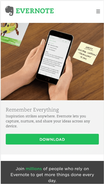
CTA destroys decision fatigue and confusion. CTA tells your prospective clients what to do and where to go next. A persuasive and clear CTA prompts your users to perform certain actions or visit a specific mobile app page.
If your app is already available on the App Store, you need to convince the users to download it. Or, if you are planning to launch one, then you can request your users to subscribe for the mail list to get updates.
CTA helps to drive more traffic to your app. As its name implies, CTA entices customers to take immediate action. Another important aspect of CTA is keeping a single visible button. The CTA button would be failed if it would not serve the purpose. The purpose is to make people convince to do act upon something. So, make sure that the CTA button is visibly clear. You can also choose contrasting colors on the page in comparison with the main page.

Image via: scriptcerto
While developing an app, you need to ponder on some other significant aspects. Like, the visual appeal of the landing page should not cover the CTA button. It means you have to strike a perfect balance between aesthetics and the CTA button.
#2. Appealing Headlines
The “headlines” is the first thing, which the reader sees. The headlines should be relevant and concise. Furthermore, the headlines need to be catchy and unambiguous that can spontaneously draw the attention of your visitors. You have a little space to work on. So, make sure that the word limit for the headline does not exceed more than five or six. It should be precise.
In the shortest time, you have to describe your mobile app. You may find this task difficult. You can also call it the ‘tagline’ for your app. You can use this tagline while promoting your app. Let us elaborate on it with an example, Paytm is an India-based payment app, which is used for various purposes. The headline is “Simplifying Payments for India.” These four words are short and simple. And, these words tell you the entire story of the app as it is for what used. Make the headline bold and use an accurate font.
#3. Videos & Social Media Accounts
Video is one of the essentials in the list of compulsory elements for the landing page for mobile. In the mobile app, video is much more powerful medium to attract users as compared to written content. Taking a usual poll, most people prefer watching a video for getting information. Since people are able to connect more rapidly and quickly. Don’t try to overemphasize your app in the video. Try to make it short and simple, which covers all the important points. If people would like your video, they might share it on various social media platforms.
#4. The Body Copy
This is generally the part of the mobile app landing page where you list out some strong suits of the app and its benefits. To answer your readers’ unasked questions, you need to provide as much copy.
The body copy includes the main text part of an advertisement or printed matter (logo, headline, subheading, and graphics) that provides the medium of communication.
The length of your copy completely depends on your mobile app and the industry you are in. For example, a diet and a healthy lifestyle app require less copy and more images to make users convince.
#5. Creative Logo
The main motive of the landing page is getting the response from the people in the market. In short, with landing pages, you are actually promoting your app. Thus, it becomes important to get a unique logo design.
The unique logo will not only attract people towards your app, but it will be able to frame some idea about the app beforehand. People will be able to search your app on the App Store more easily. With a unique design, the mobile app will get prompt recognition. However, if such a key element is missing in your landing page, then you will fall short although your idea may be exclusive.
Best Mobile App Landing Page Example
Here we have rounded up an example, which possesses the best mobile app landing page.
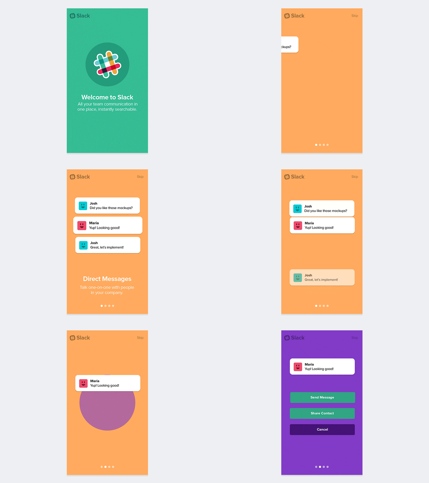
Slack
Why Slack does possess a great landing page? Here we’ve listed a few things about Slack’s landing page for mobile:
- It provides a simplified explanation of key benefits and features.
- Great use of icons to showcase integrations. And, it makes easy to read words faster.
- Easy CTA (Call to Action) button

Image via: Dribbble
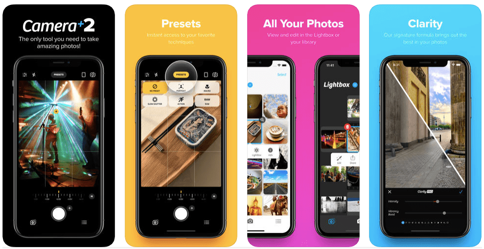
Camera+ 2
Camera+ 2 app embraces a great landing page, due to the fact ―
- Stunning colors, visuals, and gradients
- Use of icons next to the title for quick scanning
- Clever use of “tool tips” to highlight diverse features within the app

Image via: Apple App Store
Conclusion
A landing page for mobile app can enhance its entire online presence. Adopt these essential ingredients to optimize mobile app landing pages, you will experience a big difference in results.
Want to share your thoughts? You can share them by leaving the comments below.


