Is your website getting a large number of visitors but not giving you the quality results you want? Efficiently directing your visitors and persuading them to convert is not an easy feat at all.
E-commerce is the fastest growing industry, and it is expected that e-commerce sales will increase by up to $523 billion by 2020. This would open a number of opportunities for online shoppers. For online business owners, optimizing their business websites needs to be a top priority, if they really want to reach their milestones. This is the reason, competition is getting tougher day by day.
There are a number of online shopping platforms presents all around the globe, and users have no problem bouncing from one website to another in order to find their desired products. With the limitless number of options available literally at their fingertips, it is important for web marketers to go beyond to meet consumers’ needs and desires in the best way possible.
In many cases, a business website just needs a few user interface tweaks to boost conversion rates, as opposed to a full website redesign. No matter what tweaks and adjustments need to be made, it is always wise to think carefully before you do it. It is highly advised to work with careful planning and A/B testing in order to track results and opt for strategies that lead to better results and determine which ones should be ignored or improved upon. Optimizing your website is a task that needs to be constantly updating.
Here, I’ve listed amazing website hacks that marketers can use to improve website design in order to increase the conversion rates.
Website Loading Time Matters a Lot
Do you know the normal human attention span is as low as 8 seconds? Keeping this factor in mind, everything related to web, no matter if it is a website or a mobile app, needs to function smoothly, and above all, fast. Website loading time is also an important factor, especially when it comes to search engine rankings. And if you want to sell your business online, prospective customers will don’t think for a second to abandon your website if the speed is too slow.
If truth be told, a fast website is a key to get your customers glued to your website. There are so many factors that can greatly contribute to decreasing webpage speed. And if you have tried all the tweaks such as improving your web design, compressing the size of images and codes, reducing your forms fields, eliminating unnecessary plugins, then more likely, you will need to double check your web host.
If a host is a real reason behind your slow website speed, then don’t waste your time on quitting your provider, as there are countless better options available. Just make sure that you use a well-suited hosting provider based on your CMS. If you use WordPress to develop your website, it is advised to opt for some fastest WordPress hosting services for better results.
Seamless, intuitive user experience is the foundation of any online business, e-commerce platform, media publication or community forum. A website that loads faster leads to a positive UX, and a positive UX leads to fastest conversions.
Give More Emphasis on Your CTAs
Dubai Monsters and different other professional web design agencies, SaaS startups, entrepreneurs, and e-commerce business owners understand the power of CTAs and consider them as the most integral element of web design. Regardless of the user’s demographics and what type of content they are presented with, in the end, their focus needs to be on the CTA button. Therefore, it must be obviously placed in a way the user can identify it with a single glance.
Moreover, there are a lot of factors that can greatly affect the CTA button. In fact, these buttons are the most split-tested feature of any online business. Colors are most probably the most important psychological factor that results in more clicks. While there is no perfect rule to coloring your CTA buttons, it must stand out in contrast to the background layout. Preferably, it is a color that is not used anywhere throughout your web design.
Use the CTA button as a separate object without the context of the rest of the website. It should be sharp and simple with a clearly conveyed message.
By adding a more personal touch to your CTAs will increase your website conversion rate.
Moreover, positioning plays a key role in this regard. It is also advised to try different placement areas on your web design including header, sidebars, center and more. Social media and visual content consumption are indeed a bit challenging, so our users. Testing and optimizing your CTAs will likely be continuously changing project.
Display Engaging Content
Believe it or not, when a website presents valuable content, everyone will love to read. If truth be told, marketing fluff, website copy or blog post having jargons, catchphrases and revised idea, doesn’t work as it did a few years back. Consumers like reading brand material that allures them on a level they can comfortably relate to. Therefore, a good content strategy must be an important part of every online business marketing plan.
A report named “Crossing the Chaos” revealed that businesses that gave importance to content marketing increased their website conversion rates by more than 5 times.
There are many things that you can incorporate into your content marketing strategy. However, the ultimate results in all your efforts must be to create material that tells a story and provides a greater degree of value to the reader.
When it comes to marketing to millennials, it is going to be a very challenging task for marketers. The millennial generation spending power is predicted to increase by $200 billion in 2017. When it comes to buying patterns, user-generated content (UGC) has proven to be extremely effective.
Another study revealed that user-generated content is 20% more powerful than any other type of media or visual content while influencing purchases among this demographic group.
One of the best types of user-generated content is testimonials that you can display on your website. Displaying customer reviews have the power to give your brand authenticity and credibility. This will ultimately increase sales and website traffic.
This amazing form of content marketing provides more than user experience. It can boost conversion rates while allowing visitors to keep on your website. It is highly advised to carefully monitor your social media accounts in order to get the idea of your target audience and their opinions, questions, and concerns about your brand. There are some genius tools like Brandwatch and Mention that will allow you to check what others are saying about your brand, your competitors, and your niche in general.
Content curation goes beyond than a one-size-fits-all thing. Each industry has its own target audience with their own needs and preferences. The best way to stick to a successful content strategy is to create two-way material that aims to inform, market and tell a powerful band story that gives the reader a clear-defined takeaway. Don’t be afraid to show your creative flair and experiment new things. You never know which content marketing tactic works best for your business.
Key Takeaways
Being a business owner, increasing conversion on your website will be the ultimate aim of your life. You must always be testing and implementing new strategies to improve your web design to get more traffic, and ultimately more conversions. Keeping an eye on your analytics and determining more areas to improve and optimize needs can do wonders.
Keep in mind, there are innumerable options for millennials, they are prone to swap loyalties before you blink your eyes. The success lies in drawing customers to your website and providing them a positive UX that keeps them well-informed and engaged. Good luck with your website conversion endeavors!
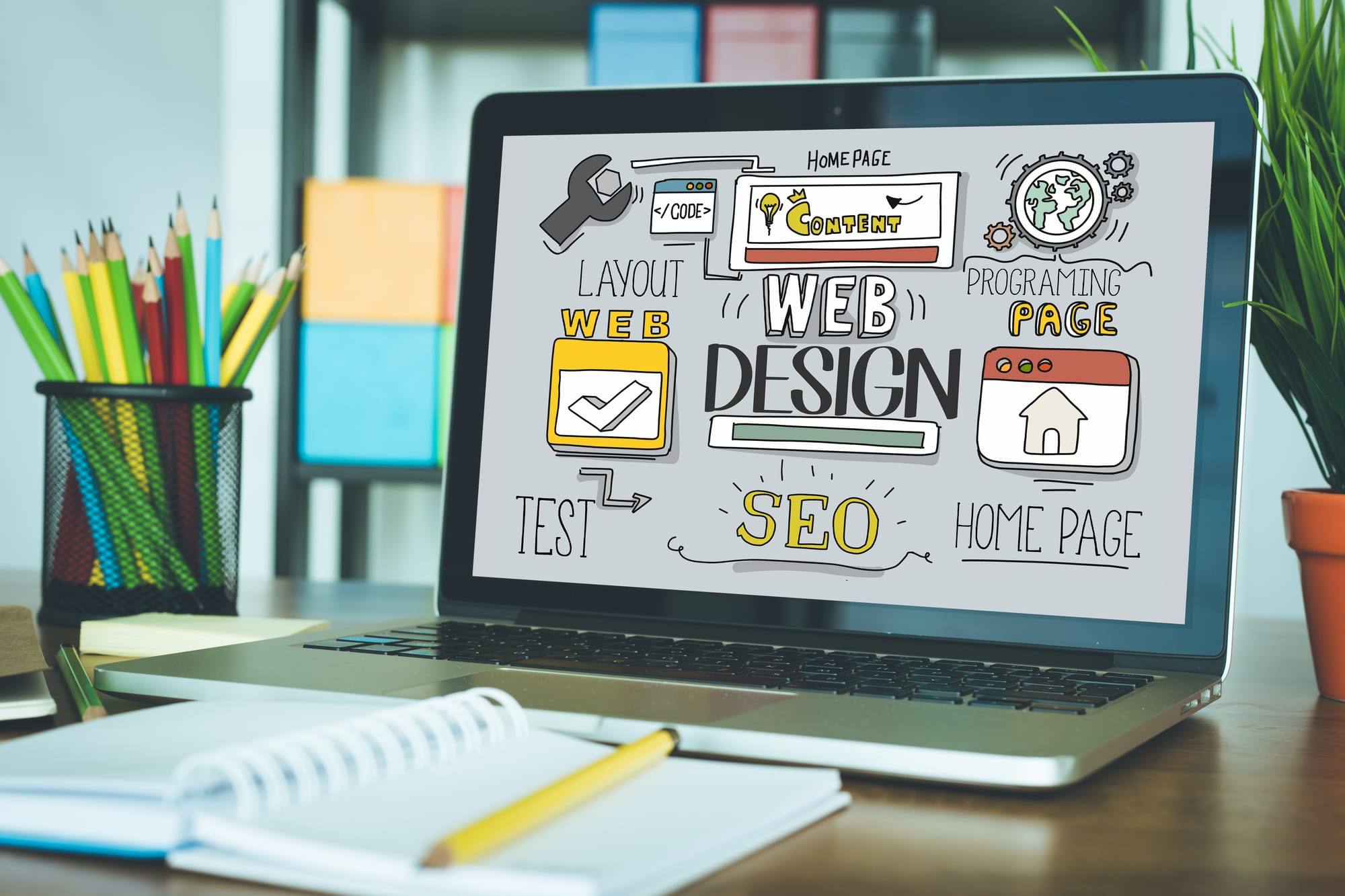
WEB DESIGN concept– stock image


