Simplicity is the watchword for the year 2015. App design through its evolution is leaving several trends in its wake. However, it is hard to imagine that there are a number of companies that have still not adopted Flat UI Design. Many of them are practically fighting the trend. Unfortunately, many companies are in the same boat at the moment as far as the design of their mobile apps goes. If your organization has not embraced flat design, now is the time to make a change.
Flat UI Design is here to stay. If your app interface is still ridden with glossy buttons and flashy gradients, you are absolutely outdated. Mobile app and web site designers are focusing more on user-centric designs, which are more digitally aesthetic. When it comes to leading mobile apps or web sites, today everything these look flat rather than clickable, bulged or beveled. This flat design style lets content speak for itself. With a clean design and clear calls-to-action, app user interfaces are extremely user-focused with key functionalities.
So what is Flat Design?
Flat digital design is basically a minimalistic design approach that lays emphasis on usability. It features clean, bright colors, crisp edges and flat illustrations. Windows 8 Operating System is an example of implementing flat design to an interface, which opposes skeuomorphic design. The implemented image icons made from the bright colors. These icons are very attractive and are successful in luring customers.
It can be predicted that this design style will still be a ruling concept for designers in the coming years. The minimalistic design focuses on simplicity and usability while only using 2D elements.
Through the removal of complicated patterns, textures, gradients, shadows and other effects, the flat UI is meant to make an app more interactive. Just because it lacks many flashy elements does not mean that flat design is boring. Simple illustrations can convey messages more quickly than detailed images. Icons that resemble images can let users easily understand them.
It is not difficult to see the key difference between a flat and skeuomorphic design. Bigger, solid color blocks can quickly be understood. This makes it easy to understand the message. Remember a site or app is typically judged by how well it works, rather than what it looks like. This is not just the shallow simplicity that comes from an uncluttered look, surface or feel of a product, but a deep simplicity that comes from knowing the essence of a product. So sites and apps that take full advantage of flat design are likely to get positive feedback from users.
How did things get flat?
The flat design trend kicked off in the world of technology as the use of mobile devices like smartphones and tablets expanded. With more and more people abandoning their desktops in favor of handheld devices, user interface designs necessitated simplicity to let users communicate as clearly as possible.
Since then, flat technology is also extensively used in the world of production design, video, print, and you name it. Complicated illustrations and concepts are being delivered much clearer than before, thanks to flat design. Thoughtfully developed and simple graphic elements can be deciphered easily by most people. The clarity of message and strong color is a great thing.
Supports different themes
Many apps support different themes. Creating themes for skeuomorphic design can be a very time consuming task. Creating new CSS files and exporting a new set of graphics requires a serious amount of extra work. However, with flat UI, these problems are things of the past.
One of the key aspects of Flat Design is the strong focus on color. Designers are experimenting with newer tones such as lilac purple, peachy red and web green.
Planning for Flat Design
If you are planning to use flat mobile design then consider user-centric and minimalistic outlook. Design without content is definitely not design but it is just beautification. While you plan for your app design, be sure to utilize superior technologies. By eliminating unnecessary decorations, it makes for speedier pages and more flexibility.
Shapes to use in flat design
The use of simple user interface is arguably one of the biggest attractions of a flat design. The icons and buttons play a key role when it comes to flat UI. The designer can use simple shapes like squares, rectangles or even circles. The edges of these tiles or blocks can take any shape. Simplicity is however the most important thing. The shapes have to be easy to tap or click. Colors also play a huge role in creating a flat design. It is important to consider them as well.
For pure reading experience, flat design focus on legible fonts, good quality photos and well thought out navigation. Gone are the days of two lines of navigation buttons. This means that less text is used, with concise, well-worded information presented to users in different font colors and sizes. All these are meant to ensure the information is digestible. Flat design generally does away with any three-dimensional elements that have been seen in the past.
Navigation is normally made easy when an app is minimally laid out and organized in a modular manner, directing the user to take action on various parts of the application. Excessive use of textual elements can become messy and distracting. But this technology is very efficient when it comes to communicating calls-to-action and providing essential information to visitors.
Final Thoughts
Flat Design is a revolution in digital design, but it all depends on how a designer implements his or her designs – and how well they understand design principles. Industry giants like Apple, Google and Microsoft have adopted this technology, which is why it will continue to gain prominence in the years to come. Flat Design will continue to evolve as more and more people embrace smart devices and mobile browsing surpasses desktop navigation within the next few years.
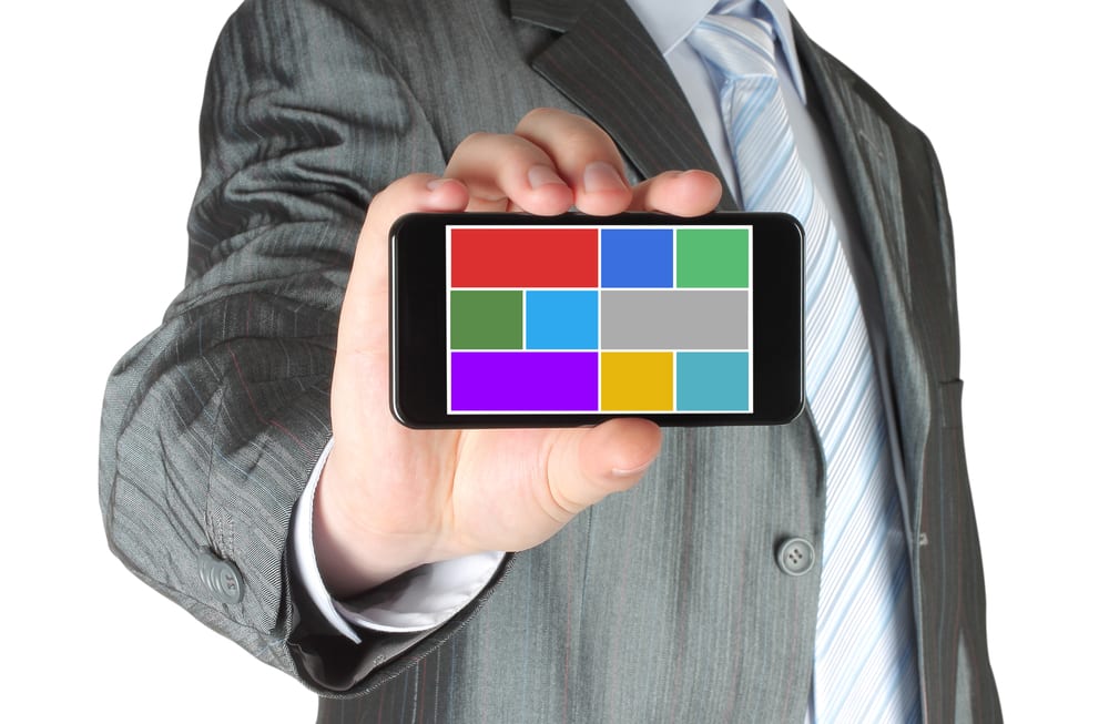
Images: “Man shows smart phone with color flat icons on white background/Shutterstock.com“
________________________________________________________________________________
Tweak Your Biz is a thought leader global publication and online business community. Today, it is part of the Small Biz Trends stable of websites and receives over 300,000 unique views per month. Would you like to write for us?
An outstanding title can increase tweets, Facebook Likes, and visitor traffic by 50% or more. Generate great titles for your articles and blog posts with the Tweak Your Biz Title Generator.


