
Mobile is the key platform for digital marketers to focus on today. Thanks to the widespread presence of high-speed internet and the affordability of mobile phones, most content is consumed on a small screen.
There’s no question that all businesses need to adopt a mobile-first strategy. To highlight the urgency of this matter, here are a few mobile marketing statistics to consider:
- There are 5.11 billion unique mobile phone users in the world
- People spend at least 3.5 hours per day on their mobile devices
- 51% of shoppers have made an online purchase with a smartphone
- Mobile commerce sales will form more than half of all eCommerce sales by 2021
And if these statistics aren’t enough, Google has announced that from September 2020, it will index and rank mobile versions of your website first. Your desktop site no longer holds the most important place when it comes to boosting your SEO. And this changes everything.
In practical terms, here’s what mobile-first indexing will mean when Google starts to prioritize your mobile site over the desktop one.
- If the content on your mobile site is different from what’s on the desktop version, then Google will rank your website based on your mobile content.
- Even if your desktop site is beautifully designed, it’s your mobile site’s appearance and user-friendliness that will impact your rankings.
- The snippets and meta descriptions that appear in search results will be taken from the data available on your mobile site.
- Google will prioritize the structured data on your mobile site over the desktop platform.
These are some pretty significant changes in
And that’s what we’re covering in this post. Here’s everything you need to know about getting your website ready for mobile-first indexing in 2020.
Use Responsive Themes
Marketers have always suggested that businesses create mobile-friendly websites. A mobile-responsive website can no longer be an afterthought. According to Google, you need to build your website so that it is optimized for mobile and then scale it up to create your desktop site.
If you have a WordPress site, this will be relatively easy to do. There are several free and premium themes available that include mobile responsiveness as a key feature. You can also work with website builders like Divi, Elementor, and several others that have a mobile view allowing you to see what your mobile site will look like.
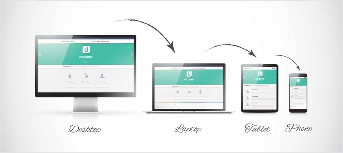
All you have to do is install a good theme or a builder plugin, and you can make your mobile site look great.
Create Content for Smaller Screens
Your mobile content is the most essential aspect of your site that you should work on. Mobile phones and smaller screens are convenient because they are portable, but they also have limitations. Especially concerning how easily we can read or consume content on them.
Here are a few essential ways for you to optimize content for smaller mobile screens:
- Prioritize content. Since mobile screens are small, it’s apparent that you cannot post a great deal of content on the home page. You need to prioritize what’s important and highlight that material. You can then progressively disclose other content in other pages through the navigation feature.
- Structure your content using headings, lists, and formatting options to create emphasis in the right places and to make your content easy-to-read
- Use short paragraphs only consisting of 3 to 4 lines and no more. This makes your content appear more scannable.
- Create casual and straightforward conversation and pass your content through an editor like the Hemingway App. It will help you identify complex sentences that are hard to read.
- Use images and videos more. The smallness of mobile screens means that reading text over a long period can lead to eye fatigue and strain. Video content is easy to view and listen to instead of large pages of text.
It’s worth mentioning the importance of video content in a stand-alone way. You need to prioritize creating video content for mobile. The most viewed content on mobile are videos, and you’ll miss out on a large section of your audience if you don’t boost your video creation strategies. Here are some essential video statistics related to mobile:
- According to YouTube, more than 70% of all video consumption is on mobile devices
- Users spend 40 minutes a day watching YouTube videos on mobile devices
- 90% of consumers watch videos on their mobile phones
- 93% of Twitter video views happen on mobile.
There are many more important statistics that showcase why video matters. The long and short of it is that you need to build your content so that it works for mobile screens. Keep your mobile consumer foremost in mind when creating your content.
Finally, make sure that the content on your mobile phones and the desktop website is virtually identical. This is because Google has announced that this is an important factor that will affect rankings.
Add Schema Markup
Another essential way to optimize your mobile site in 2020 is to use structured data carefully. What this means is that you have to add schema markup to your content to help search engines make sense of your website material.
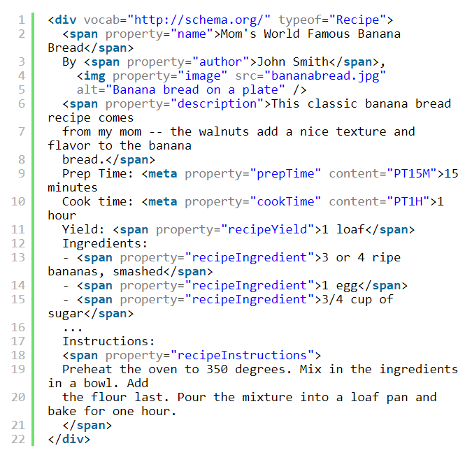
For example, think of search results for food recipes. Often, the meta description tells you the cooking time, cuisine, and other important details.

These details are presented on the search results page on Google because the sites have added schema markup to help the search engine algorithm.
Adding schema markup will make search engines prefer your content. Visit the Schema.org website and use the most relevant markup language. You can add schema manually, which will look like the following image.
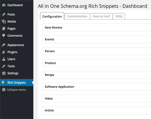
You can also use helpful plugins to make marking up and structuring your content easier. You’ll be able to enter information into specific fields and automatically create schema setups.
As a final note, you want to keep your schema markup the same on your desktop and mobile site.
Conclusion
The implementation of a mobile-first indexing strategy by Google is going to shake things up for websites that don’t boost their mobile site.
Fortunately, now that you’re aware of this critical change, you can take steps to manage your ranking and prevent your business from losing its current place. You may even raise your rankings by boosting your content and mobile site design.
The most important step you can take right now is to think mobile-first simply. When you shift your mindset in this way, you’ve taken a great step forward. Use the tips given here and also explore more UX principles for mobile to make your mobile site ready to bring in more traffic in 2020.
DepositPhotos – mobile website
- 6 Types of Search Optimization to Make You Think Beyond Google
- Love The Competition In Five Easy Steps
- You’ve Won! Now What?
- Search Engine Strategies in 2016 that Are Guaranteed to Work for Your Initiative
- Why Most Content Strategies Fail—And How to Fix Yours Today
- How to Boost Your Sales With a Digital Magazine?