Designing a landing page that clicks is not rocket science. But to create a PPC landing page that will give you both clicks and conversions is the work of pure art and science. An effective landing page design may be a combination of several factors like usability, accessibility, persuasion and trust. However, conversion is the ultimate driving factor behind every paid search strategy.
PPC ad landing pages are more than just advertisements. In fact, a high performing PPC landing page with good conversion can improve your quality score, which can actually reduce your cost-per-click and improve your Google ad rank. Unfortunately, most PPC ad campaigns falter right after post-click phase and hence fail to convert their leads. The reason behind this is because 80 percent of the paid traffic is directed towards the wrong page and some of these are –
- The website’s homepage
- The shopping cart page
- The product detail page
- The Sign-up or registration page
Only 20 percent of the traffic gets directed towards PPC specific landing pages. Even if you are one among those generating a fraction of this 20 percent traffic, how far are you actually going with your campaign?
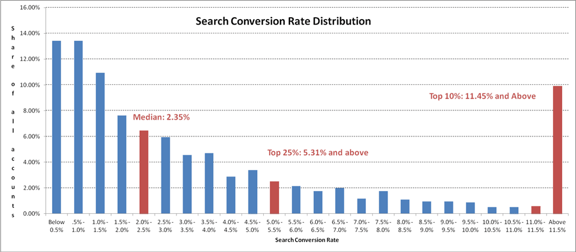
Are you converting somewhere between 2 percent and 5 percent? Is it enough? Well honestly speaking, it might sound a pretty good conversion rate for beginners but then it is something that is not likely to make any massive difference. According to an observation report, this is how landing pages with good conversion can get distributed into –
The red bar on the right-hand side reveals that the top 10% advertisers are actually converting at a rate of more than 11.5 percent. So now you can spot out the difference between a good converting landing page and a better converting landing page.
2.35% is Average, 5.31% is Awesome but Above 11.5%…it’s Unicorn
Shooting for a conversion rate of more than 11.5 percent is an out-performance, which is actually 3X or 5X higher than the average conversion rate. But then it is a gradual process and rapidly creating an optimal landing page will not guarantee you immediate high conversions. You need to undergo continuous tests and implementation till you finally reach a unicorn score, and here are certain industry standard lessons that you would definitely not want to ignore –
7 Valuable Learnings for Designing a Great PPC Landing Page
#1. Determine Your Landing Page Goals
What is your goal? Do you want people to download your research reports? Or do you want visitors to take the free trial offer? Make sure that your marketing goals align with your paid search goals. Get straight to the point. If you have more than one goal to accomplish, then it’s better to have separate landing pages for different purposes. Also, factors like location, user interest and demographics should also be playing a decisive role in your PPC landing page.
#2. Bring Continuity Between a PPC Ad and a Landing Page
Sometimes, a visitor may get confused if your PPC ad reads different from that of the landing page. That is why it is best to align your PPC ad offer with that on your landing page. Try using the same text for both the PPC ad and the landing page to assure visitors that they have landed on the right page. This reinforces the action that led a customer to come to your landing page in the first place.


#3. Use Images and Graphics Wisely
Images and graphics are both great boosters that can power up a landing page. In fact, when visitors arrive to your landing page, images and graphics are the first things that will draw their attention. So these are the elements that have got to convey to your customers that they have arrived at the right place, which is why you would have to use them wisely.
Images can have a huge impact on the human mind when you make the necessary eye contact. So if you want the visitor to look straight at a particular element on the landing page, like the Call-to-Action button, then make sure the directional clues are there on your picture. Here is an example below –

#4. Keep the Copy Sweet and Short
Short copies are better and more convenient when it comes to reading online, and here are four cases where they have outperformed long copies. It’s better to break down your copy rather than placing large chunks of information. They become easier to visually digest for your readers. Do abide by the best
#5. Place Your Point of Assurances
It is impossible to ignore Bryan Eisenberg – one of the first conversion gurus, when talking about how to make a landing page convert better. It is in one of his books named ‘Always be Testing’, where he points out the importance of placing trust icons next to the CTA buttons. Viewers tend to notice these elements and feel more at ease when they finally decide to convert. Eisenberg calls these elements as “point of action assurances”.
Trust symbols can vary from a typical security or Visa logos. It can even include a company’s achievement award logos. Viewers like them and can convert faster. So make sure you have these point of assurances placed right next to your CTA buttons.
#6. Provide the Choice of Options
Many people might get landed on your page but might not convert. It could be that they intended to buy something else, which they could not find on your landing page. They might also leave a landing page only to return the next day to complete it. In such cases, it is best to provide more than one choice for your visitors. Like placing both ‘Buy’ and ‘Sign-up’ options. If people have not found what they are searching for on your landing page, then they can sign-up instead rather than completely abandoning the page.
#7. Always be A/B Testing
Never leave a PPC landing page design incomplete without the A/B Testing. It is the final and the ultimate stage that will tell you a lot about customer behavior and your page performance. Take a look at the three PPC landing page test variations tested by Uber. The first page has a light background color scheme with the picture of a white Prius. The second page has a dark background color scheme with a different image of a car in it. And the third page used the image of a customer along with a short quote.
Variation #1

Variation #2

Variation #3

As you can see from the images above, it is not just the design pattern that had been put to test but also the copies and the layout patterns used for all the three different sets. All these changes might seem subtle but then it is extremely important to test each of the elements that make a landing page. The results that you get will tell you whether a landing page design hurts your PPC or not.
Images: ” User’s Own“
______________________________________________________________________________
Tweak Your Biz is a thought leader global publication and online business community. Today, it is part of the Small Biz Trends stable of websites and receives over 300,000 unique views per month. Would you like to write for us?
An outstanding title can increase tweets, Facebook Likes, and visitor traffic by 50% or more. Generate great titles for your articles and blog posts with the Tweak Your Biz Title Generator.
- How Much Does A Virtual Assistant Cost Per Hour?
- 5 Productivity SEO Techniques and 3 New Search Developments Every Startup Entrepreneur Must Know
- 25 ‘Positive Assets’ For Home Office Business Success
- Read This Before Deciding About Launching Your Own Start-Up
- How to Set Up a Home Improvement Supplies Website
- Optimize Your Business With One Simple Step