The most important thing about your landing page is that it brings people to your website, where they will spend money. This means that you need to have a great landing page. But, you may not know what makes a great landing page. One of the best ways to learn is to look at landing pages for some of the more popular websites, and see how they are put together.
Check out some examples of great landing pages that you can use for inspiration.
#1.
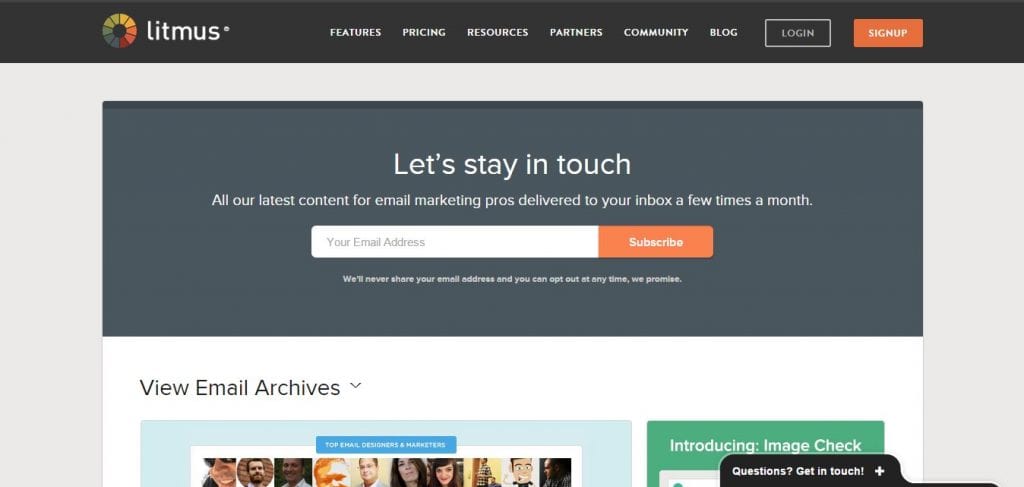
The landing page that is used for promoting newsletters is pretty awesome, and this is a company that knows how to use color to get noticed. The most important part of the landing page (where you provide your email address) is darker than the rest of the page, so you are automatically going to notice this above anything else on the page. The “Subscribe” button is a color that is complimentary to the background, and also stands out.
#2. Conversion Lab
This is actually a homepage with a form, but it is still worth taking a look at, just because it is a bit different. The homepage is actually the whole website, and there are navigation links to take you to various pieces of information below. Click on “Get Contacted”, and everything will move over so there is room for the form to appear. You don’t have to go to a different page to get to the form, but it isn’t in the way either.
#3. Sell My iPhone
This page of Gadget Salvation that shows where you can sell your old iPhones has icons of all the models. Buttons are blue and free of a lot of pattern, but it contrasts with the rest of the white so it really stands out. The list is easy to use, and because it stands out, you aren’t going to miss it.
#4. Inbound Emotion
This is a Spanish HubSpot Partner site, so you may not be able to read anything on it, but you should still check it out just to see the layout of the page. There are some pretty cool features, including a form that stays right in place even while you are scrolling around the site. Another fun feature is a set of hands that provide directions to the form and to share the page with others.
#5. Sign up for the Free Plan
The first thing you will notice is a one-field form where customers can create their accounts. Also on this page are answers to the most frequently asked questions, which again contrasts from the rest of the page so you are going to be able to find it easily.
#6. OpenSesame
Data collected by Chartbeat suggests that the majority of people tend to spend most of their time on a landing page reading the content that is around and beneath the fold. So, it is a good idea to do what OpenSesame has done (however on the home page), and put a search form directly at the fold. This way, customers are able to get into a couple of pages of content, and the form never moves so they are always reminded about it. This is a great example of how to provide information and make sure that the form gets noticed and filled out.
#7. How to Select a DAM
There are loads of cool features on this landing page, specifically the form. There are icons that let you know what information to enter, so there is no confusion. The background is blue, so it stands out from the image of a hero that is behind the form. The submit button also really stands out, because it is orange and there is an arrow that lets you know that you will go on to the downloadable guide. This is a terrific landing page, and one that you should really take note of.
#8. Landing Page Course
This is one of the most popular landing pages, for good reason. In fact, this company has written a book on how to create landing pages that get results. Some of the best things about this landing page are that the directional cures are right in the headline and browser’s fold, and there is a lot of detailed information on the form. So, attention is going to be directed to the form to encourage people to fill it out, and, that detailed information ensures that the landing page ranks high on search engines because of the many keywords.
#9. Subscribe to Basecamp today
This is a long landing page with a lot of information in the fold. One of the coolest things about this page is the little cartoon man who is pointing at the form, so there is absolutely no way you can miss it. It gives an otherwise ordinary page a bit of personality, while doing the job of getting customers to fill out the form. People like the cartoon man, so something like this is definitely something you should consider for your own landing page.
Tips for Creating an Awesome Landing Page
- Take Advantage of Whitespace – There are a few reasons why you don’t want to have a lot of whitespace on your landing page. For one thing, the page is going to look boring and empty, and it won’t be attractive. Also, when you use the whitespace for your call to action, again, it is going to get noticed because it is standing alone.
- Make Your Call to Action Stand Out – The most important thing on your landing page is the call to action, so make sure that it is going to get noticed. Put borders or containers around lead-gen forms and call to action buttons so they stand out. Other things on your page should lead visitors to your call to action, so there is no way that they aren’t going to notice it.
- Use Directional Cues – When people have directional cues, they will be more likely to go to the form or wherever else you want them to go. Make sure that the directional cues are leading your visitors so you will see higher conversions. Do things that make the call to action really stand out, without seeming like you are trying to force visitors into acting. Let them think that they are only using your directional cues to get them where they want to be.
____________________________________________________________________________________
Tweak Your Biz is a thought leader global publication and online business community. Today, it is part of the Small Biz Trends stable of websites and receives over 300,000 unique views per month. Would you like to write for us?
An outstanding title can increase tweets, Facebook Likes, and visitor traffic by 50% or more. Generate great titles for your articles and blog posts with the Tweak Your Biz Title Generator.


