An ideal UI/UX design is a key ingredient for mobile app success formula. In fact, the most popular mobile apps have been those with stunning graphics, rich visuals, and seamless access of content. However, you may ask what is the first thing that strikes a user’s mind? Most of you might have guessed by now. But, for those still wondering, it is none other than an “app icon”.
Many people think the onboarding process as the first interaction with an app. However, in reality an app icon is the first thing through which users’ see an app. Hence, an app icon is the one that needs to stand out in the preliminary stages. You need to have optimized icons in place, so that they get to be seen on top of results within an application store.
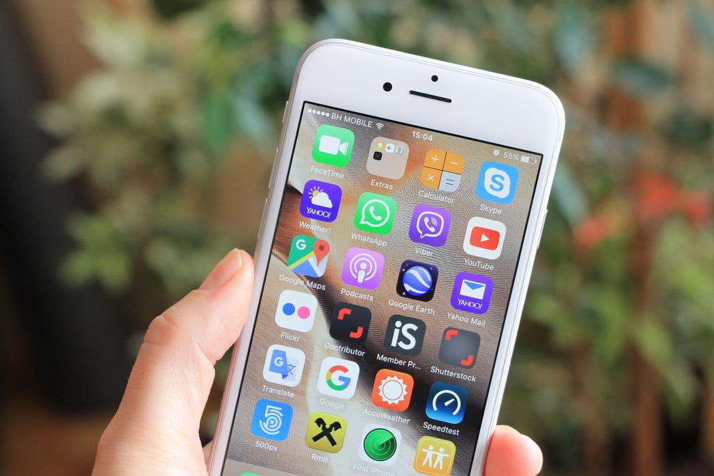
A mobile app icon needs to be design oriented
70% of downloads take place only if apps are discoverable. This means if your app is visible within the app store, only then your app is downloaded. A great icon is the one drawing the visibility towards your app, and in turn influencing the users. Hence, there is good reason enough to invest valuable time and money on the icon.
Because of cut throat competition, and tons of apps getting launched on the application store daily, it has become all the more difficult to get your app to grab the attention of visitors, especially when they are around for mere seconds. Not only does the icon need to be capable enough to catch the attention, but inspire users and create an urge within them to download.
Let us check out a few critical guidelines to be taken into account, when aiming for an enticing mobile app icon design, compelling users to look out for more.
#1. Success lies in ‘simplicity’
You might want to showcase your creativity or innovative thinking to the world, and hence go for an unconventional icon design, which may not relate to the app that closely. This may leave users confused and thinking about what the app is about. Ultimately users might be put off even opening the app, thinking that the app doesn’t seem of any use to them, even if it is highly relevant. Take lessons from apps like Vine, PayPal, Talking Tom, etc. who use letters or actual characters present in the app, giving a brief idea about what the app can turn out to be.
#2. ‘Boldness’ creates maximum impact
As we discussed above, showing the actual characters of an app can play a defining role in making an impact. A similar strategy is using the captured bold expressions of app characters, inviting the audience who give emphasis to emotional content within an app. A color palette with striking colors, and app characters with a range of expressions used in app icon, certainly works wonders.
#3. Everlasting impression through ‘symbols’ or ‘shapes’
What does an ‘F’ shape in the Flipboard app, an innovatively designed cloud in the SoundCloud app, or radiations symbol in the Spotify app tell you? They not just convey the app’s purpose in an effective manner, but are unique enough to grab the attention. They are so easily noticeable on a user screen that they can be made out while going through search listing pages.
#4. ‘Borders’ give a feeling of neatness
Looking at highly popular apps like Amazon, WhatsApp, Pinterest, you can comprehend why they are easily noticeable even within a crowd of apps. App icons surrounded by borders give a sense of tidiness as compared to those without any outlining. Borders not just emphasize the icon, but also make them stand out effectively.
#5. Avoid having ‘text’ within the app icon
What is another factor seen commonly amongst the topmost apps? Whether Facebook, Twitter, Linkedin, Google Plus, Tumblr, Pinterest, or more, you will only see a single or possibly a couple of characters from the app name. Embedding the app initials rather than spelling out the entire name on an app icon is highly advisable and a must to follow.
#6. ‘Flat’ designs remain trendy for a lifetime
With the likes of Twitter, Trip Advisor, or more, using a Matte finish flat app design icon serves as eye candy to users’ eyes. Making use of selected colors and not appearing shiny will make the most impact and look beautiful with any trends.
#7. ‘Brands’ should be reflected if any
People are extremely familiar with brand logos all across the globe. Whether it be a queen representing Starbucks, strike through ESPN logo, continuous 3 lettered CNN logo, the tick mark for Nike, or more. Keeping these brand images on icons, will work wonders by themselves, without putting in much effort.
#8. ‘Update’ app icons frequently
No matter how good your logo is, if not updated frequently users will be bored to hell, seeing them over and over again. No matter what app update you launch, whether it’s 2015 edition, 2016 edition, Christmas edition; mention the same on the app icon. Right from special editions to festival editions giving a seasonal look will connect with the app more effectively and add an extra zing to the design, connecting with the audience on all levels. However, try not to mess around a lot with the original icon. Just go with the mood, keeping the originality intact, as an app store update comes for a price not worthy of spending every now and then.
So, what have you learnt?
The most important principle lying behind mobile app icon design success and popularity is doing a thorough competitive analysis of the contemporaries and trying not to replicate them, however, do take lessons from their positive or negative experiences. Check out the benchmark mobile apps, and try to take the best from them, and things to avoid. A systematic strategy in place will guarantee the app launch, and facilitate the process.
Just to wind things up, have an app icon that is extremely simple to understand, makes a bold impact through letters or characters, with unique symbols or shapes in place, surrounded by nice borders, not containing text, a flat appearance, reflects brand value, and dynamic based on occasion use.
- Top 10 Most Affordable Event Management Software
- The Top Smart Home Trends Set to Make Waves in 2022
- How to Create an App for Your Online Business: 3 Essential Steps
- How Technology is Enabling a Healthy Work-Life Balance?
- Five Ways to Protect Your Customers’ Information Internally and Externally
- The Future of Data Science