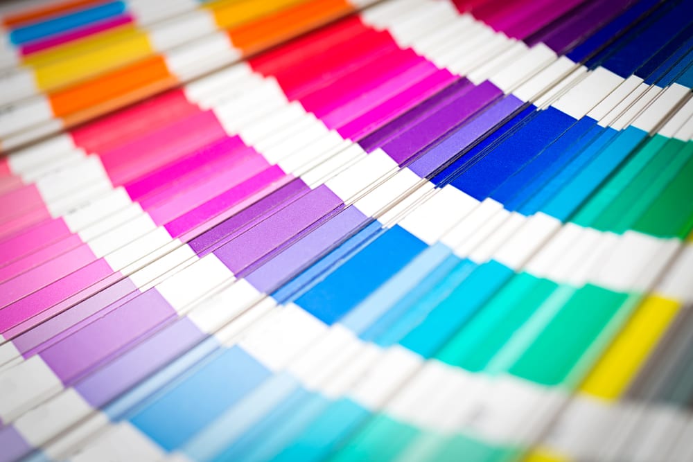
There are more to colors than what meets the eye. Have you ever wondered what makes us like one website so much as compared to others? Take for example the Facebook website. It is perhaps the simplest looking site which is predominated by the color blue. Why did Zuckerberg choose blue? Not because it is his favorite color but because blue stands for transparency and trust and being a social media website, Facebook has to be trusted by its users.
The science behind power of color
Colors are not merely used to enhance the aesthetic look of a site but they play a larger role in making it popular and also increasing the conversion rates. Psychology of colors is a branch that is taught under marketing and most successful marketers attribute their success to the right use of colors.
We seldom realize the way colors affect our moods and attitudes. Our brain has its own mechanism to interpret the colors our eyes see and generate emotions too. Yellow is a color of warning and hence most traffic signals use yellow predominantly.
Now, being a website owner, you must be eager to know how color psychology can help you to increase conversions for your site. Let us explore.
#1. Gender and color
Gender and color psychology are related to a great extent. Blue, purple and green are the three colors women like the most. Brown, gray and orange are the colors they hate. Similarly, for men, the favorable colors are blue, green and black and the most hated colors are brown, orange and purple.
Over 35% of women like blue and most men prefer it too. No doubt, sites like PayPal and Facebook use blue as their base colors.
Women in general are found to dislike earthy tones. The age-old perception that women like pink is just a myth as most women who were covered by marketing studies have revealed their aversion towards it. So, when it comes to increasing the conversion rate of your site, you should clearly keep the color preferences of the genders in mind.
#2. Colors and the signals they send
Each color is associated with a feeling or signals something which should be kept in mind. Like we have mentioned before blue stands for trust and black for sophistication. Similarly, green signifies the outdoors and nature. It also stands for creativity. Most sites use this color for their call to action button. As for example in this search for sleepy lagoon mp3, on music search site Mp3olimp, the download link uses a blue color while the play link uses a green color. The use of these two primary colors prompts the viewers to take a positive action.
#3. Target audience
The audience you are targeting, their gender and demography should determine the colors you choose to design your website. Websites selling baby products should use colors that are soothing and help in creating trust, like blue. Sites that cater primarily to women should use more of primary colors like blue, green or purple. Black also works well if you are into luxury products or want to prove your exclusivity. Citizen watch, Lamborghini and even Louis Vuitton have websites with black undertones that make them stand apart from the crowd.
Websites meant for a younger generation should be colorful as well as funky. Bright colors splattered across the screen attract the young people.
Have a look at the black color used in the Lamborghini’s website:
#4. Type of product
The type of product or service you offer should determine the colors you use to design your website. Banking products, which rely heavily on creating an atmosphere of trust and transparency use blue. Orange is known to create a sense of urgency. It is related to fun and physical activities. Sites related to baby products often use more of this color to appeal to the youngsters. Even sports websites use more of it.
On the other hand, online stores like Amazon use orange to draw viewers to the offers section. It makes the viewers impulsive and improves the conversion rates.
#5. Combination of colors increases conversion
Websites that choose colors judiciously experience high conversion rates. Since every color sends a particular signal to the viewer, having too many of them would confuse them. Sticking to a few basic primary colors is important. The combination should be soothing and yet eye-catching.
Choosing colors for the call to action is most important. Ideally, it should stand out, and of a color that is not used in the page. Using colors like green, red or even blue is known to boost sales.
Use of a few basic and primary colors and keeping the users’ demography and preferences in mind will help you to design pages that will ensure high conversion rate and success of your business. Follow the color psychology and boost your online business.
Images: ”Color swatches book. Rainbow sample colors catalog./ Shutterstock.com“
__________________________________________________________________________________
 Connect with Tweak Your Biz:
Would you like to write for Tweak Your Biz?
Tweak Your Biz is an international, business advice community and online publication. Today it is read by over 140,000 business people each month (unique visitors, Google Analytics, December, 2013). See our review of 2013 for more information.
An outstanding title can increase tweets, Facebook Likes, and visitor traffic by 50% or more. Generate great titles for your articles and blog posts with the Tweak Your Biz Title Generator.


 Connect with Tweak Your Biz:


