What’s the one thing that makes an online business succeed or stumble and fall to the ground? The landing page. Rather, the conversion rates the landing page generates. While there are plenty of ways to drive traffic to the website, it is the conversion rate that indicates whether your online business is a success or not.
If the conversion rate of your landing page is not so great, then you should immediately take steps to improve upon it. However, first, you should know what makes a great landing page that has sky-high conversion rates. You can spend time reading e-books about improving the conversion rate, or you could find inspiration from websites that have already done it.
If you are a modern businessperson, you would be familiar with countless landing pages. You might even be able to spot the truly boring ones filled with text and nothing interesting to click on. If you want to know how to improve your landing page conversion rate, then you should look at the true greats out there. Here are five of the best landing pages on the web that have conversion rates unlike any other:
#1. Present and Correct
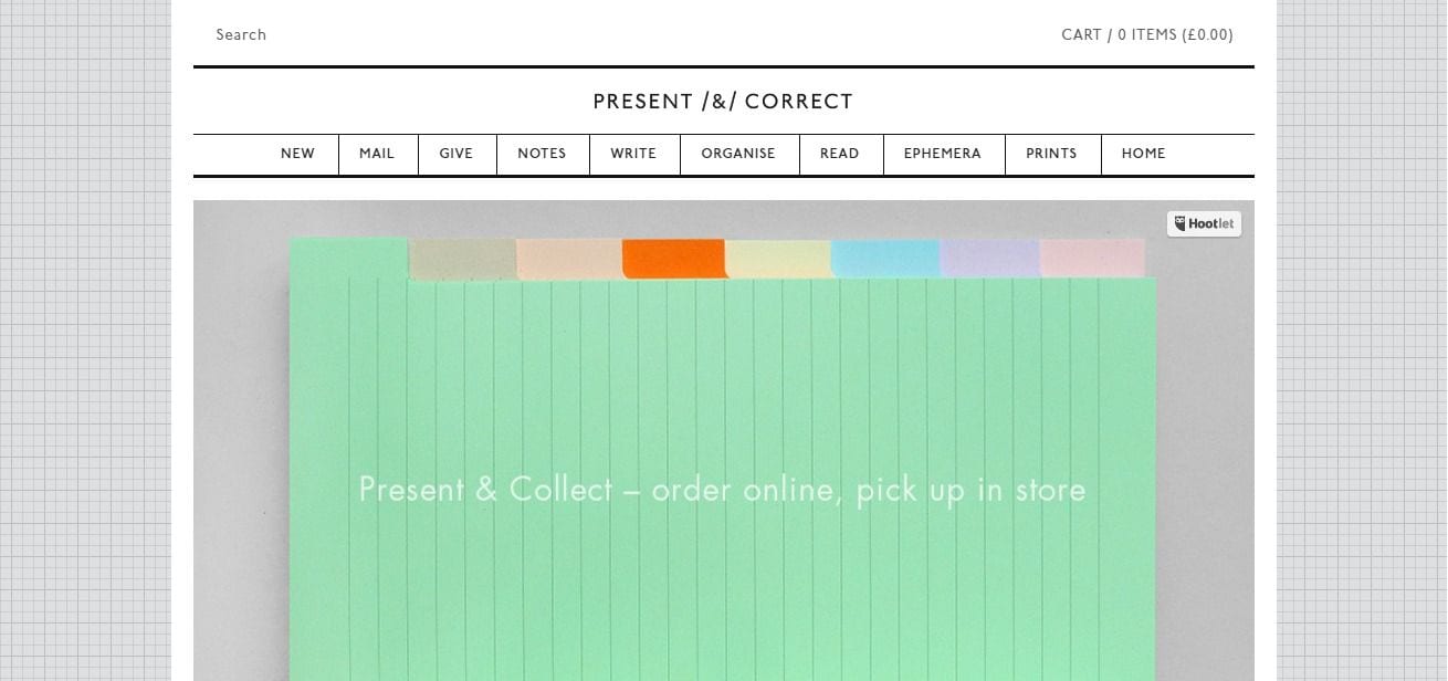
Present and Correct is a design business, so it is no wonder they have managed to create a highly appealing landing page. From the outlook, the design is rather simple and minimalist. So what makes people want to stay, browse and trust in their services? The gorgeous visuals.
The homepage of the Present and Correct website is focused on showcasing images of stationery. The images are stunning in muted colors. The pictures are eye-catching as well as curious. Why is this design company showing pictures of vintage stationery? Visitors are compelled to find out.
The clever choosing of images also showcases to potential customers that Present and Correct is a creative company. That is a major selling point for a design business. With the clever use of a minimalist, image-heavy theme, Present and Correct manages to both captivate visitors and garner social proof.
Such visuals obviously will not be suitable for all businesses. However, when you choose a theme, it is important to pick one that will allow you to grab the attention of visitors with imagery in this manner. All good landing pages have at least one compelling image.
#2. Wistia
Wistia is a video marketing service that offers a free account. Wistia has created a stunning landing page for the free account signup that has amazingly high conversion rates. The high conversions can be attributed to just three factors: minimalist design, strong call to action, and an excellent listing of benefits.
Wistia’s free account landing page has no visuals except a blue, minimalist pattern background. Much of the space is taken up by the sign-up form, the purpose of the landing page. Signing up has been made completely free of hassles. If a user has doubts about the free account, there’s a smartly titled (“what’s the catch”) list of benefits right below the form.

#3. Bills.com
Bills.com proves that landing pages do not have to be static and boring. Some businesses use animations to pique the interest of users. However, animations are often slow loading. Bills.com instead has opted for a simple and speedy plugin that innovatively communicates the company’s USP to drive conversions.
On the landing page, visitors have presented a slider and asked to list their amount of debt. That is all the business needs to engage customers. At the end of the slider presentation, visitors are provided a sign-up form with an excellent CTA button. No wonder this site revels in high conversions.

#4. The Sharp Firm
Sharp is a law firm located in Austin, Texas. As a legal establishment, they can make the landing page interesting by only so much. Regardless of the long paragraphs and lack of visuals, Sharp has managed to create a highly converting website. Their secret? A heading that hooks the reader, clear listing of services, and well-placed CTA buttons.
“Sharp and Tough Representation for You,” screams the title of the website the moment a visitor lands. That is an immediately attention-grabbing headline. It is definitely the sort of thing a potential client on the hunt for a lawyer wants to hear. Sharp instantly exhibits their unique selling proposition on the landing page that naturally increases the conversion rate.
The other thing Sharp does right is the clear and concise listing of their legal services. After the headline hooks a potential client, the client can easily understand the services the firm offers. The listed services are easy to scroll down and understand. This level of navigational ease compels even the most casual visitor to click on the links provided.
Last but not least, Sharp has prioritized design and placement of CTA buttons. The text copy attracts the target consumers instantly: “get a free case evaluation.” One CTA button is placed near the heading, so visitors immediately see it. The other is attached to a form conveniently located above the fold.

#5. H.BLOOM
H.BLOOM is an online flower shop. This store’s landing page is a prime example of how everyone can smartly customize regular WordPress themes to drive conversions. H.BLOOM does not rely on fancy animations or plugins. Rather, the landing page is sleekly designed with beautiful pictures of flowers, a CTA button that stands out, and a simple 3-step “how it works” section that clearly shows the benefits of the business.
H.BLOOM knows how landing pages work. They capture the attention of visitors with a charming heading, and in the subheading quickly describe the business. In the background is a visually appealing picture of a bouquet. This landing page loads fast and is very easy to navigate. The order form placed on the top right side is what drives the conversion rates.

The Lesson to Learn
If you want your landing page to be as high converting as the ones listed above, try to see what these examples get right. In general, all of the above landing pages are visually appealing. More importantly, they have captivating CTA buttons placed cleverly to generate clicks. Also, some have very aptly listed the advantages that make the business outstanding.
You may not have the funds to do a fresh presentation like Bills.com. However, you can at least master the basics like H.BLOOM. Browse through the above-mentioned landing pages and then design your landing page with similarly effective elements.


