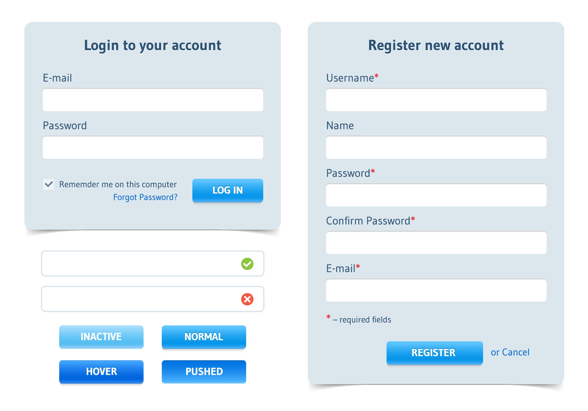
People arrive on your app with a definite purpose, or goal in their mind. The first thing connecting your users with your app is a form. A form is probably the most important element of interaction, whether at the beginning or towards the end. In fact, forms have the reputation of both starting and ending a transaction.
However, creating mobile app forms is not a cakewalk, as most users might think. There are four macro factors to consider while designing a form such as structure, fields, labels, and buttons. However, within each category, there are many sub-components, which if implemented properly, help users to fill the form quickly, without any confusion.
Let us first get familiar with the main elements of a form, before discussing them in detail. A typical form within an app, combines the following parts:
#1. Structure
It is the systematic placing of other form components like buttons, labels, and fields. Also, there is an inter-dependence, and logical relationship between the components, which is taken care of when developing a structure.
Things to take care of when deciding a structure:
- Ask for things only which are relevant. Every extra field, label, or button, can impact the conversion rate greatly if that extra information has no relevance whatsoever related to the use of an app. If your app has nothing to do with “Age”, or “Sex”, inserting these fields might not be perceived positively by most users.
- Organize the form according to the flow. Think from a user perspective, and imagine what you would expect when encountering a form, especially in what order. If you have “Phone No.”, or “Address”, placed before the “Name” field, users might already lose the trust.
- Club information into related groups. Having a flat form with all the fields simply placed one below another, will do no good in motivating the users. Instead, club information into different groups such as personal information, account information, contact information, payment information, and more, to have your app converse with the users, rather than simply asking for information.
‘One Column’ or ‘Multiple Columns’: Which one to choose?
Forms having more than one column, have the tendency to slow down the comprehending speed of the users, allowing them to feel lethargic after a while filling up the form. Imagine, a form having two or three columns. A user will need out to fill out the first column by scrolling to the last field and then scroll above to fill out the second column. Once done with the second column, the process is repeated for the third column. This would be so cumbersome, that users might prefer to change their mind by leaving the app after filling the first column.
Henceforth, try to incorporate only one column within an app, no matter what form it is. This way users will have to scroll down only once to fill up the information. The best way to achieve this is asking for only important and relevant information.
#2. Fields
These are those text boxes, wherein users are asked to fill up the information as mentioned by labels. They are in the form of sliders, radio buttons, check boxes, text fields, and other specially designed input fields.
Minimal fields are always best
Minimizing the fields to the lowest possible extent by combining multiple fields into a single field, will not just make your form easier to fill up, but also have it load fast, delivering better processing. As an example, in travel apps, instead of having three fields for time of arrival or departure (“AM/PM”, “Hours”, “Minutes”), you can always have just one field.
Provide options for mandatory/optional fields
Avoid using optional fields in your form as much as possible. If, in case,you need them for relationship building, differentiate them as optional, or mark an asterisk (*) to the mandatory fields.
Set default values to lower the typing burden
Default values work best when you are confident of a broader section of users using those values. Static default values should be kept only if 90% of users are bound to select that value. As an example, “$” showing up in the “Currency” field, with an app limited to US only. Dynamic default values are ideal when there are just a few selected choices to choose from. As an example, “Male” or “Female” values showing up in the “Sex” dropdown field.
Default values help users to fill up forms faster, as most users are saved from the effort of typing the obvious. It also encourages accuracy, as users can fill up the form with ease, without worrying about typing anything incorrectly.
Have ‘auto-focus’ feature integrated within the fields
“Auto-focus” helps a field to provide a visual notification to the users by getting highlighted. If a user is in a hurry, he/she might forget to fill up a field, or multiple fields altogether. Auto-focus ensures that users have filled up all the form fields correctly.
#3. Labels
Labels clearly differentiate one field from another. They tell the purpose of filling up the fields, by naming them. They remain static for every single user.
Limit the label text as much as possible
Labels with too many words are more often tiresome to deal with. If you remember the old registration of Amazon, it had labels with text like “My name is”, “My email address is”, “Type it again”, “My mobile phone number is”, and so on. Looking today at Amazon, you have “Name”, “Email”, “Password”, and “Password again”, which is highly convenient to read and process.
Avoid using all caps whether ‘UPPERCASE’ or ‘lowercase’
Try to use “Title Case” or “Sentence case”, staying away from all caps in the form of lowercase or uppercase. Sentence case is ideally the best format to deal with making reading and scanning easier, as there are no differences in character height, except for the first character.
‘Inline’ labels work wonders as compared to others
Labels with top alignment and bottom alignment are easy to read and complete, but take up too much form space. Whereas labels with left and right alignment, are very difficult to read and comprehend, but take up less form space. Henceforth, opt for inline labels, with labels present within the text box. Such labels are not just highly effective in terms of reading and completion, but also efficient in saving a tremendous amount of form space. An even better solution is making use of placeholder text with inline labels, to cover the minor loopholes associated with inline labels.
Inline labels vanish away, even with a single character entered in the text box. This could lead to users remaining puzzled, thinking about the field they just entered. Another problem is users considering them as default values, Hence, they might not feel the necessity to fill them up. Enabling a small placeholder float label to show up, when inline labels vanish, is the best solution so far when dealing with form labels.
#4. Buttons
An action button is meant to perform a specified task, based upon the user action performed. It might be submitting a filled up form, or directing users to another page.
When you provide multiple options in the form of buttons, users are bound to get confused if they are represented by same colors. Make them visually appear differently, by associating distinctive colors based on importance.
Almost every single form has a back button, letting users perform modifications in what is already done. If placed on the right-hand side, users mistake them as a “Submit” button. So, always position it on the left-hand side of “Next”, “Proceed”, or “Submit” buttons.
Making use of generic language in button text, such as “Submit”, or “Send”, could leave users thinking about what the button is up to. It is always better to use text that specifies the exact purpose of the button. This includes, “Create my free account”, “Get subscribed to the newsletter”, and so on. Such text, not only guides users in the right direction but also uplifts the overall visual appearance of action buttons.
When there are too many action buttons on a single page, it is one hell of a disturbing task for users to choose from the available options. Try not to have more than three action buttons on every single screen.
“Reset” button is the most dangerous button to deal with. Imagine users filling up a form, and pressing the Reset button unknowingly. This could remove all the saved data, letting users fill up the form all over again.
The takeaways
Many users are hesitant to fill up a form, because of the consequences following after that. By designing forms that are user-friendly, fast, minimal, and relevant, you can not just win the hearts of users, but also let them show full trust and credibility, and even feel secure while entering details.
Images: ”Login form and registration form/Shutterstock.com“
____________________________________________________________________________
 Tweak Your Biz is a thought leader global publication and online business community. Today, it is part of the Small Biz Trends stable of websites and receives over 300,000 unique views per month. Would you like to write for us?
An outstanding title can increase tweets, Facebook Likes, and visitor traffic by 50% or more. Generate great titles for your articles and blog posts with the Tweak Your Biz Title Generator.


