I’m obsessed with conversion rates.
It’s the easiest way to increase your revenue without increasing your marketing budget. A small .01% tweak in conversions can mean thousands (or millions) in additional revenue, depending on your business type.
We’ve built a conversion optimization checklist that we use for every new client that comes on board – I’m handing it over to you today.
Use it to make sure your website is running at optimal performance and maximizing revenue potential.
 Does the headline capture our story?
A good headline has the power to hook your audience like nothing else. The headline on your website will be the single most important conversion factor which will lead to the eventual purchase of your product or service. Keep it short, sweet and to the point. Try and communicate the entire meaning of the page within 55 characters.
 Are there too many submission fields?
Whenever you ask for information via an email opt-in form, ask for as little information as possible. It should be noted that each additional form field can decrease a website’s conversion rate by close to 11%. Try and focus on the main piece of information you need to close your prospect – Email? Phone number? Social media login? Whatever it is, focus on those aspects and cut the rest.
 Are we calling out our refund policy/guarantee?
Including a refund policy comes in can dramatically increase your conversions. It helps put a customer’s mind at ease that you believe in your product / service and stand by your word. If you don’t currently offer one, it’s something to discuss internally.
 Are we using action oriented verbs?
“Reserve”. “Join”. “Learn”. These action oriented verbs have a way of subconsciously convincing visitors to take action. Make sure your website is using this critical verbiage in your call to actions and buttons.
Testimonials, emails, Tweets and other forms of social proof are a great way to add trust to your website / landing page. Make sure you’re focusing on believable forms of proof – a random picture of someone with a written testimonial does nothing. Link to their social profiles or business’ website to really drive home the value of their words.
 Is the page loading too slow?
By decreasing the load time of your website, you can drastically increase your conversion rate. You can use tools like Google’s Page Speed insights to test potential issues on your website and either enlist the help of a freelance web developer or online tools to increase the page’s performance.
 Are we calling out the benefits?
Needless to say, clearly stating the benefits of your product or service is the best way of letting potential customers consider buying whatever it is you are offering. Don’t forget to list the features of your product and more importantly, let your customers know exactly how they can benefit by using your product or service. Creating a clear value proposition will help in converting those visitors into clients.
 Are the main call to actions above the fold?
The “fold” is a term that refers to the portion of the webpage that’svisible without scrolling. No matter what type of website you have, your main call to actions need to be above the fold. Submission forms, contact phone numbers or products for sale, this rule applies to all. While other marketers debate the relevancy of the fold, it’s best to keep things simple and keep your important conversions where visitors see them: above the fold!
 Are we utilizing multi media?
Videos and images go a long way to communicate your message without having to use words. This saves space on the page and can really pack a nice conversion punch. In addition, a large number of web users prefer to consume video over text. Some marketers report creating multi media like explainer videos have helped to increase conversions over 20%.
 Take the Bite Out of Your Page
CMS such as WordPress offer plugins that cache your website’s pages and makes it visible to the user without having to generate that page dynamically every time. This leads to a serious reduction in the loading time of your website which is a good thing. It has been found that having an eight second load time, which is just four seconds above the normal load time can result in a visitor loss of 75%. For an e-Commerce website that number is huge.
 Are we creating a sense of urgency?
Now, I’m not saying you have to do anything drastic, but building in a sense of urgency to your pages can really help light a fire under website visitors. Including specific call outs like “limited supply” or “only 3 seats left” drives visitors to take action immediately.
 Do we have an offer / value proposition?
Unless people really, really, really want to use your product / services, you’re going to have to offer some form of value to get their information. On our site, we offer an in depth guide to search engine optimization in exchange for their email address. After they provide their email, we send them a PDF copy to the email they provided. We’ve seen email opt in rates triple since using this tactic.
 Are we offering flexible payment options?
There’s lots of folks out there who just don’t like taking out their credit card because it’s a slow process (well, ok, maybe that’s just me, but still). If you’re selling directly from your website make sure you accept multiple forms of payment. Adding quick checkout options like Stripe of PayPal really speaks to the younger generation and goes a long way to help defeat shopping cart abandonment.
 How many variations have we tested?
Test, test, test. You can look at all the data from other marketers (including here) but until you take action on your site, you’ll never know what works. There’s a ton of great paid tools to help you get started with testing but if you’re on a tighter budget, make sure to check out Google Analytics’ In-Page Analytics.
Closing
While these are the exact questions we use when onboarding new clients, the final question about testing is the most important.
Run your website through these questions, make changes, and do it again. Keep testing and optimizing until you’ve maximized your conversion rate.
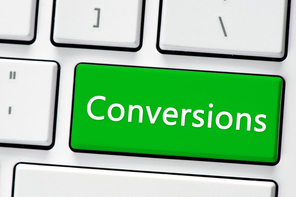
Images: “Keyboard with conversions button. Computer white keyboard with conversions button/Shutterstock.com“
________________________________________________________________________________
Tweak Your Biz is a thought leader global publication and online business community. Today, it is part of the Small Biz Trends stable of websites and receives over 300,000 unique views per month. Would you like to write for us?
An outstanding title can increase tweets, Facebook Likes, and visitor traffic by 50% or more. Generate great titles for your articles and blog posts with the Tweak Your Biz Title Generator.


