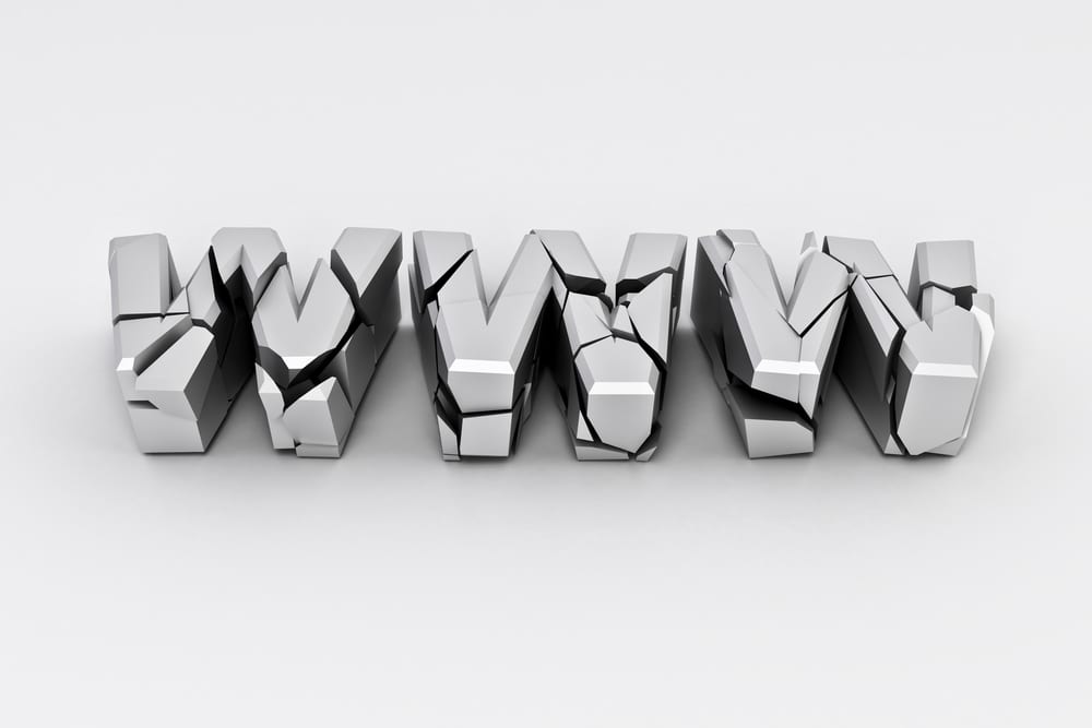
Despite the ushering of Web 2.0 and the emergence of the mobile era, there is still a breed of designers that won’t move forward. They keep on committing the same designing mistakes and the horror show in the form of yet another website is ready for uploading on the web. This article discusses 10 disasters to avoid for custom website design.
#1. What happened to the search box?
The search box is an integral part of the website. It is extremely essential that a website consists of a functional search box. Many websites do not contain a search box, making in frustrating for the visitors to look for something that might interest them. Therefore, this is disaster #1. Why not include a search box that is useful for visitors?
#2. Why are the fonts unreadable?
Legible fonts are a crucial element of web design. A first-class interface grabs the user’s attention, but if the fonts are not legible, then what is the use of a good interface? Hence, this is disaster #2. To avoid this disaster, make sure that the fonts used are not something like Comic Sans MS, but a professional font.
#3. How come the content is so unorganized?
A website heavily depends upon its content to motivate and encourage people to stay on the website and take a proactive decision such as buying a product or clicking a link. It also helps drive traffic to the website. Unorganized content may cause users to become jittery as many users do not necessarily read a page, but simply scan through information and pick up the important points. Hence, putting unorganized content such as just an entire block of page on the website is disaster #3. Organize the content on your website to enable readers to take a constructive and affirmative action.
Disabling the back button has several undesirable consequences. Hence, the programmer could cause the browser to stay put, or cause a new window to open, or even open an objectionable website. None of these outcomes is good for your objective, since users simple loathe a back button that has been fiddled with. This is positively disaster #4. Work towards leaving the back button undisturbed so that it does what it is actually meant for.
#5. Oh dear…this website is too gaudy!
A websites pages ought to have an integrated as well as steady look. However, some designers use all the fonts and colors at their disposal to create a gaudy and garish look. This is certainly disaster #5. Avoid garish designs and avoid them from coming to know that you have a wild side when it comes to web design.
#6. Is the User Interface Design incompatible?
As described previously, users expect rationality and consistency in website design. The same applies to the user interface. Some designers take the designing factor to another level, which really disturbs the look and feel of the user interface. This annoys visitors and they do not feel they are in control. Avoid such User Interface (UI) design and use a standard template for every page. This is disaster #6 that heavily borrows from design over kill.
It is relatively easy to understand that within a website, navigation should be seamless. At the same time, you will have understood that there are no set standards for a website. With the emergence in technologies, it is extremely essential that the navigation element should be intuitive as well as dependable.
At the same time, there are certain norms. Concise text should be used as navigation. Dead links should be eliminated and hyperlinks should stand out from the body text. Without proper navigation, your visitors would lose orientation on your website. Hence bad navigation is certainly disaster #7. Sort out navigation issues immediately, or else customers will leave!
#8. This website just doesn’t fit my screen – Screen resolution
Sometimes, websites are not optimized properly for screen resolution. Therefore, you might need to scroll horizontally for such resolutions. This is not a good practice currently as good designers are capable of developing websites that fit on most screen sizes. Disaster #8! Sort out the resolution issues right away so that the website fits snuggly on most screens.
#9. There just too many images here! – Over-use of images
Generally, images are used for capturing user’s imagination. However, if over used, these images can be a complete distraction and cause unnecessary grief to the user. Hence, the images should be used for guidance and illustration purposes only. Disaster # 9 in the making! Avoid too many images, especially on the home page.
#10. This background music is eating my ears! – use of background music
Some designers include background music in each and every web page. Unless this is a musical website or you are promoting your own music, there is no need to include any background music. This is disaster #10. The solution is to remove the background music code from the website completely.
A final word – always test you website for potential disasters. There is nothing wrong in continuous testing. It’s only that you should have a stomach for it.
Images: ”Broken silver www sign on white background/ Shutterstock.com“
__________________________________________________________________________________
 0Connect with Tweak Your Biz:
Would you like to write for Tweak Your Biz?
Tweak Your Biz is an international, business advice community and online publication. Today it is read by over 140,000 business people each month (unique visitors, Google Analytics, December, 2013). See our review of 2013 for more information.
An outstanding title can increase tweets, Facebook Likes, and visitor traffic by 50% or more. Generate great titles for your articles and blog posts with the Tweak Your Biz Title Generator


