Is email marketing worth it?
The short answer is yes.
You might think
But only if you’re doing it the right way. Most business owners think investing in an expensive email service provider will automatically double their list and skyrocket their sales by magic.
Wrong.
Making your email campaigns successful is entirely in your hands.
That said, you might be making some common email marketing mistakes without realizing it. This guide will show you what those mistakes are and how you can fix them, so you save tons of time and money.
Mistake #1: Bad Subject Lines
An email that doesn’t get opened doesn’t get read. Unread emails mean zero sales.
If you want to make sure your emails never get opened and get buried among dozens of emails in your subscribers’ inbox, write bad subject lines.
The fact is 35% of emails get opened based solely on the email subject line. How do you make sure your subscribers instantly click on your emails?
Here are some tips for writing great email subject lines.
Keep It Short And Specific
Yeah, subject lines are not the right place to write a novel.
A mobile phone reveals 25 to 30 characters, while desktop shows around 60 characters. That said, keep your subject line within six to eight words.
Here’s an example of an email from Copyblogger that’s short, specific and gets to the point quickly.
![]()
Mention The Recipient’s Name
Your email is more likely to be noticed if your subscriber sees their name in their inbox. Your email autoresponder gives you the option to include your specific subscriber’s name in your subject lines.
The trick is to couple it with a result they want or their pain point.
Marie Forleo does this nicely and I always end up opening her emails first.
![]()
Include Emojis
You might think emojis make emails look unprofessional but research proves that emojis dramatically improve click through rates. Subject lines with emojis are more likely to get noticed in a subscriber’s cluttered inbox.
However, this is not an absolute rule and if you feel your brand can do well without emojis then go ahead.
Mistake #2: No Welcome Email
This is when you pop up into your subscriber’s inbox out of anywhere, meaning you don’t start off by welcoming them first.
Now it’s true that your readers intentionally subscribed to your email list but there’s a good chance they’ll forget it with dozens of other newsletters they’ve subscribed to. So you want to make sure that you start building a relationship with them or selling to them (depending on what your main goal is) after you’ve welcomed them.
In case you don’t know welcome emails get 86% higher click through rates than other emails.
Your welcome email is the first email you send to your subscribers. While there are no strict rules to follow in your welcome emails, there are some general tips that work that you should keep in mind while crafting your welcome email.
Here are some of them.
Introduce Yourself
Your subscribers need to know there’s a real person talking to them and not an internet bot. Start off your email by introducing yourself and your blog or business.
Congratulate Them On Joining Your List
This is important because your subscribers need to know they’ve made a good decision by joining your list. Let them know the value they will receive from your emails otherwise they’ll have many reasons to unsubscribe after they’ve received your free offer.
Make your email list a big deal.
Tell Them What To Expect
If you’re offering a freebie, include a link to it. Next, tell them what to expect from your emails in future.
You need to put your subscribers in the right frame of mind about you and your business and your welcome email is the best place to do that.
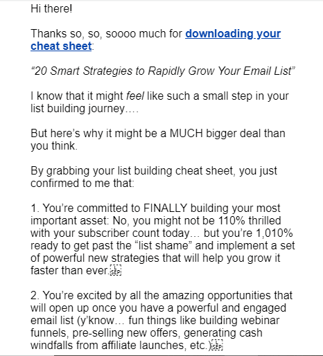
Here’s an example of an awesome welcome email by Amy Porterfield.

Mistake #3: No Calls To Action
It’s crucial to know that while your emails are about building an awesome relationship with your subscribers, they are not casual chit chat you have in a coffee shop.
This means you don’t show up in your subscribers’ inbox, say a couple of things and then disappear. Remember, you’re running a business and everything you do needs to have a purpose. The purpose of your emails is to engage your subscribers and boost your conversion rates.
You do this with great calls to action (or CTAs) that prompt the reader to do something. A CTA goes at the end of your email when just when your subscribers are about click the back button. It’s short and specific.
Here are some examples of great CTAs:
- Read this article
- Click to join
- Sign up
- Share
- Buy now
Also, make sure you don’t include multiple CTAs in one email. Every email should have one CTA or you’ll end up confusing your subscribers.
Mistake #4: Neglecting Sign Up Forms
Imagine hosting a grand stage play with no one in the audience.
Embarrassing, right? And also, a complete waste of time.
The same thing happens when you set up an awesome email campaign but forget to include sign up forms on your website.
Sign up forms are the steppingstones that lead subscribers to your email list.
The next question is how do you make people sign up when they come to your website? Not a boring ‘Join my newsletter’ please. People are not interested in newsletters anymore. They want incentives.
The best incentive is a freebie also called a lead magnet. Here’s what some of the most popular freebies look like on the internet:
- A free report
- Cheatsheet
- Template
- Checklist
If you bury your sign-up forms in a corner n your website, people will not find it. You need to make it super easy and fast for people to join your list.
Here are some common types of sign-up forms you can create.
Lightbox Popup
Yeah, popups are super annoying but they convert really well with some popups converting as high as 50.2%.
A lightbox highlights your popup making the rest of the content on your page dark. They’re perfect for immediately grabbing your reader’s attention.
Floating Bar
A floating bar is like a thin ribbon that sticks to the top of your page while readers scroll and read your content. While they’re less annoying than popups, they’re not ideal for offering incentives to new readers on your website.
That said, definitely give them a try to see how well they convert on your site.
Sidebar
As the name suggests, a sidebar sticks to the side of your page. The good thing about sidebars is that people get the option to opt-in no matter where they are on your website. Compared to this, lightbox popups and floating bars work only when people are engaged with your content.
There are tons of other opt-in forms you can experiment with to see which converts best on your site.
Mistake #5: Not Segmenting Your List
Just because you’ve gained subscribers doesn’t mean they’ll stay on your list forever.
You need to make sure you’re engaging them and most importantly, providing them relevant content.
What do I mean by this?
Let’s say you teach people how to make money online on their blog. While beginners will be interested in knowing how they can start from scratch, people who are already making some money and looking to scale their businesses will not interested be in newbie tips. They would want a little advanced content.
Secondly, if people have been on your list for a long time and you keep sending them level one content without selling your product, they’ll hit the unsubscribe right away. Simply because they’re not getting any value from your emails anymore.
This is why segmenting your list is so crucial to email marketing.
You need to treat people based on what’s relevant to them. You’ll be shocked to know this but 60% of people delete irrelevant emails, 27% unsubscribe and 23% mark them as spam.
Start segmenting your list based on factors such as your subscriber’s interests, demographics, buying behaviour and previous purchases.
Conclusion
Email marketing is one of the best ways to retain customers and boost sales.
After reading this article if you realized you’re making these common email mistakes, it’s high time you correct them. As a business owner, it’s never too late to adjust your course of action.
What is the most common mistake you found you’re making? Let me know in the comments below!
email marketing concept -DepositPhotos


