When it comes to marketing your business, there is no shortage of tips and tricks to get you noticed. But with the multitude of “best practices” out there, it can be frustrating to try and pin down which tips and tricks will work for your business.
This post details a few ways you can optimize your webpage. You want customers to be able to find you easily, know what you’re about quickly and be able to contact you from the device they’re using. With these examples as a guide, you can discover some of the best ways to get your small business webpage noticed by potential clients and become a trustworthy source for Google.
Noticing Your Speed: How Fast Should Your Page Load?
No one wants to sit around waiting for a page to load. And in truth, no one will. Your website needs to load within two to five seconds. And for mobile pages, it should load within three seconds. The longer it takes to load, the higher the bounce rate will be.
And it’s not just users who will be clicking away from your page. In an effort to weed out slower sites, Google may penalize you by ranking your mobile site much lower on the page. Slow performance is no longer acceptable, as Forbes explains in this article.
Take a quick look at how fast your page is loading on multiple platforms to make sure that you’re keeping up with the competition.
Where Should You Display Contact Information?
Typically, if you’re selling a service, you want it to be easy for people to reach you. But if your contact information is buried under links, it’s unlikely that a client is going to take the time to look for it. When looking at your site, ask yourself if you can easily find the contact information.
Without scrolling, is your contact information readily available? In this example from Exclusive Dog Training, the contact information is easy to find on the top right-hand side of the page. The phone number and email address are easily accessible without having to even click to a new page.

One thing to be aware of on this page is that while it is great that the contact information is so accessible, it should probably be bigger. When it comes to contact information you need to consider the client. Not everyone will be able to read typeface that small, and the last thing you want is for a potential customer to have difficulty reading your email address or phone number.
This could be a great opportunity for the owner to make the page more streamlined by eliminating unnecessary text. In this instance, the typeface should either be bigger or replaced entirely by the contact button.
By easily linking to a contact page, users will be able to locate the email and phone number in a new page where the typeface can be larger and more accessible. You could even create a contact form for clients to fill out to make your system even more streamlined.
Click To Dial For Your Mobile Page Makes It Easier For Clients
Your page’s mobile format is just as important as your website format. Today people are using mobile devices just as often if not more than a desktop. So it’s important that they can easily contact your business regardless of the device they’re on.
Having a click to dial button on your mobile page ensures that clients don’t have to take the time to find your contact information and then copy and paste it into their keypad.
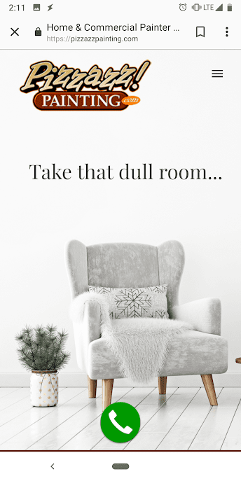
For example, this is a screenshot on mobile from Pizzazz, a painting company in South Jersey. When you open their homepage on your phone, it is hard to miss the big green call button at the bottom of the page.

Even though it’s a relatively simple design, the button doesn’t detract from the page itself. And it’s a call to action that’s intuitive. Without added text and direction, we know the action that is expected to happen if we do decide to click. The design keeps the page clean and clear but still actionable.
Your Welcome Message Is Taking Up Valuable Real Estate
No one is searching for the phrase “Welcome To My Website” so why is it taking up valuable space in your header? If the bar at the top of your page reads: “Welcome!’ you’re missing a great marketing opportunity.
As soon as a visitor lands on your page you need to communicate two things very quickly: what is this page about and how can it benefit the client? For a detailed breakdown of how to write a powerful welcome message for your website, check out this post.
Today its often considered better to let your work speak for itself. If you can provide images of your work, this may be the time to do so. If you believe your message would be better articulated through text, try to keep it concise. Think in terms of bullet points instead of paragraphs.
Try to avoid using your mission statement as a way to tell your clients what the page is about. Clients are more interested in ways your business can help them as opposed to what your business believes in. Use vocabulary that speaks to your client while avoiding overly marketed fluff.
Turn Your Competition To Your Advantage
Chances are when someone is looking at your services, they’re also researching your competitor’s services. Instead of trying to avoid the inevitable, turn this situation to your advantage. Explain how and why you’re a better choice than the competition in your area.
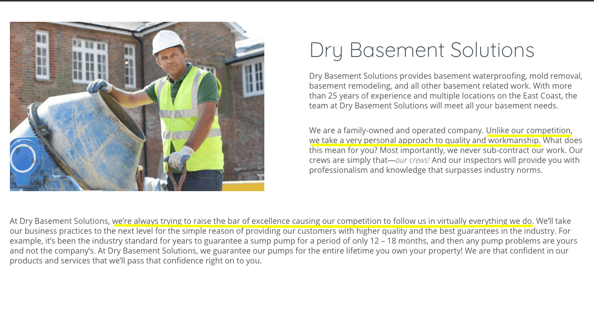
In this example, NJ Dry Basement Solutions tells the client exactly why they’re the better choice in the area and how they’re working to raise the bar every day.

Traffic Is Good, Conversion Is Better
Improving your traffic is an essential part of marketing that can aid in conversion. However, if clients are getting to your page but aren’t making purchases, then the traffic you’ve generated becomes a missed opportunity.
Conversion rates help with revenue, so it’s important that when a visitor comes to your page, you’ve got a layout that encourages them to follow through with a purchase or setting an appointment.
While there are dozen of strategies that you can try, the suggestions above can help you quickly identify ways to get your page on the right track.


