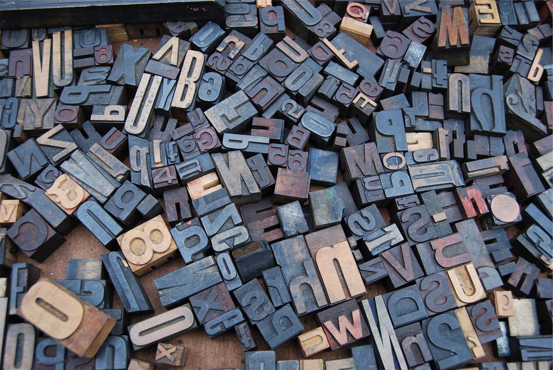
All of us at one point in time have come across a certain style of font that made the ordinary text appear attractive and pleasing to the eye. This transformation is made possible with the use of typography.
Nowadays, typography is used in every industry from documents to advertisements to promotion to packaging to book covers to motion pictures. You name it and it would have already been typed graphically (just a jocular take on word typography).
In order to appeal to the masses, the demand for creating stunning visuals has been increasing day by day. Typography has etched its own proliferating industry where numerous professionals earn their living by dishing out a piece of their creative intellect and skills.
The best part being you don’t need to be a professional to add a creative side to your text, the availability of typography online tools has enabled even a layman to become an instant creative designer.
Why do fonts matter?
Choosing the right font is just like choosing the right outfit. Whether you do it consciously or casually it reflects a lot about your style and preference.
Just like your everyday outfit won’t go with every occasion, likewise, different fonts serve a different purpose. A bubbly font would be appropriate for a kids birthday party but try using it in official documents, everyone would know who to not approach for the next official documentation.
Relevant and attractive fonts set the ground for the entire design and generate interest in the minds of the viewers about your brand. The bottom line being the font choices should be appropriate and purposeful.
How to make appropriate font selections?
The various typefaces which designers and typographers use have their respective character and personality. Some fonts are playful, frivolous or casual while the others are conventional and formal. Yet some other fonts are outrightly cheery and exuberant.
It is the creative designer’s responsibility to fit the exact font into the visual for it to stand out at it’s best. Incorrect font selection can lead to a mismatch in the intended message of the visual creative. It can lead to interrupted communication, prevention of mass appeal and even destroying the purpose of the visual.
And it’s just not the typographers or the graphic designers, most of us have also pitched in and shared a piece of our intellect at creating visuals at some point in time. Therefore, below we share a few handy and effective tips for using fonts in typography.
Contemplate on the nature of the visual
The layout of the entire visual will depend upon the nature of the project. The treatment of the fonts will largely vary in case of a business presentation as against a leaflet announcing promotional offers at a retail store.
An appropriate starting point would be to match the aspects of the intended message with the respective font traits. At times, you would want to use fonts which are the biggest and the most attractive of all, so that the eyes of the viewers automatically see them first.
Other times, you might want to use small fonts with maximum clarity, especially for paragraphs so that the continuity is not interrupted. Remember, font styles largely influence the readability of your creative. Therefore, always look for fonts which are easy to decipher.
Attempt to establish a visual order
When you are selecting fonts for a particular project, first think about which aspects of the visual you would want your viewers to see first.
You could segregate the essential information such as the offers, headlines or the company name and use large and bold fonts give optimum importance to the most important textual elements. As mentioned before, font qualities such as boldness, size, and spacing determine how the eyes navigate through the visual document and which fonts attract most of the attention.
A great way of assigning fonts to the visual order is to read the backgrounds of the fonts you intend to use. Information with regards to how they were discovered and for what purpose can help determine if they can be used at a specific order in the creative.
Create a combination of mismatched fonts
If fonts are combined appropriately, they can bring about an aesthetic visual appeal. For example, if you match a bold spaced font with a slender one, each of the font types brings it’s respective personalities to the table and retains their individual importance.
As a result, the texts printed in both these fonts are clear, distinguishable and equally appealing when contrasted. Refrain from pairing fonts which are similar in their visual appeal.
Avoid using too many fonts
Using a number of fonts, irrespective of whether the length of the text is long or short creates confusion in the minds of the viewers and their attention gets divided many times. Such a visual does not communicate it’s intended message and instead looks conflicting and cluttered.
Most of the projects benefit from a thoughtful assortment of fonts. If at all your project demands the use of multiple fonts, make sure to make numerous alterations and combinations until the various fonts complement each other and render the desired rich and warm feel the visual intends to evoke.
Practice is the key!
As with all other skills, practice makes a man perfect. If you intend to become competent at typography without any professional training, you need to experiment with fonts.
Becoming an expert requires a whole lot of trial and error. Although there is no written formula with regards to which font goes well with which one, the skill of creating an attractive visual is often considered objective which makes it yet trickier.
So use your intuition and start taking risks. Numerous practice will inculcate the sense of ‘which font goes well where’ and your creative levels are bound to swell far and wide.
Typography has found it’s importance in the field of advertisements and promotions ant and attractive fonts set the ground for the entire design and generate interest in the min for a long time.
The traditional typefaces have given way to the creation of modern-day famous typography designs which are widely used around the globe. The growth and advancement of digital technology in recent times has enabled myriad choices of typefaces which can be used to create mesmerizing visuals.


