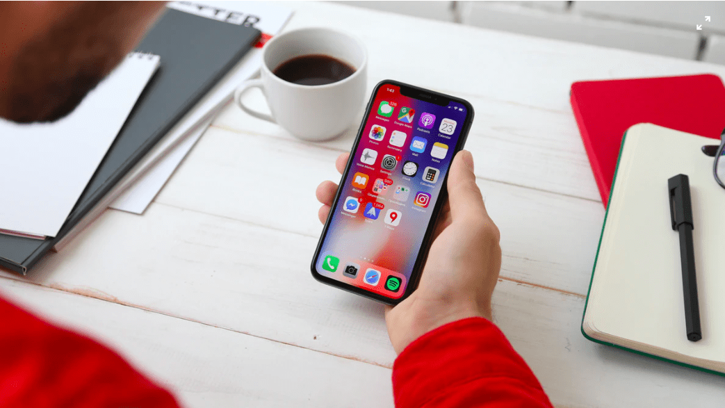
In 2019, giving users a great mobile experience isn’t just about helping users adapt to changing technology. It’s also about refining the design principles and technology that previous years have already given us. Below are five ways you can create a better mobile user experience this year.
Thanks to the iPhone X’s removal of the home button, as well as the ever-increasing size of device screens, there are two major navigation trends in 2019:
As device screens get larger, it becomes harder for your thumbs to reach across. Placing navigation buttons at the bottom of the screen makes for a more user (and thumb) friendly experience.
Navigation gestures became all too necessary with the iPhone X’s removal of the home button. Likewise, we’re seeing Android manufacturers follow in the same footsteps. Implementing gestures can help clear up precious screen space by removing redundant navigation icons.
But take heed: Cieplińska warns that until everyone can come up with a “commonly-accepted system of gestures,” developers should include a gesture tutorial for first-time users.
2. Start Designing in Flat UI 2.0
Mobile developer Gil Bouhnick says flat UI is nothing new—it has dominated the mobile space for 6 years. But now, Bouhnick says it’s time for flat UI 2.0:
“Flat UI 2.0 helps users interpret visual hierarchies and clickable content while making UI more sophisticated.”
And that means several design changes throughout apps and websites:
- The use of vibrant colors, in both your app and your logo
- A fresh take on gradients using warm, vibrant colors
- Duotones—a recent web design trend—that will mesh nicely with gradients
- Multiple layers of backgrounds to help create a sense of depth, or “deep flat design”
- Using cards to organize data, rather than relying solely on the typical table view
3. Create Eye-Catching, 3D UI Designs
In conjunction with flat 2.0, you can also grab attention by implementing 3D graphics in web and mobile.
Marina Yalanska of Tubik blog notes several examples that show how 3D can be used across a wide range of industries, from educational and lifestyle apps to blogs and eCommerce interfaces.
Yalanska points out that while pulling off the 3D look is both time-consuming and requires the right skills, it can save time and money by creating content that is impossible to photograph or too expensive to obtain.
4. Do Voice UI, But Do it Right
Research firm Gartner predicts that 20 percent of user interactions with smartphones will be used through virtual personal assistants.
That may sound like companies should go all-in with improving voice UI, but Jeremy Williams of Adobe Blog points out that there’s still well over 57% of users who don’t use voice assistants for mobile devices, tablets, and computers. That’s possible because there aren’t many good voice interfaces out there.
His suggestion? Before jumping on the VUI bandwagon, first ensure that it’s being implemented with a user design strategy that truly brings value to the user. A useful voice UI can help your software or app stand out by capturing this unfulfilled potential.
5. Engage Customers With Chatbots
A great mobile experience isn’t just about sleek designs and intuitive navigation. In order to boost customer engagement, it’s essential to give customers support right when they need it.
That’s where chatbots come in, capable of providing support quickly and at anytime. And don’t think that users will be turned off by a chatbot—Botcore found that 63% of consumers are already willing to use them.
And it’s not just consumers warming up to chatbots. They also found that more than 50% of enterprises are projected to spend more on chatbots than mobile apps by 2021 for their ability to help users.
6. Consistent User Feedback
Lastly, you’ll want to make sure you’re getting user feedback on a consistent basis. You can do this through your chatbot or customer surveys. While user feedback is nothing new in 2019, it’s important for creating an experience in your customer’s value.
Getting consistent feedback will help you improve your product and move towards something your customers need instead of want. Most people only use a select few apps that they download. You want your app to be amongst the most used. This is why it’s important to take customer feedback seriously.
Not only do you want to consistently ask for feedback, but listen to the feedback your users are providing when you’re not asking for it. You’ll want to engage in social listening and paying attention to what they’re saying on Twitter. It’s also important to read reviews for the potential improvement of your product. If you don’t continue to improve your product, your competitors will find your weak spots and customers will just follow the best product and service.
7. Keep it simple
You’ll want to keep your app simple and intuitive with a clean design interface. This will guarantee that your app is easy to use. While it may be tempting to add a bunch of new features to your app – don’t!
This is why companies such as Photoshop are losing market share to sites like Canva. While Photoshop may be the tool to go to for professional photographers and graphic designers, most people are casual designers and they need a simple tool. Keep things intuitive for your users and continue to pay attention to trends and where people continue to gravitate.
So there you have it, 7 ways to create a great mobile experience. We’re passionate about all things mobile especially as we head into 2020. It seems that more people are using mobile than ever and doesn’t show signs of stopping. What are some ways that you’ve seen have helped improve your mobile experience? We’d love to hear about it in the comments below!


