Choosing fonts for both your site’s header and body text is truly important for the overall design of your business website. Although typography continues to be overlooked, yet choosing the right typeface can make a big difference to the performance of your webpage. Making the appropriate font decisions will substantially boost your website appeal and will attract more customers and prospects.
Why Does Font Choice Matter?
- Complements content
- Affects branding
- Reflexes on good readability
- Attracts visitors
- Strengthens a smooth user experience
- Helps in- site navigation
- Ensures web safety and visibility across all browsers and devices (Google.com fonts are all optimized for these purposes)
Realizing the strong impact of font customization, web designers at Puzl website builder, have thoughtfully done that job for you. They have tested and compared all the combinations in advance, deciding on the best possible font choices, corresponding to the design theme selected.
For all, not being members of the platform, in this article I am going to provide some general guidelines on selecting the right typeface to any professional website:
#1. Readability Comes First
No point in creating great content if it cannot be effortlessly consumed by your prospects. A well-selected typography is one of the most important steps in this direction. Make sure the font you choose is legible enough. The simpler the better.
Intricate fonts may look more attractive and elegant but when it comes to the body text, simpler but readable would be a wiser move to impress and retain your visitors. Avoid script or decorative typefaces if you don’t want your visitors struggle to identify letters.
Many sites choose a font in the 10px-12px range. To achieve optimum readability using a font size of at least 14px- 16px is recommendable. When deciding on a font for your titles, keep in mind that they must be big enough to draw attention but still not so huge that any other page element looks tiny. Always try to strike the right balance.
#2. Pairing Matters
The vast majority of professional designers use two typefaces: one for the main body and one for headlines. The reason behind lays not only in breaking the monotony and boosting the visual effect but also in improving content hierarchy and making it more distinct. Although the number of fonts chosen is entirely up to you, if you feel like keeping it more straightforward, try to stick to two, at most three. What matters the most is not the number but the way you pair them.
When picking up a pair of fonts, the most essential issue to consider is how they work together. “Are they similar enough?”, “Maybe too similar?” , “Do they clash?”, “Are they too different?”, “Do they complement each other?”. Try them all if needed and explore all possible alternatives. That’s the most effective way to find out the most powerful combination for your webpage.
A good example is choosing a strong Sans-Serif for main titles, and a simple Serif for the other, smaller headlines. They complement each other in a manner that each font individually could not express.
#3. Get Familiar with the Main Fonts
There are four main font categories to choose between:
- Serif Fonts — They come with a little ledge that adorns the tips of a letter. Serif fonts can be used for larger blocks of body copy. Characters are more distinct and easier to read off screen. Serif fonts give a more formal, classy and conservative look. They are best for traditional press, printed books, magazines and newspapers.
- Sans-serif Fonts — They are simple and straightforward, lacking the “lines” of the serif fonts letters. They can also be used for larger blocks of body copy. Yielding a more modern feel, they are considered as more informal, uncluttered and playful. No doubt Sans-serif Fonts are commonly used for digital newspaper headlines, blogs and website text content.
Image: The visual difference between Sans serif and Serif Fonts
- Decorative Fonts — Also referred to as display type, they are typically purposed for titles and headlines, and for small amounts of text which needs to be highly visible and draw attention. Giving a feeling of importance, accent and originality, decorative fonts are the perfect fit for greeting cards, logos and posters.
- Script Fonts — They recall handwriting and are mostly used in formal invitations, quotes, logos, headings. Great choice for highlighting text but difficult to read if delivered in big amounts. Script fonts convey personal, creative and artistic attitude.
This Infographic will give you a clearer picture of the common feeling that different fonts use to evoke in users:
Helpful Tips:
- When choosing a font for body text, it’s usually best to stick with a Serif font or Sans-serif font.
- According to some typography experts sans-serif fonts are better for online reading because of the quality of screen resolutions is worse than in a print. With the fast improvements of the digital technologies, Serif fonts are more and more becoming easier to read in a digital format.
- Once you’ve decided on the best font for your website, it’s time to properly style it. Pick one color for the body text and stay consistent. Using multiple text colors looks amateurish and not quite professional. The higher the color contrasts, the more visible the text will be. Choosing black type on white or colored background is one viable solution.
- Proper spacing between letters is essential for your audience to be able to scan through the content smoothly.
- Bear in mind that browsers’ latest versions are constantly changing the rules. For the sake of safety, choose fonts that have proved to work well across all browsers.
Choosing fonts that best highlight content and respect your brand identity is not an easy thing to do. It is more of a gut instinct and there is not a secret formula for making the right selection. It all depends on the general feeling of your design, the message you want to evoke in your visitors and the efforts you put to make them all-in-one work for your website success.
Given the role fonts play in influencing visitor experience, treat them with the credit they deserve and your business website will sure be rewarded with a better customer satisfaction and engagement.
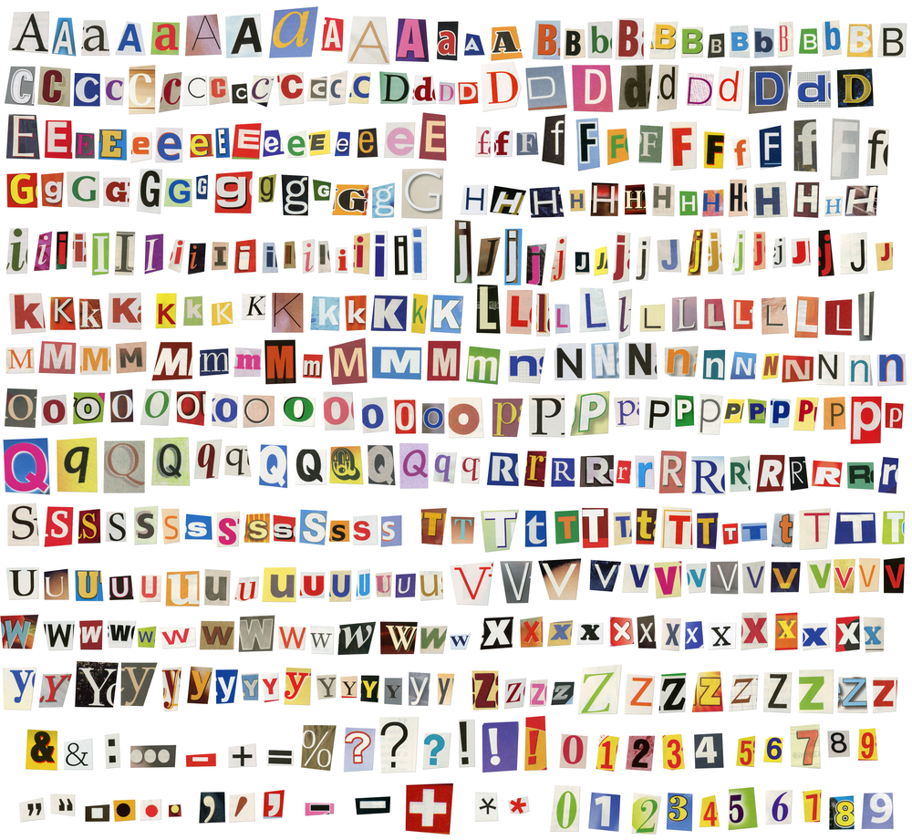
Images: ”Newspaper, magazine alphabet with letters, numbers and symbols. Isolated on white background. / Shutterstock.com“
________________________________________________________________________________
 Connect with Tweak Your Biz:
Would you like to write for Tweak Your Biz?
Tweak Your Biz is an international, business advice community and online publication. Today it is read by over 140,000 business people each month (unique visitors, Google Analytics, December, 2013). See our review of 2013 for more information.
An outstanding title can increase tweets, Facebook Likes, and visitor traffic by 50% or more. Generate great titles for your articles and blog posts with the Tweak Your Biz Title Generator.


 Connect with Tweak Your Biz:


